|
|
Post by alexgg on May 12, 2010 18:03:26 GMT -5
Mattel Hurricane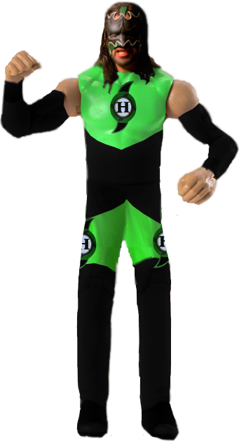 (HBK Basic4 used as base) (HBK Basic4 used as base) |
|
Erdrtyu
Main Eventer

Joined on: Mar 9, 2007 19:07:14 GMT -5
Posts: 4,291
|
Post by Erdrtyu on May 29, 2010 4:42:54 GMT -5
You've got a very weird habit I've seen, of covering up joints and just laying color over them. That's not good. You shouldn't cover up joints like that unless it is a knee pad or elbow pad or something else that sould cover up joints. Unless Hurricane here is wearing a cloth attire starting from his legs down, you should still have the shape of the legs visible. The legs look weird, and look like weird rectangles hanging down from his body.
Ok, that's the negatives. Now for some good things. I like pretty much the whole top half of the body. The head is not great, but very good given your experience. Try to match up the skin tones better though. The top of his attire is more how it should be done. It's just a recolor on top of the torso and you can still see the torso underneath. The logo looks good too.
Actually the arms have the same problem as the legs. It looks like your brushing over the whole arm, instead of just recoloring it to look black. Again, I don't know what program you're using, so I can't help too much.
There are some good elements to this figure, but the weird looking legs and not too good arms just kind of ruin it. Keep trying, you'll get much better with more practice.
|
|
|
|
Post by wrestlefreak99 on Jul 27, 2010 12:46:13 GMT -5
legs look a little long but other than that its awesome
|
|
|
|
Post by alwayssunny on Aug 6, 2010 2:03:39 GMT -5
It looks like hes wearing feeties? (I think thats what you call em)
|
|
Nick
Mid-Carder
Used to animate a bit, might return sometime in the future.
Joined on: Jul 8, 2010 16:54:34 GMT -5
Posts: 372
|
Post by Nick on Aug 9, 2010 1:45:06 GMT -5
It would be great if you should the points of articulation. I give it a 8.5/10
|
|


