Deleted
Joined on: Apr 25, 2024 7:18:09 GMT -5
Posts: 0
|
Post by Deleted on Apr 9, 2014 14:41:48 GMT -5
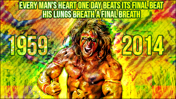 Made this for fun, since I'm still pretty shocked at his passing. RIP. |
|
RollinsFan44
Main Eventer
 12 UK Classifieds Refs.
Joined on: Feb 27, 2013 13:05:53 GMT -5
Posts: 4,160
|
Post by RollinsFan44 on Apr 9, 2014 14:44:15 GMT -5
Love it. Very creative. RIP Warrior  ! |
|
Jamie
Main Eventer
Joined on: Sept 14, 2013 15:54:23 GMT -5
Posts: 3,380
|
Post by Jamie on Apr 9, 2014 15:13:37 GMT -5
Pretty creative, colouful and cool! I think it's "breathe" not "breath" for the first breath, though. Besides that mistake, it's sweet!
RIP Warrior
|
|
Deleted
Joined on: Apr 25, 2024 7:18:09 GMT -5
Posts: 0
|
Post by Deleted on Apr 9, 2014 15:17:19 GMT -5
Pretty creative, colouful and cool! I think it's "breathe" not "breath" for the first breath, though. Besides that mistake, it's sweet! RIP Warrior I knew it didn't look right to me haha, thanks. |
|
|
|
Post by Sleazyness on Apr 9, 2014 17:14:39 GMT -5
Great graphic. I need to get better at making graphics.
|
|
Deleted
Joined on: Apr 25, 2024 7:18:09 GMT -5
Posts: 0
|
Post by Deleted on May 3, 2014 0:30:37 GMT -5
The color scheme of the background kicks ass! The text work does not, however. The composition is great with the tagline at the top and the birth year and death year on the left and right side of Warrior. But the font choices and the blending of the text is what ruins it for me. The top text doesn't stand out at all being blended into the wild background and also kinda makes the color scheme a bit overkill. I like that you added the multiple strokes to the text to try to make it stand out but I still hate the text fill overlaying the background. I would have went with white text at the top at least and a different font than the font used for the years. I think if the top text was a different color and a different font, then I probably wouldn't be bothered by the text for the years. I don't think the blending would bother me then because it would set it apart from the text at the top more and overall look more pleasing. The only other big thing that's bothering me is that everything is a little off center. If you look at the top text, you can see it's pushed a little bit more towards the right side as there's a shorter gap from "beat" to the right side edge than there is from the left edge to "every". It's a little less noticeable with the years but they're also spaced a little bit differently from their respective edges.
Overall it's pretty nice work. The color scheme on the background is awesome and I love the blending on the Warrior pic. It's just the text work that brings it down for me but a few tweaks would set this thing off very well. Good work.
|
|