|
|
Post by Valbroski on Apr 9, 2015 16:38:53 GMT -5
Version 1: 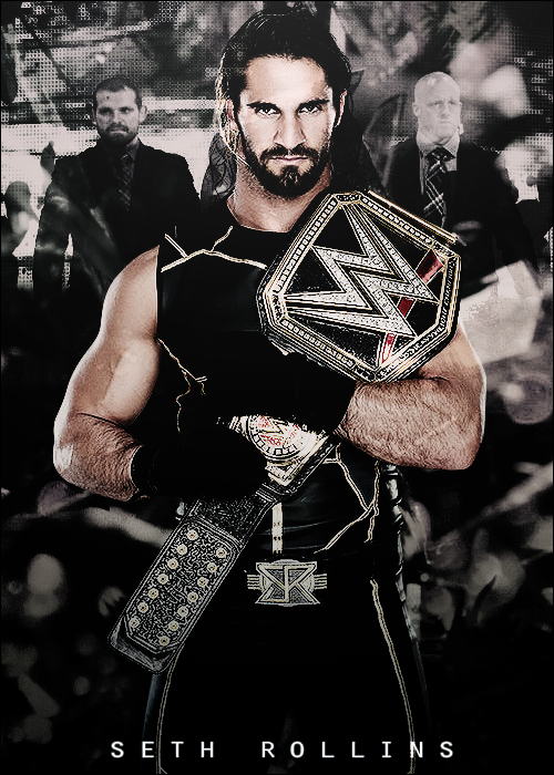 Version 2: 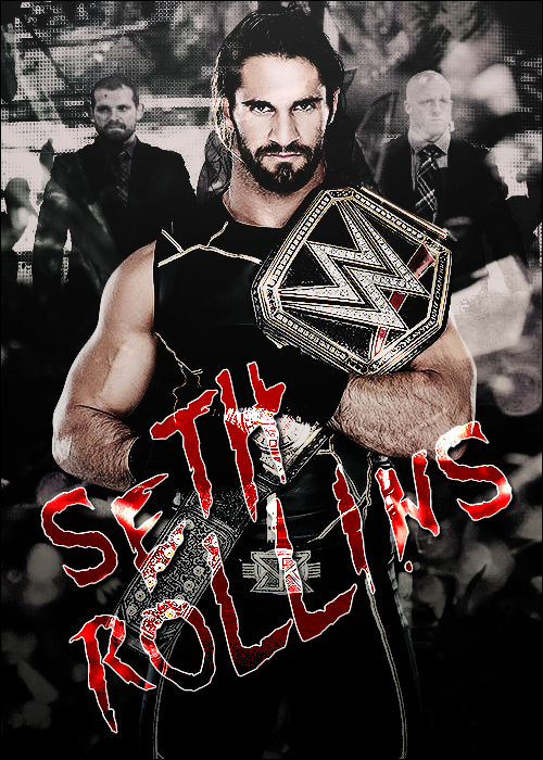 so I did 2 different versions. The first one with a little bit more of a clean poster vibe while the other is more of a graphic. I admit I eyeballed the placement of the text on the first one so I'm not sure if it's properly centered but I just did this for fun anyway so I didn't nit pick it too much. Feel free to critique, thanks. |
|
|
|
Post by The Yes Man on Apr 9, 2015 16:41:39 GMT -5
Those are both very cool man, awesome work.
|
|
KPnDC
Main Eventer

Joined on: Jun 8, 2013 21:58:21 GMT -5
Posts: 1,754
|
Post by KPnDC on Apr 12, 2015 12:24:12 GMT -5
I'm a minimalist guy, so the first one is perfect IMO. Great job.
|
|
|
|
Post by Valbroski on Apr 12, 2015 12:28:38 GMT -5
I'm a minimalist guy, so the first one is perfect IMO. Great job. I prefer minimalist design too which makes me a sucker for simple/clean fonts like that. I felt like the first one had a PPV poster vibe too it, aside the odd placement of J+J security. I was gonna squeeze the authority in there as well but it started to feel cluttered. |
|
|
|
Post by ¡Twist Of Cinnamon! on Apr 17, 2015 23:00:36 GMT -5
Much prefer the first one, less is more. The text is the second seems a little too distracting compared to the rest of the image. Only thing I'd really change is using the Burn Tool on Joey since he seems a lot brighter than Jamie.
|
|
|
|
Post by Valbroski on Apr 20, 2015 21:04:45 GMT -5
Much prefer the first one, less is more. The text is the second seems a little too distracting compared to the rest of the image. Only thing I'd really change is using the Burn Tool on Joey since he seems a lot brighter than Jamie. yeah I see what you're saying, kind of looks like smoke over Joey. |
|


