Deleted
Joined on: Apr 24, 2024 16:35:41 GMT -5
Posts: 0
|
Post by Deleted on Jul 2, 2016 15:14:41 GMT -5
|
|
|
|
Post by J'Dinkalage Morgoone on Jul 4, 2016 13:13:35 GMT -5
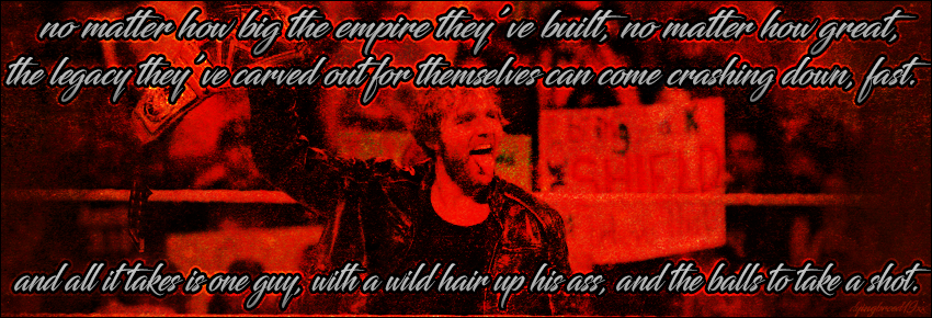
the wording and background are distracting and hurt my eyes
not a good contrast
|
|
|
|
Post by Valbroski on Jul 4, 2016 22:02:29 GMT -5
yeah, I'd definitely do less text or explore different ways of placing it. one option is to play around with different sizes for some of the words within the quote. pick out what words you'd visually want to have a stronger impact and make those ones stand out by making them bigger than the other less important words in the quote. every word doesn't necessarily have to be the same size. as for the rest of the graphic, it's fitting for Ambrose. normally I'm not a fan of high saturated sharpened looking images but it does have a grunge feel thats fitting for him so the only thing I'd suggest changing there is try and bring forward the pic of Ambrose a bit more with some more contrast. I know it may be more difficult to pull off due to it all being one image but further adjusting the levels of the image and then using lighting effects could help create more depth and give the image more of a focal point despite the background being one image. anyway overall I'd really just suggest beating up the text more if anything. there's nothing drastically wrong with the sig but like almost every case it can always benefit from putting in more work. edit:  just to give an example of what I was trying to explain with the typography, something like this is really effective. if you just google typographic art or typography you'll see a bunch of methods of what an effective design element just text can be. I know in the case of a signature its more difficult to pull off because you're working on a smaller scaled canvas but still. |
|
|
|
Post by ¡Twist Of Cinnamon! on Jul 7, 2016 5:22:49 GMT -5
Theres definitely too much text, to the point where it becomes too distracting and takes the focus off Dean. I'm not liking the font choice either. Its a bit difficult to read, especially considering the amount of text too. The red grunge seems to suit Dean. I still cant decide if its a bit overdone though. A quick background blur would be welcome to make Dean more of a focal too.
|
|