MiniFigChamp28
Superstar

Joined on: Feb 9, 2015 0:35:15 GMT -5
Posts: 663 
|
Post by MiniFigChamp28 on Aug 5, 2016 12:07:31 GMT -5
WWE changed the poster for Summerslam and I wanted to know which one do you guys like more Original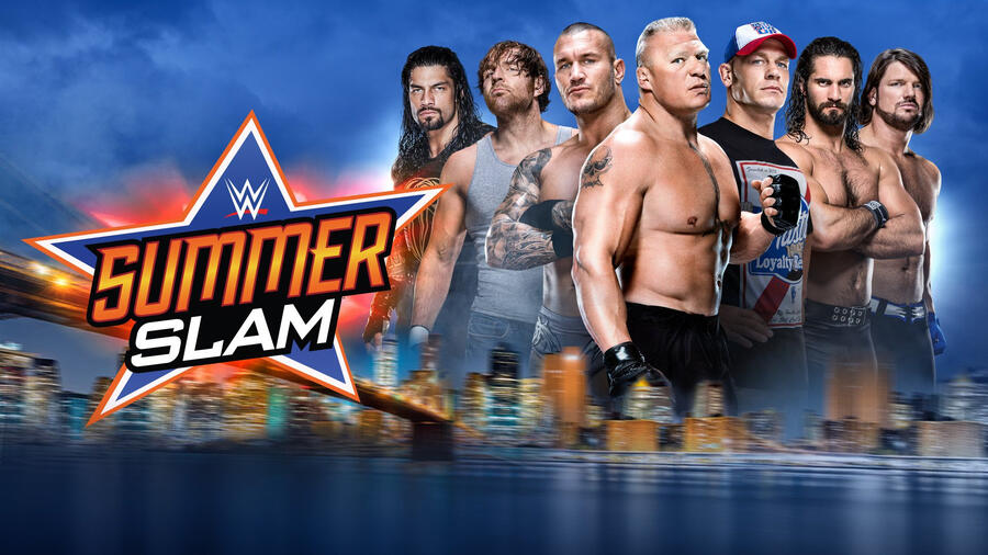 New New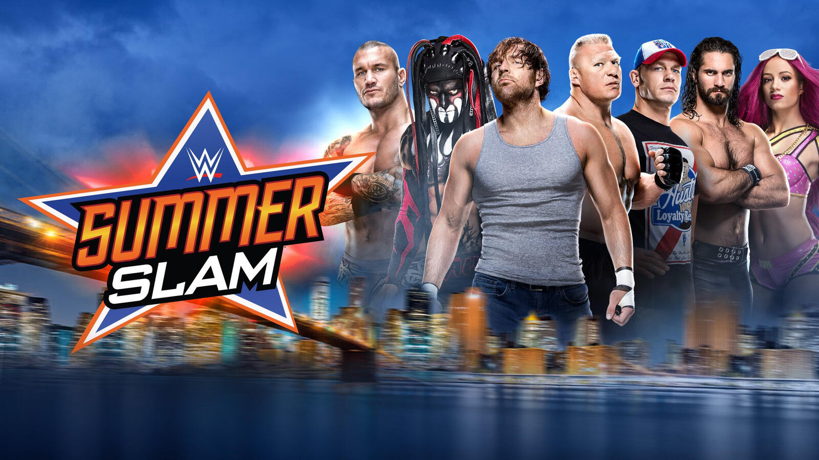 |
|
KingOfKings™
Main Eventer
Running to get a piece of some Alexa Bliss cake
Joined on: Jul 22, 2016 20:04:38 GMT -5
Posts: 1,594
|
Post by KingOfKings™ on Aug 5, 2016 12:09:27 GMT -5
Second because of Balor & Sasha, no Roman Reigns either.
|
|
|
|
Post by Evil Abed on Aug 5, 2016 12:15:54 GMT -5
Its hard to go against one that replaces Reigns with Sasha and Balor and features Ambrose but it feels terribly unbalanced. Im gonna go with the first.
|
|
Deleted
Joined on: May 2, 2024 13:27:09 GMT -5
Posts: 0
|
Post by Deleted on Aug 5, 2016 12:16:01 GMT -5
The one with Dean in the front, the guy who puts in more work.
|
|
|
|
Post by Rude Awakening on Aug 5, 2016 12:19:55 GMT -5
The 2nd one looks goofy to me maybe it's because Sasha and Finn and more colorful than others. I like the 1st one.
|
|
|
|
Post by theoutlaw1999 on Aug 5, 2016 12:22:28 GMT -5
Looks like we're getting Demon Balor at Summerslam!  |
|
|
|
Post by slappy on Aug 5, 2016 12:26:18 GMT -5
Original because Finn looks so out of place and awful as the Demon.
|
|
|
|
Post by Ultimate Figure Collector on Aug 5, 2016 12:31:30 GMT -5
The original looks cleaner. Something about Finn in the second one looks really out of place.
|
|
Deleted
Joined on: May 2, 2024 13:27:09 GMT -5
Posts: 0
|
Post by Deleted on Aug 5, 2016 12:32:34 GMT -5
Dean front and center is tops.
|
|
|
|
Post by punksnotdead on Aug 5, 2016 12:34:38 GMT -5
The first one is aesthetically better. They just need to swap Sasha with Reigns.
|
|
|
|
Post by attitudesback on Aug 5, 2016 12:51:44 GMT -5
First one looks way better. Second one has too many people.
|
|
|
|
Post by DeadlyGame on Aug 5, 2016 12:52:17 GMT -5
Dean is in the center where he belongs.
|
|
|
|
Post by Midnight on Aug 5, 2016 14:30:10 GMT -5
New, although it lacks AJ Styles.
|
|
Deleted
Joined on: May 2, 2024 13:27:09 GMT -5
Posts: 0
|
Post by Deleted on Aug 5, 2016 14:33:21 GMT -5
The second one looks better.
|
|
|
|
Post by HHH316 on Aug 5, 2016 15:14:44 GMT -5
2nd, I guess. But really I'm fine with either.
|
|
|
|
Post by HVMMONS on Aug 5, 2016 15:20:03 GMT -5
Second 100%
|
|
|
|
Post by theoutlaw1999 on Aug 5, 2016 15:21:39 GMT -5
The second one looks way more marketable and Finn and Sasha really add to the poster.
I also like the fact that Ambrose is at the front instead of Lesnar.
|
|
johnnyaustin21
Main Eventer
Joined on: Nov 21, 2011 14:16:20 GMT -5
Posts: 1,609
|
Post by johnnyaustin21 on Aug 5, 2016 16:39:51 GMT -5
The Original by far,its a perfect way of showing off all of the top talents in draw in the WWE.You have the top six stars currently in Cena,Orton,Reigns,Rollins,Ambrose and Styles and then the biggest part timer in Brock.
|
|
|
|
Post by King Bálor (CM)™ on Aug 5, 2016 18:57:51 GMT -5
Second is better....but still not great. Balor and Rollins should be at the forefront.
|
|
|
|
Post by ThugSuperstar on Aug 5, 2016 19:11:58 GMT -5
It's a tough choice for me. I really like AJ being featured in the original poster, but the WWE Champion should absolutely be front and center considering it's one of the biggest PPVs of the year, so I think I like the second one more. I still would've found a way to add AJ to it, though.
|
|