hoganvspiper
Superstar

Joined on: Jun 9, 2013 21:10:25 GMT -5
Posts: 822 
|
Post by hoganvspiper on Aug 27, 2016 7:16:12 GMT -5
Can anyone tell me where I might find the Hart Foundation with updated fonts on the back of their tights? I don't think one can tell by looking thru the packaging, so I think I'm left with word on the streets reports. Any help would be appreciated.
|
|
Medieval
Main Eventer
@mattelwwe_medieval
Joined on: Jan 22, 2015 12:46:43 GMT -5
Posts: 4,638
|
Post by Medieval on Aug 27, 2016 8:43:48 GMT -5
The 1st batch from ringside had the wrong fonts. The ones being found at retail[walgreens & gamestop] have the updated correct font.
|
|
|
|
Post by Y3RP: LA MARAVILLA!!! on Aug 27, 2016 9:33:07 GMT -5
pic?!
|
|
|
|
Post by madness86 on Aug 27, 2016 11:49:14 GMT -5
I ordered one Anvil from Amazon and found another at GameStop. I have both fonts now.
|
|
|
|
Post by hbkbigdaddycool on Aug 27, 2016 11:57:09 GMT -5
Does anyone have pictures to show the comparison then??
I never heard of this until now.
|
|
|
|
Post by wrestlingdelorean on Aug 27, 2016 11:58:09 GMT -5
I ordered one Anvil from Amazon and found another at GameStop. I have both fonts now. so Amazon has the updated font? |
|
|
|
Post by PJ on Aug 27, 2016 12:02:09 GMT -5
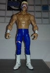
Does anyone have pictures to show the comparison then?? I never heard of this until now. Here were the Anvil figure comparison I made when it was first reported. I got a second Hitman the other day, but I haven't compared it with my first yet. There were pics posted a week back. I think the first release (anyone who got them from RSC) had thicker fonts for the words HITMAN* and ANVIL on the back of the tights. Then people were posting pics of the ones found at retail where the fonts on the tights was thinner and the ends of the letters were topped off. 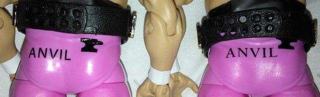 |
|
|
|
Post by madness86 on Aug 27, 2016 12:12:30 GMT -5
I ordered one Anvil from Amazon and found another at GameStop. I have both fonts now. so Amazon has the updated font? Amazon had the thicker font,GameStop had the narrower font.. May just be the case from what I encountered though. |
|
|
|
Post by PJ on Aug 27, 2016 12:31:14 GMT -5
The Hitman I received from Amazon had the thicker stick letters like my RSC figure.
|
|
|
|
Post by The King Of Crisps on Aug 27, 2016 12:55:06 GMT -5
Helvetica and Times New Roman
|
|
|
|
Post by JC Motors on Aug 27, 2016 20:36:39 GMT -5
I never knew about the font changes
|
|
|
|
Post by Y3RP: LA MARAVILLA!!! on Aug 27, 2016 22:33:59 GMT -5
damn, I just checked mines. my anvil has the old script and bret has new script. also notice anvil, he has a ink botch. where black ink bleed down his crack and it looks like a poop stain!  |
|
|
|
Post by kgchampion on Aug 27, 2016 23:17:54 GMT -5
Just found Anvil at Gamestop today. Has the Times New Roman font. Now I worry if I find Bret at any place other than Gamestop or Walgreens (neither of which have him), he'll have a mismatching font and my OCD will cause me to burn all my toys.
|
|
popyduggan
Main Eventer
Joined on: Jun 24, 2010 5:31:32 GMT -5
Posts: 4,601
|
Post by popyduggan on Sept 3, 2016 18:07:40 GMT -5
Got my Hart Foundation from WalmartDOTcom, and they both have the new fonts. The HF i recently ordered from RSC had the old font, which I'm cool with because I collect the running changes and more tag titles.
|
|
Deleted
Joined on: Apr 19, 2024 0:34:31 GMT -5
Posts: 0
|
Post by Deleted on Sept 3, 2016 18:30:13 GMT -5
You people... The difference between the fonts, while they are two different fonts, the correct one has what are known as "serifs."   |
|
Deleted
Joined on: Apr 19, 2024 0:34:31 GMT -5
Posts: 0
|
Post by Deleted on Sept 3, 2016 18:33:04 GMT -5
Helvetica and Times New Roman Could be Arial and Times New Roman, Helvetica would be better as its the best font ever made. |
|
Deleted
Joined on: Apr 19, 2024 0:34:31 GMT -5
Posts: 0
|
Post by Deleted on Sept 3, 2016 18:39:38 GMT -5
Helvetica and Times New Roman walk into a bar. Bartender says, "You gotta leave. We don't serve your type."
|
|
|
|
Post by PJ on Sept 3, 2016 19:41:18 GMT -5
You people... The difference between the fonts, while they are two different fonts, the correct one has what are known as "serifs." You kids and your fancy words...I am just going to continue to say they are topped off.  lol |
|
Deleted
Joined on: Apr 19, 2024 0:34:31 GMT -5
Posts: 0
|
Post by Deleted on Sept 3, 2016 20:08:40 GMT -5
You kids and your fancy words...I am just going to continue to say they are topped off. lol |
|
|
|
Post by rustyjohnson on Sept 3, 2016 21:16:29 GMT -5
You people... The difference between the fonts, while they are two different fonts, the correct one has what are known as "serifs." Thanks actually...never knew what that meant... "The More You Know!" lol  |
|