|
|
Post by Mongo Bears on Nov 28, 2016 22:22:57 GMT -5
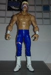
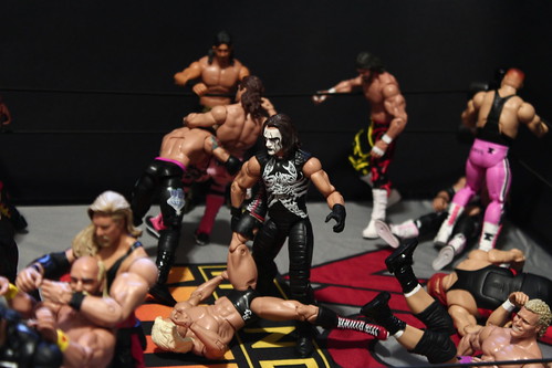
Ever wished the attire for the figure in the box looked more like the one pictured on the box? I am a flashback only collector, so current roster collectors feel free to chime in on the ones I don't know about. But, there are the obvious choices that would be e38 macho man not having the shirt pictured on the box or the gray gloved undertaker that was missing the tie that sure enough is pictured on the box  I would like to gripe a little about the Rse sting which I received today. I like the figure so don't get me wrong. The head sculpt is excellent. I don't love the nwo logo on the chest and I really don't love the red accented leg pads on the tights. I'm sure these aren't errors but I don't recall when he wore this exact attire. Can anyone help me with that? Regardless, Id like it better if it looked like the pic on the back. |
|
|
|
Post by Fighter Hayabusa on Nov 28, 2016 22:30:21 GMT -5
I think it is an error. Looks like a mashup of various different Wolfpac attire. Also, he never wore a t-shirt poncho style. Never did I ever see Sting wear anything but a normal short sleeved shirt.
|
|
|
|
Post by kgchampion on Nov 28, 2016 22:36:08 GMT -5
Originally he just wore a wolfpac t-shirt and regular black/white face paint and his usual singlet. Later he wore the red accents and nWo logo in the center. I think he wore it during his ppv match with Bret Hart.
The Toybiz WCW figure was the same attire.
|
|
|
|
Post by Professor Sparlin on Nov 28, 2016 22:42:01 GMT -5
I still like the figure because I like the r&b attire, but DM Crow still is my favorite. You really don't see the flaws until you stand them side to side. DM Sting is taller, has jakked arms, and larger torso. I think the r&b sting is too skinny. As for attires, I agree with Fighter, it looks like a mash up.
|
|
|
|
Post by Joe/Smurf on Nov 28, 2016 22:43:50 GMT -5
They usually photoshop the picture on the outside so they're accurate to the figure so I can't think of too many other examples.
|
|
|
|
Post by PJ on Nov 28, 2016 22:50:08 GMT -5
The NWO was put in the wrong apot on the Wolfpac Sting.
|
|
|
|
Post by BadGirlRyleigh on Nov 28, 2016 23:11:36 GMT -5
It's not a real attire
|
|
👑🇵🇭⭐️
Main Eventer
 WF 10 Year Member
King Of The Ring 2007 - Team Undisputed
WF 10 Year Member
King Of The Ring 2007 - Team Undisputed
Joined on: Feb 4, 2013 13:46:47 GMT -5
Posts: 4,673
|
Post by 👑🇵🇭⭐️ on Nov 29, 2016 0:32:12 GMT -5
I still like the figure because I like the r&b attire, but DM Crow still is my favorite. You really don't see the flaws until you stand them side to side. DM Sting is taller, has jakked arms, and larger torso. I think the r&b sting is too skinny. As for attires, I agree with Fighter, it looks like a mash up. Okay, this is what I picture when I read R&B Sting. |
|
|
|
Post by Fighter Hayabusa on Nov 29, 2016 8:40:28 GMT -5
The NWO was put in the wrong apot on the Wolfpac Sting. The nWo logo should've been in between the two scorpions and no red pads. If going with red pads then the scorpions should've been running down the side with no nWo logo. I got a cloth shirt from Ralph so all of that will be hidden. May eventually get a coat if I find it loose or DM Crow Sting cheap enough. |
|
popyduggan
Main Eventer
Joined on: Jun 24, 2010 5:31:32 GMT -5
Posts: 4,601
|
Post by popyduggan on Nov 29, 2016 9:04:56 GMT -5
Elite 34 Hogan and Elite 38 Savage for sure.
|
|
|
|
Post by Mongo Bears on Nov 29, 2016 12:02:22 GMT -5
Wth between that and the two-tone skin this figure is looking less and less appealing. Glad I only bought one, I usually buy two of these exclusives. Mdt please no mash-up or painted on flesh tone for my elite neon surfer sting. Thats the one I care about, I'll give a pass for this Rse sting. |
|
Deleted
Joined on: Apr 17, 2024 23:28:49 GMT -5
Posts: 0
|
Post by Deleted on Nov 29, 2016 13:12:27 GMT -5
I wish B62 Sting looked like the box I feel ripped off. |
|
|
|
Post by Nivro™ on Nov 29, 2016 15:05:53 GMT -5
All my boxes are in the dump so not really.
|
|
|
|
Post by Mongo Bears on Nov 29, 2016 15:09:42 GMT -5
All my boxes are in the dump so not really. Whether or not the box goes into the trash, the figure might be better if it looked like the picture on the box in some cases. This isn't about keeping the figures moc. |
|
|
|
Post by TheChamp420 on Nov 29, 2016 15:32:58 GMT -5
HBKs elites are terrible photoshops
|
|
|
|
Post by GreyHaze:Big Bad Booty Daddy on Nov 29, 2016 15:50:55 GMT -5
Wth between that and the two-tone skin this figure is looking less and less appealing. Glad I only bought one, I usually buy two of these exclusives. Mdt please no mash-up or painted on flesh tone for my elite neon surfer sting. Thats the one I care about, I'll give a pass for this Rse sting. This is what I've been clamoring about for the past 4 months. Sting is my favorite of all time and this figure although somewhat decent isn't near worth the money. I've waited for a long time to get good Sting figures and Mattel could easily knock it out the ball park but meh. Okay so here's my gripes- -like everyone else stated the nWo logo is in the wrong place -the figure suffers from a thin torso and small arms (hawk arms are appropriate) -the forehead chin area should have skintone -I feel like the sides of the head are a bit too long -painted skintone -would be nice to see some wrist cuffs -the face paint is missing the vertical lines on his lips and I'm not a fan of the face paint they chose -inaccurate shirt and bat (his bat for that period was aluminum) -last but not least it's just me nitpicking but I wish this scan would of had his hair to the sides covering his ears so I could finally make my holy grail '98 crow Sting I'm not trying to crap on the figure, but honestly it could of been figure of the year easily. Mattel has the parts, the resources so I'm not sure why they can't give us an awesome Sting figure. Despite it's flaws the DM was almost near perfect (besides the lack of tall boots and roided arms.) If anyone from Mattel reads this I hope they start to give us better Sting figures, the modern Stings also have inaccurate boots they need to mold a new one. Lawyler's are the close but they don't fit the calves. That being said, I hate fixing up all my Sting lol. |
|
weatherdude15
Mid-Carder
Joined on: Sept 28, 2014 20:34:09 GMT -5
Posts: 249 
|
Post by weatherdude15 on Nov 29, 2016 16:20:23 GMT -5
I tend to agree that the image depicted on the packaging should reflect the figure inside the box. It accents the packaging and gives the buyer something to compare. Used to do that when I was a kid and marvel at the accuracy. It also provides a nice display for MOC collectors.
|
|
warriorheart
Superstar
Joined on: Apr 7, 2015 22:51:53 GMT -5
Posts: 613
|
Post by warriorheart on Nov 29, 2016 16:24:41 GMT -5
Really wish we would of got that grey tie for the Undertaker as well. The Elite 23 purple and Legends remake got a tie and a mask along with the hat and jacket. Not sure why we wouldn't get at least a tie for that one.
|
|
|
|
Post by Sizzle on Nov 29, 2016 16:27:10 GMT -5
All my boxes are in the dump so not really. Whether or not the box goes into the trash, the figure might be better if it looked like the picture on the box in some cases. This isn't about keeping the figures moc. It's only better if you look at the picture on the box and the figure. |
|
|
|
Post by rustyjohnson on Nov 29, 2016 17:36:26 GMT -5
Ever wished the attire for the figure in the box looked more like the one pictured on the box? I am a flashback only collector, so current roster collectors feel free to chime in on the ones I don't know about. But, there are the obvious choices that would be e38 macho man not having the shirt pictured on the box or the gray gloved undertaker that was missing the tie that sure enough is pictured on the box I would like to gripe a little about the Rse sting which I received today. I like the figure so don't get me wrong. The head sculpt is excellent. I don't love the nwo logo on the chest and I really don't love the red accented leg pads on the tights. I'm sure these aren't errors but I don't recall when he wore this exact attire. Can anyone help me with that? Regardless, Id like it better if it looked like the pic on the back. You know what? You're ALLOWED to gripe lol this is a forum - gripe away. That's what I loved about the legends line - aside from slaughter the pic matched the figure exactly. That Macho Man was terrible. It looked so stupid...Undertaker not having a tie? Why didn't they take one of kane's crap accessories away and give taker the tie? No excuse for that one. NONE. This actually man, has bothered me all my life. Anytime the wrestlers didn't look like the pic, it bothered me. Maybe it's cuz in the 80's these guys were our superheroes..? Whenever you bought a superhero he looked just the pic, right? Cuz that outfit wouldn't change. Batman looked like batman and supes like supes etc... I dunno maybe subconsciously, I/WE thought of the wrestles in the same way. Hulk was always red n yellow (after 85. I'm sure that's why I was always weirded out by the white ljn one. I never saw hogan in white but he wore white alot), macho only changed the color of his tights...brutus was really the first to be really flashy until warrior took it to another level... but regardless, they more or less looked the same...maybe a new ppv outfit but stil.... So Maybe that's where it stems from. I think I may have rambled my point into the ground. Maybe it's the morphine.... |
|