Post by kanekilledvince on Nov 5, 2007 3:50:48 GMT -5
I've decided that I will review figures frequently and post them here. Not too frequently, as they take me a long time to do, but I enjoy doing them and I hope that they may help some people out there if they're considering buying figures of people, and if you already have the figures it may make you take another look and appreciate it just a little bit more.
I try my best to go into as much detail as possible in my reviews, I attempt to be as honest as possible and I criticise where i feel criticism is required.
However, as much as I dish out criticism... I also accept, and enjoy, creative criticism. If you feel i have missed something, been too biased or have any other problems with my reviews, just let me know.
I will eventually try to think up a catchy name for my reviews to give them some personalisation, but i'm not creative so if you can think of one.. go for it
Anyway, I have decided that I would pack this thread up as much as I can. I intend to do this by reviewing three different figures.. However, The figures will all be of the same person. This time, Its John Cena.
Here goes...
The Figures
RA 5, RA 21 And RA 26 John Cena.
Lets start at the start..
RA 5 John Cena
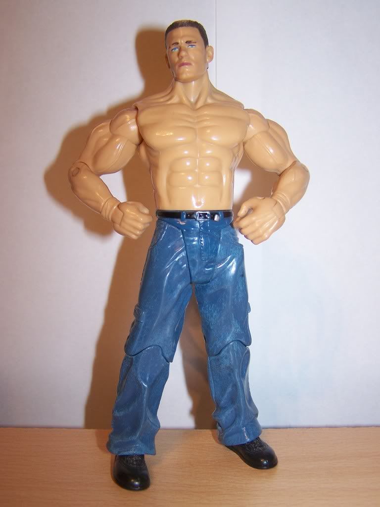
Well... As bland as they come, really.
There once was a time when Cena wasn't being hounded by fans for being a bad wrestler. No, there was a time when people quite liked him. This time was when he was on SmackDown! in the mid-card division. There was no Chain Gang. No CD. No Personalised Championship belt. No Video Game covers... And.. Sadly.. No personalised attires.
Well.. This wouldn't be the most detailed of action figures, but it does give a nice resemblence to whom it is supposed to be.
Telling It Like It Is:
Jakks had it easy with this figure There could have been a little extra added (which i'll get to later) but for what it is, it does the job.
A bit of an in-betweener, i have to wonder where the inspiration came from. John is wearing a plain, very boring, pair of black shoes, some blue jeans and a black belt.
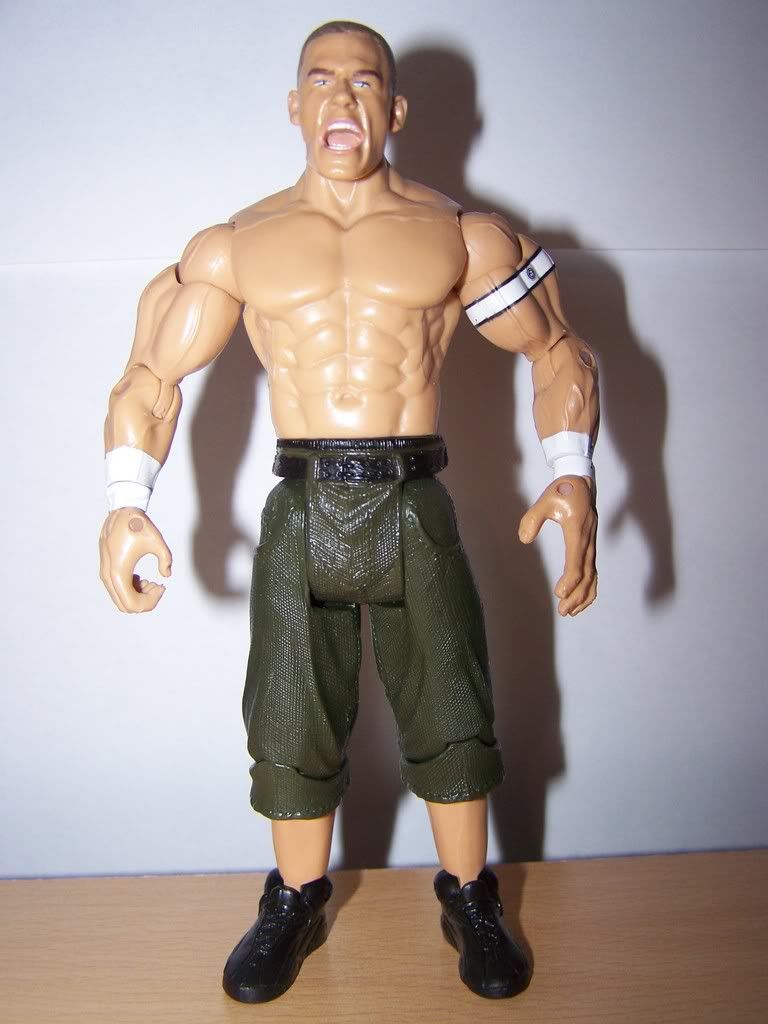
The scan is good. It looks just like John Cena. I believe John was heel at this time, and his facial expression is suited to that. He looks a little angry and upset, but he isn't over the top like some figures. he looks subtle in his anger. Maybe confused. Either way, its definitely a good scan and doesn't look too outdated, although the hair is maybe a little innacurate for today's standards.
The torso is ripped in a believable, Cena way. It looks nice and is pretty accurate. The arms are very ripped, as they are the standard RA arms. I guess it is unfair to complain about his arms being too ripped as people like Johnathan Coachman also have to suffer through the same flaw. I'd love to know who they scanned to get those arm moulds...
The jeans are.. Well.. basic.
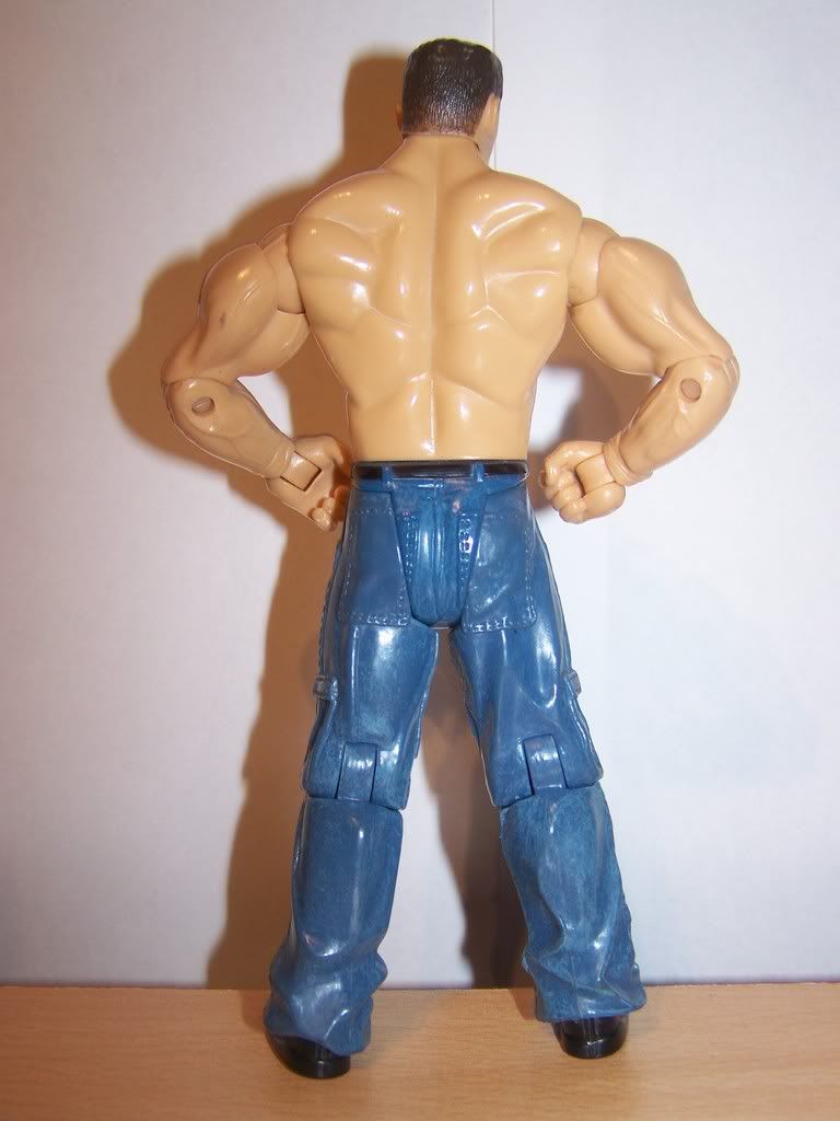
They could have thrown a logo on the back, as if they were a designer pair of jeans. A little WWE logo on the back pocket maybe? anything at all would have taken the bland look away. Even just a slightly brighter or darker blue on the pockets would have looked more out-standing. For playability the mould is great. This jean mould in particular means that the legs spread more when they are bent. This is handy for doing erm.. well.. wrestling moves.
Could It Be Improved?
Yes. Well.. to an extent.
The figure is obviously not based on his ring attire, as he wore shorts. But.. when he wasn't wrestling we never seen him walking around topless.. He wore a jersey every time! Why wasn't a cloth jersey included?
Jakks Standard response to this question would likely be "because of production costs".
OK.. I can work on that answer. Production costs. A lot of earlier RA's suffered from missing designs (Kane from the same series had a rough time getting over a back design).
But.. they have a t-shirt mould.. surely a t-shirt with a jersey-styled design would do? I wouldn't complain.. would you? Honestly?
Maybe you would.. I don't know.. all i know is it would have been much more accurate, and would have possibly made a good figure a 'great' figure.
Overall:
Overall.. I gotta say...
6.5/10.
Its lacking in areas. It looks bland and It could have been better. But, it does look accurate and the Accessory hat that it comes with is personalisation enough i suppose. Looking authentic is a good thing in my book, and thats one thing I certainly can say about this figure.. It certainly does look authentic. More logo's, a t-shirt, jersey, extra microphone accessory.. any of those would have made sense and boosted its rating.
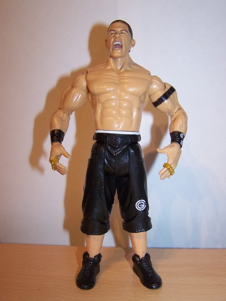
RA 21 John Cena
OK, we're stepping ahead by 16 series'.. So a HUGE change should occur in that time, right?
Thankfully.. From head to toe... a huge change has occurred.
John Cena has began to step into the main event. He has become heavyweight champion. He is now known worldwide. WWE have personalised him. He now looks different from the other grapplers on the WWE's TV shows.. Jakks are laughing!
Finish this sentence:
OK, Finish this...
Ruthless Aggression Series 21 John Cena...
Done?
I decided that the missing words are "Kicks Ass!"
True to word, it really does.
The headscan is a newer, more up to date John Cena. Does it look like John Cena? Yes, Sir. It does indeed.
The same torso is used again, but it is suited and it looks good. Mr. Cena does look a little more "ripped" these days, but i can live with it.
More of a piece for display, as the hand mould isn't really much use when you're playing with them. It features new legs which are specifically designed for John Cena, what a bonus!
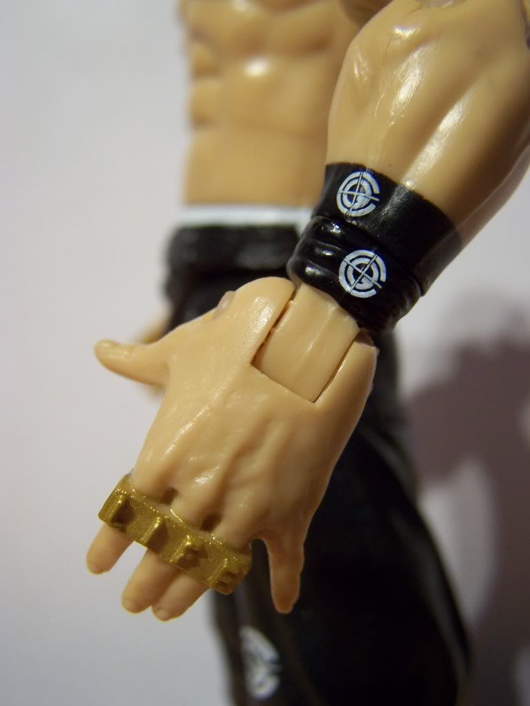
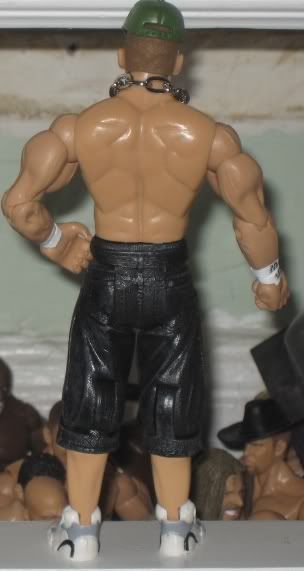
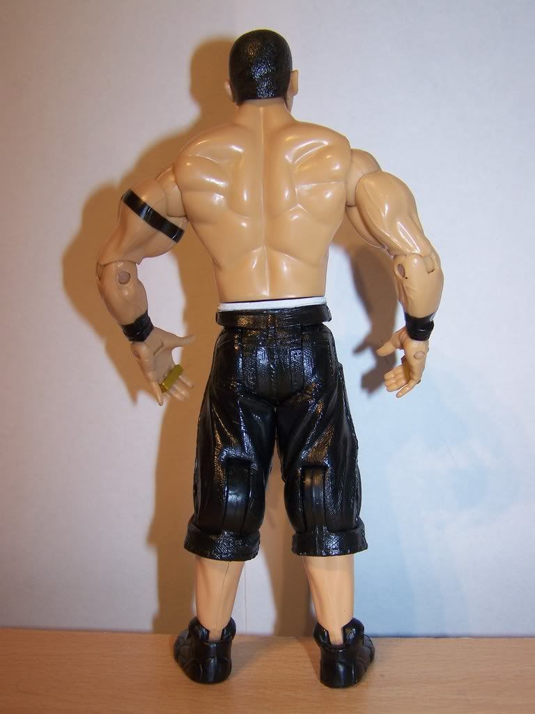
This time, Cena isn't coming alone. He is well equipped with unique "Brass Knucks", wrist and arm bands, and his Chain Gang jeans.
Much more detailed than most other figures (well, as far as John Cena's go) this is a must have in my opinion. I really enjoy when a figure is in black, as it really looks more in-place with an arena set up or displayed on a shelf. Sometimes bright coloured figures, whilst looking fresh, can look cartoonish. I think black is more realistic looking. His jeans have his chain gang logo also stamped on them, which make him look a lot less bland or dull.
Room For Improvement?
Again.. I may have been asking for too much when i wanted a back design. No logo. No different-coloured pockets. In real life, John Cena's ass is a miniature bill-board. Even Nintendo have had their logo on him. Surely a little "WWE" logo on the back would do no harm? i guess so.
One other thing that bothers me is the same thing i complained about in the last review. Shoes. Again, solid black. not even a shade of grey thrown in.
Overall:
Again, authentic is the word that comes to mind. High on the detail list, it's certainly worth picking up if you don't already have it, and if you do, you should be happy to own it. No accessory bums it down a bit, but i guess you can't have it all. Nice figure, one of my favourite attires, awesome hands... Definitely worth a look.
8/10
RA 26 John Cena
Not jumping too far ahead this time. So can Jakks make a substantial difference in 5 series'?
Well.. Not a substantial difference. But John Cena himself hasn't made any major changes in the meantime himself, either. Still main-eventing, carrying the gold, beating the competition and overcoming the odds, Nothing huge has changed.
Spot The Difference:
OK, So we have already come to terms that there can't be a huge difference in the figures because there isn't a huge difference in the actual man. So why does the figure exist? Well.. if you make cakes for a living, you're gonna make your most popular cake more than your other cakes. To Jakks.. Cena is the cake of cakes.
Well.. lets not be too harsh. There are changes.
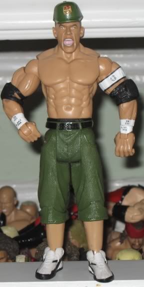
Cena is more ripped this time around. This is obviously a good thing, as he has become much more ripped in real life, so a newer mould was used to make him look it. He doesn't look so chubby this time around and instead is much leaner.
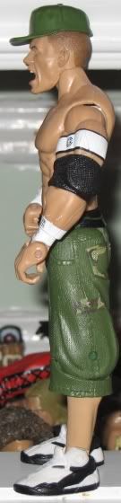
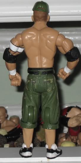
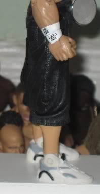
He is sporting his new "YOU CAN'T SEE ME" wristbands, and has a nice CG Chain Gang logo on his arm. His pants are nice and fresh with his updated green colour jeans, and they even feature small sections of Camouflage on his back pockets. His hair is updated with a light brown colour which fades to a lighter brown as it travels down his head. not a huge detail, but definitely worth mentioning.
It also comes with his WWE spinner championship belt. A nice accessory, to say the least.
Colour By Numbers
One thing that strikes me is... why don't they color in his belt buckles lately? It would look much better and a ton to his figures appearance. I like the pockets having the camo, and i guess my want for a small logo on the back has officially been a little failure. These days, Cena's ass is used only to get the attention of 14 year old girls. No more advertisers on there. What a missed opportunity. How much would jakks have benefited from working a deal with Nintendo or Pepsi to shove a logo/tag on the back of Cena's figures.
Anyway,
The shoes are back in black... and nothing else.
The headscan may be overused at this stage. A once cool "screaming" headscan just looks like a "yawning" headscan when you see too much of it. I really don't know how they managed it.. but they somehow ended up putting the CG logo on his arm band upside down. How they did it is beyond me, but they did it. Speaking of this logo.. wouldn't a CG logo have looked good on his knee, as it was on RA21?
My final problem comes down to a usual Jakks complaint. When Jakks made Cena a specific mould.. they did so expecting to forever use the same mould that was on RA21 John Cena. Sadly, Cena had to go ahead and improve his physique. How dare he. This problem is a little ridiculous. Only noticeable when you look for it, the torso being thinner, means that cena is wearing massive trunks. Yep, bis soft round-edged trunks are a little odd on a thinner, sharper body. This is not hugely noticeable, But i am being a bit picky.
Overall:
One of th best John Cena figures on the market. Some complain about a lack of a full-on camo design. Its very tough to steer away from "what could have been" when it comes to this figure. There are so many previous figures, its hard to take it for what it is without instantly thinking how it could have been bettered.
However, reviewing anything, you are forced to take it for what it is and not what it should have, or could have, been.
In my opinion, this figure recieves a..
8/10
I can't justify a 9/10 because I don't feel it is superior to 21, but I can't give it 7/10 or lower because i dont see it as being any worse than 21. Some could argue that the WWE Spinner makes it supersior, But I'm only reviewing the figure.
Again, worth checking out if you're on the look out for a John Cena.
Well thats all from me.
I sincerely hope you have enjoyed these reviews as i have spent a long time putting them together. I hope they're beneficial to someone out there. If you have any of these figures in your possession you should value them and appreciate them. All are spot-on, and look great for their respective time.
Comments, thoughts, feedback and opinions welcome and appreciated.
Take Care guys,
Shane/KKV
Credit For Pictures: Loose Jakks Database
I try my best to go into as much detail as possible in my reviews, I attempt to be as honest as possible and I criticise where i feel criticism is required.
However, as much as I dish out criticism... I also accept, and enjoy, creative criticism. If you feel i have missed something, been too biased or have any other problems with my reviews, just let me know.
I will eventually try to think up a catchy name for my reviews to give them some personalisation, but i'm not creative so if you can think of one.. go for it
Anyway, I have decided that I would pack this thread up as much as I can. I intend to do this by reviewing three different figures.. However, The figures will all be of the same person. This time, Its John Cena.
Here goes...
The Figures
RA 5, RA 21 And RA 26 John Cena.
Lets start at the start..
RA 5 John Cena
Well... As bland as they come, really.
There once was a time when Cena wasn't being hounded by fans for being a bad wrestler. No, there was a time when people quite liked him. This time was when he was on SmackDown! in the mid-card division. There was no Chain Gang. No CD. No Personalised Championship belt. No Video Game covers... And.. Sadly.. No personalised attires.
Well.. This wouldn't be the most detailed of action figures, but it does give a nice resemblence to whom it is supposed to be.
Telling It Like It Is:
Jakks had it easy with this figure There could have been a little extra added (which i'll get to later) but for what it is, it does the job.
A bit of an in-betweener, i have to wonder where the inspiration came from. John is wearing a plain, very boring, pair of black shoes, some blue jeans and a black belt.
The scan is good. It looks just like John Cena. I believe John was heel at this time, and his facial expression is suited to that. He looks a little angry and upset, but he isn't over the top like some figures. he looks subtle in his anger. Maybe confused. Either way, its definitely a good scan and doesn't look too outdated, although the hair is maybe a little innacurate for today's standards.
The torso is ripped in a believable, Cena way. It looks nice and is pretty accurate. The arms are very ripped, as they are the standard RA arms. I guess it is unfair to complain about his arms being too ripped as people like Johnathan Coachman also have to suffer through the same flaw. I'd love to know who they scanned to get those arm moulds...
The jeans are.. Well.. basic.
They could have thrown a logo on the back, as if they were a designer pair of jeans. A little WWE logo on the back pocket maybe? anything at all would have taken the bland look away. Even just a slightly brighter or darker blue on the pockets would have looked more out-standing. For playability the mould is great. This jean mould in particular means that the legs spread more when they are bent. This is handy for doing erm.. well.. wrestling moves.
Could It Be Improved?
Yes. Well.. to an extent.
The figure is obviously not based on his ring attire, as he wore shorts. But.. when he wasn't wrestling we never seen him walking around topless.. He wore a jersey every time! Why wasn't a cloth jersey included?
Jakks Standard response to this question would likely be "because of production costs".
OK.. I can work on that answer. Production costs. A lot of earlier RA's suffered from missing designs (Kane from the same series had a rough time getting over a back design).
But.. they have a t-shirt mould.. surely a t-shirt with a jersey-styled design would do? I wouldn't complain.. would you? Honestly?
Maybe you would.. I don't know.. all i know is it would have been much more accurate, and would have possibly made a good figure a 'great' figure.
Overall:
Overall.. I gotta say...
6.5/10.
Its lacking in areas. It looks bland and It could have been better. But, it does look accurate and the Accessory hat that it comes with is personalisation enough i suppose. Looking authentic is a good thing in my book, and thats one thing I certainly can say about this figure.. It certainly does look authentic. More logo's, a t-shirt, jersey, extra microphone accessory.. any of those would have made sense and boosted its rating.
RA 21 John Cena
OK, we're stepping ahead by 16 series'.. So a HUGE change should occur in that time, right?
Thankfully.. From head to toe... a huge change has occurred.
John Cena has began to step into the main event. He has become heavyweight champion. He is now known worldwide. WWE have personalised him. He now looks different from the other grapplers on the WWE's TV shows.. Jakks are laughing!
Finish this sentence:
OK, Finish this...
Ruthless Aggression Series 21 John Cena...
Done?
I decided that the missing words are "Kicks Ass!"
True to word, it really does.
The headscan is a newer, more up to date John Cena. Does it look like John Cena? Yes, Sir. It does indeed.
The same torso is used again, but it is suited and it looks good. Mr. Cena does look a little more "ripped" these days, but i can live with it.
More of a piece for display, as the hand mould isn't really much use when you're playing with them. It features new legs which are specifically designed for John Cena, what a bonus!
This time, Cena isn't coming alone. He is well equipped with unique "Brass Knucks", wrist and arm bands, and his Chain Gang jeans.
Much more detailed than most other figures (well, as far as John Cena's go) this is a must have in my opinion. I really enjoy when a figure is in black, as it really looks more in-place with an arena set up or displayed on a shelf. Sometimes bright coloured figures, whilst looking fresh, can look cartoonish. I think black is more realistic looking. His jeans have his chain gang logo also stamped on them, which make him look a lot less bland or dull.
Room For Improvement?
Again.. I may have been asking for too much when i wanted a back design. No logo. No different-coloured pockets. In real life, John Cena's ass is a miniature bill-board. Even Nintendo have had their logo on him. Surely a little "WWE" logo on the back would do no harm? i guess so.
One other thing that bothers me is the same thing i complained about in the last review. Shoes. Again, solid black. not even a shade of grey thrown in.
Overall:
Again, authentic is the word that comes to mind. High on the detail list, it's certainly worth picking up if you don't already have it, and if you do, you should be happy to own it. No accessory bums it down a bit, but i guess you can't have it all. Nice figure, one of my favourite attires, awesome hands... Definitely worth a look.
8/10
RA 26 John Cena
Not jumping too far ahead this time. So can Jakks make a substantial difference in 5 series'?
Well.. Not a substantial difference. But John Cena himself hasn't made any major changes in the meantime himself, either. Still main-eventing, carrying the gold, beating the competition and overcoming the odds, Nothing huge has changed.
Spot The Difference:
OK, So we have already come to terms that there can't be a huge difference in the figures because there isn't a huge difference in the actual man. So why does the figure exist? Well.. if you make cakes for a living, you're gonna make your most popular cake more than your other cakes. To Jakks.. Cena is the cake of cakes.
Well.. lets not be too harsh. There are changes.
Cena is more ripped this time around. This is obviously a good thing, as he has become much more ripped in real life, so a newer mould was used to make him look it. He doesn't look so chubby this time around and instead is much leaner.
He is sporting his new "YOU CAN'T SEE ME" wristbands, and has a nice CG Chain Gang logo on his arm. His pants are nice and fresh with his updated green colour jeans, and they even feature small sections of Camouflage on his back pockets. His hair is updated with a light brown colour which fades to a lighter brown as it travels down his head. not a huge detail, but definitely worth mentioning.
It also comes with his WWE spinner championship belt. A nice accessory, to say the least.
Colour By Numbers
One thing that strikes me is... why don't they color in his belt buckles lately? It would look much better and a ton to his figures appearance. I like the pockets having the camo, and i guess my want for a small logo on the back has officially been a little failure. These days, Cena's ass is used only to get the attention of 14 year old girls. No more advertisers on there. What a missed opportunity. How much would jakks have benefited from working a deal with Nintendo or Pepsi to shove a logo/tag on the back of Cena's figures.
Anyway,
The shoes are back in black... and nothing else.
The headscan may be overused at this stage. A once cool "screaming" headscan just looks like a "yawning" headscan when you see too much of it. I really don't know how they managed it.. but they somehow ended up putting the CG logo on his arm band upside down. How they did it is beyond me, but they did it. Speaking of this logo.. wouldn't a CG logo have looked good on his knee, as it was on RA21?
My final problem comes down to a usual Jakks complaint. When Jakks made Cena a specific mould.. they did so expecting to forever use the same mould that was on RA21 John Cena. Sadly, Cena had to go ahead and improve his physique. How dare he. This problem is a little ridiculous. Only noticeable when you look for it, the torso being thinner, means that cena is wearing massive trunks. Yep, bis soft round-edged trunks are a little odd on a thinner, sharper body. This is not hugely noticeable, But i am being a bit picky.
Overall:
One of th best John Cena figures on the market. Some complain about a lack of a full-on camo design. Its very tough to steer away from "what could have been" when it comes to this figure. There are so many previous figures, its hard to take it for what it is without instantly thinking how it could have been bettered.
However, reviewing anything, you are forced to take it for what it is and not what it should have, or could have, been.
In my opinion, this figure recieves a..
8/10
I can't justify a 9/10 because I don't feel it is superior to 21, but I can't give it 7/10 or lower because i dont see it as being any worse than 21. Some could argue that the WWE Spinner makes it supersior, But I'm only reviewing the figure.
Again, worth checking out if you're on the look out for a John Cena.
Well thats all from me.
I sincerely hope you have enjoyed these reviews as i have spent a long time putting them together. I hope they're beneficial to someone out there. If you have any of these figures in your possession you should value them and appreciate them. All are spot-on, and look great for their respective time.
Comments, thoughts, feedback and opinions welcome and appreciated.
Take Care guys,
Shane/KKV
Credit For Pictures: Loose Jakks Database