Deleted
Joined on: Nov 29, 2024 21:32:50 GMT -5
Posts: 0
|
Post by Deleted on May 4, 2011 17:28:02 GMT -5
I wasnt trying to get into a pissing contest with you. But thank you for teaching me a new word today. ag·gran·dize/əˈgranˌdīz/Verb 1. Increase the power, status, or wealth of. 2. Enhance the reputation of (someone) beyond what is justified by the fact.  I'll make you a shirt for your custom Hogan if you'd like one. Just to show no hard feelings. |
|
|
|
Post by jthomps3 on May 5, 2011 9:37:46 GMT -5
New Customs (5/5/2011): The Eliminators: 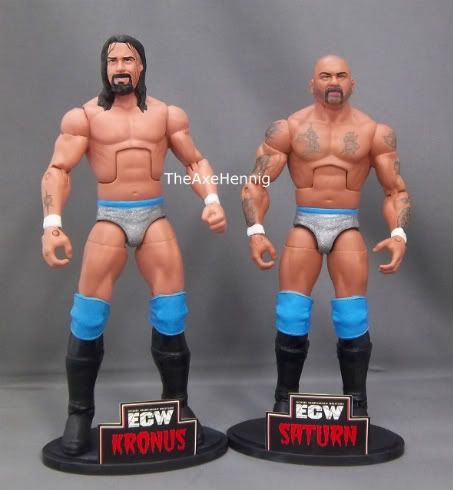 (with "flap-style" ECW shirts): 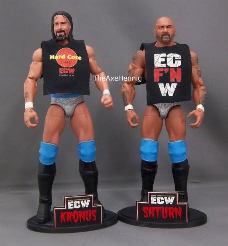 Reference photos: 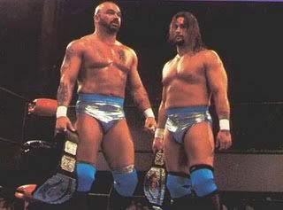 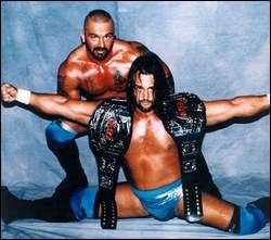 Original proto (I decided to change the color scheme): 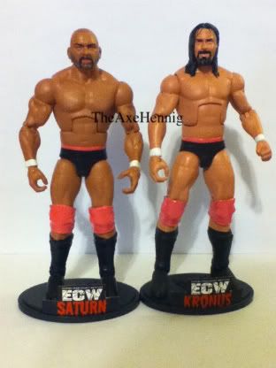 |
|
deepfreeze
Main Eventer
    Deepfreeze-Customs
Joined on: Jul 30, 2007 10:59:38 GMT -5
Posts: 1,545
|
Post by deepfreeze on May 5, 2011 9:44:19 GMT -5
Awesome work my friend, i love the tattoo-job on both!
The current colour-scheme looks IMO a lot better than the previous one! Is this the Rulers of the Ring Head of Saturn on this custom?
Keep up the great work!
|
|
|
|
Post by LtD73 on May 5, 2011 9:57:00 GMT -5
That Kronus head is so familiar but i can't work out who it is
|
|
machomadness
Mid-Carder
 
Joined on: Jun 12, 2012 2:00:38 GMT -5
Posts: 219
|
Post by machomadness on May 5, 2011 10:06:44 GMT -5
Those Eliminators look freaking amazing. The Tat work is super!!
BTW, Love that Hogan as well. The only thing I dont like is the Jakks knee pads. Id love to see some mattel red kneepads on it and it would be perfect for me.
|
|
skunkcustoms
Superstar
  
Joined on: Sept 9, 2009 13:01:40 GMT -5
Posts: 832
|
Post by skunkcustoms on May 5, 2011 10:11:34 GMT -5
I agree with deepfreeze, that color scheme looks better than the first one. As always Axe, love your impressive work. Is that a Stevie Richards head for Kronus?
|
|
|
|
Post by jthomps3 on May 5, 2011 10:19:44 GMT -5
Thank you, gentlemen.
Deepfreeze- I'm not certain which Saturn head I used. I am pleased with the color scheme.
Skunk- Ding Ding Ding! It's a Stevie R3 head.
|
|
|
|
Post by Joey Eches on May 5, 2011 10:32:32 GMT -5
those look pretty damn sweet, especially the Saturn! my only problem is with Kronus, his beard seems to be a bit to bushy, and from what I can see from the reference pictures the beard doesn't move up toward his lip like that either, but all other details are phenomenal!
|
|
|
|
Post by jthomps3 on May 5, 2011 11:25:05 GMT -5
Joey, Thanks for the reply! I really appreciate it. I wanted Kronus to look the least amount possible to Richards, so I decided to give him the more "poofy" goatee look as shown below: 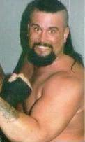 This is how I remember Kronus from when I was a kid. |
|
|
|
Post by facefullafist on May 5, 2011 12:19:55 GMT -5
wow, those look amazing. could have fooled me into thinking those are retail figures. great job.
|
|
|
|
Post by marduk on May 5, 2011 14:10:30 GMT -5
OMG!! they look amazing.
|
|
Deleted
Joined on: Nov 29, 2024 21:32:50 GMT -5
Posts: 0
|
Post by Deleted on May 5, 2011 15:37:52 GMT -5
phenomonal customs there man, love the tattoos
|
|
|
|
Post by jthomps3 on May 5, 2011 18:52:25 GMT -5
phenomonal customs there man, love the tattoos Thank you, Zombie. I had no true idea what Saturn's tattoos were, so I did my best to make something visually appealing ;-) |
|
|
|
Post by Affliction: Elite Trader on May 5, 2011 20:05:31 GMT -5
holy crap dude, i was totally blown away with kronik and now you lay this on us. from head to toe, truly brilliant. i wish those were mass produced so i could one day own them.
|
|
|
|
Post by awsomekharma on May 5, 2011 21:00:55 GMT -5
GREAT work!!!!!! would u consider selling the eliminators?
|
|
|
|
Post by Calcifer Boheme on May 5, 2011 21:03:24 GMT -5
The Eliminators are one of my favorite teams ever, it's really a shame they didn't last longer.
Great job on both guys, how did you do the tattoos? They're insanely realistic.
|
|
|
|
Post by jthomps3 on May 5, 2011 21:13:59 GMT -5
*I'm honored that the pathetic vagina is obsessed with me enough to sit at his computer and continually smite me throughout his day. It makes a difference. Really... it does.*
Awesomekharma- The Eliminators sold as soon as photos were posted. Sorry my friend.
Calcifer- I drew the tattoos on first (with a sharpened pencil). Then I took green paint, added flesh tone, then a little gray. Next, I grabbed the smallest paint brush imaginable (20/0), and traced over the pencil outlines. Then, I added more flesh tone to the green and filled in some inner parts of the tattoos. Lastly, I dry brushed diluted skin tone over the tattoos (to achieve the faded look).
Thanks for the comments.
|
|
christianedge
Main Eventer
   
Joined on: Dec 22, 2009 21:47:07 GMT -5
Posts: 1,743
|
Post by christianedge on May 5, 2011 21:27:08 GMT -5
Beautiful work once again. I'm glad you changed the color scheme, not that the black and red looked bad, but the silver and blue look awesome. The accessories (shirts and nametags) are an added bonus.
|
|
Deleted
Joined on: Nov 29, 2024 21:32:50 GMT -5
Posts: 0
|
Post by Deleted on May 5, 2011 22:28:28 GMT -5
you have skills BROTHER!!!
|
|
|
|
Post by indywrestling on May 5, 2011 23:21:27 GMT -5
Those eliminators are unreal, great work man, u never let down
|
|


