Gonzo Customs
Main Eventer
   
Joined on: Dec 24, 2001 4:51:46 GMT -5
Posts: 4,056
|
Post by Gonzo Customs on Jun 12, 2009 11:38:45 GMT -5
GateCitySinner's Jeff Jarrett from Customania 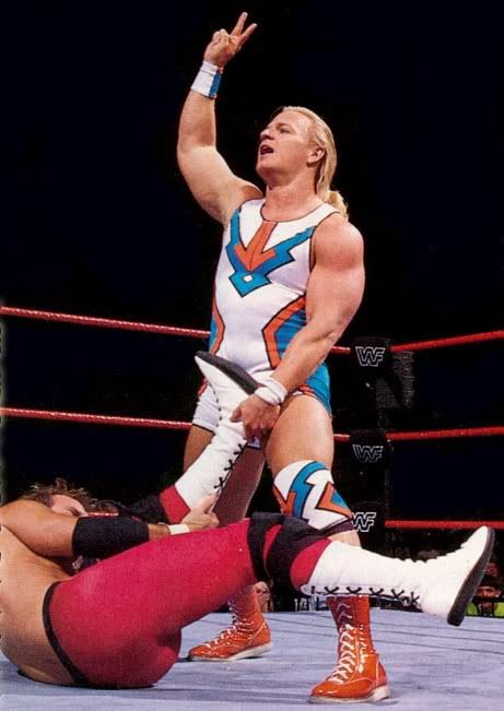 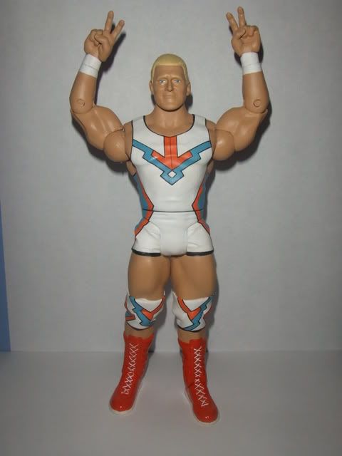 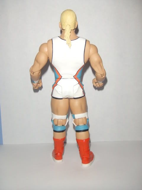 Great Gonzo's Jeff Jarrett 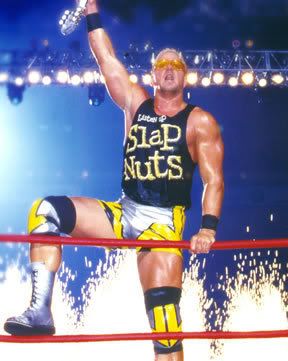 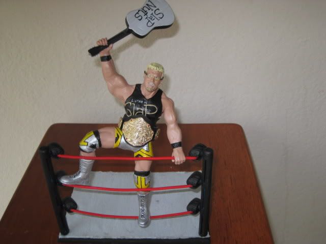 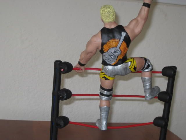 The Following Judges have been notified: TXR, Rozz, Becca, Gore, CMD, RAC, Foxeth The first 5 votes from the 7 will count. **Edit** Adding Link to Photobucket for more pics s269.photobucket.com/albums/jj67/gonzocustoms/Competition/ |
|
T-Phunk
Main Eventer
    T-Phunkamania Runnin' Wild!!!
Joined on: Jun 23, 2004 11:32:19 GMT -5
Posts: 4,265
|
Post by T-Phunk on Jun 12, 2009 12:26:48 GMT -5
Also not a judge, but I'll put my two cents in.
The body on Gate's is flawless. It's unbelievable how perfectly straight the lines are. However I am not as big a fan of the head choice. I can see a resemblance, but it does not hold up to the standard of the rest of the figure.
As for Gonzo's Jarrett, the body is well done with clean lines as well. Perhaps it's the far away shots, but the head doesn't look as clean and therefore realistic. I'd love to get a better up close look to judge it better. The other thing that stands out as a flaw in this and most posed customs I see is that the shoulder joint almost never look very realistic. This is actually one of the better ones, but still not right to me. It's the reason I typically prefer articulated customs.
Those tiny flaws being said these are both great works from talented customizers. Since I am on going overall appearance, GateCitySinner's precision on the singlet helps him narrowly win this decision for me.
|
|
|
|
Post by Lewscher on Jun 12, 2009 12:38:21 GMT -5
wow, both great customs.  now the first one paint is flawless however maybe a different head and the hair is too smoooth, add texture.. the second is SO awesome... love the detail and the sculping is kick ass.... is it for sale? if so PM me please ;D |
|
|
|
Post by jfinnomore on Jun 12, 2009 13:00:51 GMT -5
GateCitySinner's is flawless. the lines are perfect and the paint is factory smooth. what a great figure. the likeness is good enough and the attire choice is creative. very cool figure.
Great Gonzo's is also pretty tight. the painting is solid. the only thing i'd complain about is the shirt isn't perfect but its still nicely done.
that being said i'd still give the slight edge to Gate.
|
|
|
|
Post by RAC on Jun 12, 2009 13:57:28 GMT -5
I've seen work from both members before and can definitely say it's great to judge both of your works, that being said I'll move onto the person I chose.
GateCitySinner's Jeff Jarrett has one of the smoothest paintjobs I've seen and some of the nicest detailed line work. I like the extra work done on to make the body work for Jeff. Head is alittle odd but works well.
Great Gonzo's Jarrett is one of the nicer preposed customs I've seen but the way the shoulders were placed don't seem to help. Jarrett's head has a more cartoony look and less realistic so that doesn't help.
Overall, GateCitySinner's Jeff Jarrett wins for overall look, poseability, etc.
Both were great entries. Great work guys.
|
|
|
|
Post by Y3RP: LA MARAVILLA!!! on Jun 12, 2009 14:08:26 GMT -5
i like the gates jj figure! lots time was been put into that fig, u can tell! keep it up!!!
|
|
Sandy
POSSIBLE BAD TRADER
Joined on: Dec 17, 2004 14:33:52 GMT -5
Posts: 5,868
|
Post by Sandy on Jun 12, 2009 15:32:20 GMT -5
Gate- I said it before the figure is very clean...The lines are so straight. The skintone looks very smooth. The head does not work for me though. I look at it and say yeah it looks like him kind of...then a second later I say no the nose is too big and the face is too full. The hair needs more texture. It is unrealistically straight. But the neck down pretty much perfect.
Gonzo- I'm a sucker for posed customs. I know that the majority of the board hates them nowadays but I'm one of the few who truly appreciate how much work goes into them and all the cutting, sanding, sculpting, reshaping, etc that goes into making them. I really love the pose. You captured it very well. I think also the accessories are hurting the final outcome more than making it look better. The pictures without the accessories look better imo. The painting looks very clean and smooth. Straight lines on the shorts and kneepads and the shirt came out very well. My biggest gripe would be the arms. I think it would have really benefited if you would have used a dremel to take out some of the definition in the arms. The head works better than Gates head. Pretty much everything 'cept for the overly-muscluar arms work for me. I really like the final outcome and the setup in general.
But thank god some new stuff was posted. This board is pretty dead as of late. Hopefully this is just a sign of things to come and more people will post their customs.
|
|
|
|
Post by fulgore on Jun 12, 2009 19:17:15 GMT -5
Gonzo
|
|
Y2 F'n J
Superstar
   Your paragon of virtue!
Joined on: Jun 9, 2009 16:44:02 GMT -5
Posts: 971
|
Post by Y2 F'n J on Jun 12, 2009 19:55:57 GMT -5
Its a hard descicion; Both are very good, but this goes to Gate. Gonzos was pretty good, but sorta cartoonish. This is GateCitySinner's Jeff Jarrett.
|
|
CMD
POSSIBLE BAD TRADER
Joined on: Apr 16, 2003 0:08:57 GMT -5
Posts: 5,666
|
Post by CMD on Jun 12, 2009 22:20:37 GMT -5
I'm going with Gate's. It's a bit more original, I don't recall seeing a single Jarrett before in that attire, and the details are all clean and sharp. In accords to Gonzo's Jarrett, I've never been a fan of posed figures made from RA parts. The parts just don't work well for that type of figure. The figure just seems a bit dull. The gear can also use more wrinkles.
-CMD
|
|
|
|
Post by rajinikanth on Jun 12, 2009 23:28:52 GMT -5
WOW it looks exact!
|
|
becca
Main Eventer
   
Joined on: Dec 13, 2005 11:20:18 GMT -5
Posts: 4,042
|
Post by becca on Jun 13, 2009 0:05:33 GMT -5
Gate - this looks awesome, my favorite part is the shorts - brilliant. The painting is unreal as always. The head doesn't scream Jarrett to me and thats my big knock here. Still, the rest of it is great. Since you've clearly mastered painting and sculpting, I have some nitpicky suggestions that i think would push you to make it even better: sculpt a little bit more of his "pudge" and go over the boots with gloss one more time. Also, some dimension to the hair color would improve it too. But the hands are great, the knee pads are great and the skintone is great.
Gonzo - I like that you went this route and didn't try to beat Gate at his own game. I think you nailed the pose and it's a great representation of this whole attitude. However, the RA arms posed look goofy and the painting just isn't as clean as Gate's. I think some more detail could be paid to the shirt especially. But it's a really nice looking custom anyways, just gotta give the nod to Gate.
Winner: Gate
|
|
BIGticket5
Main Eventer
    add me: www.myspace/rostafer_23
Joined on: Jan 26, 2002 20:01:11 GMT -5
Posts: 1,745
|
Post by BIGticket5 on Jun 13, 2009 3:21:34 GMT -5
i prefer gcs' to gonzo's
|
|
Gonzo Customs
Main Eventer
   
Joined on: Dec 24, 2001 4:51:46 GMT -5
Posts: 4,056
|
Post by Gonzo Customs on Jun 13, 2009 4:36:14 GMT -5
I will go ahead and concede and accept this as a loss. I'm not going to make excuses, you won fair and square. I will post the other 6 customs I did in the last 3 weeks as well as 2 others that were already works in progress here in the next day or so to help liven up this board.
|
|
|
|
Post by gatecitysinner on Jun 13, 2009 4:57:43 GMT -5
We still got 4 judges left to vote, let all the remaining judges have a chance to throw in their two cents so we can clearly tell who the winner is.
|
|
Gonzo Customs
Main Eventer
   
Joined on: Dec 24, 2001 4:51:46 GMT -5
Posts: 4,056
|
Post by Gonzo Customs on Jun 13, 2009 10:46:08 GMT -5
They are welcome to post their votings. However it was the best of 5, you've already got three in the book. But yes, I would like to hear what each has to say.
|
|
biohazard
Superstar
  
Joined on: Jan 9, 2009 16:04:09 GMT -5
Posts: 853
|
Post by biohazard on Jun 13, 2009 11:49:14 GMT -5
The winner needing 5 votes out of 7 is a terrible system. What if 4 judges voted one way and three the other would that somehow be a draw despite the clear winner? Food for thought for your next contest. Food for thought Scooter. That's not how the judging works. You take the first 5 official judges. You line up 7 in case somebody forgets to vote or doesn't have time to get on here to do it. |
|
biohazard
Superstar
  
Joined on: Jan 9, 2009 16:04:09 GMT -5
Posts: 853
|
Post by biohazard on Jun 13, 2009 12:36:16 GMT -5
Never once was I rude in that statement. You had a misconception as to how the judging was to take place. You voiced your opinion as to how terrible it was. I, in turn, filled you in on the true form of judging. Nowhere did I give you a reason to try to attack me. If you can't take being wrong don't post. Go back to making Scott Steiner with a cleft palette. Thanks again.
To my vote:
I've reviewed Gate's before, but will sum it up again. Nice job. You modded the hell out of this figure, but it looks so professional that you can't tell. That skintone is damn near factory. Lines are crisp. I wish I could pull those things off like that.
Gonzo. Honestly, this isn't a bad figure by any means. There are a couple of things that bug me though. One is the arm pose. The way it goes from the torso to the arm itself is too, I don't know how to put it, like maybe you should have made more of an armpit? I know what I see I just can't describe it. The sculpt should have been taken up some instead of flattened out there. The other thing that stands out is the huge arms. All in all they are small details but when you go to critique these two figures, all you can really point out is the small stuff.
My vote, Gate.
|
|
T-Phunk
Main Eventer
    T-Phunkamania Runnin' Wild!!!
Joined on: Jun 23, 2004 11:32:19 GMT -5
Posts: 4,265
|
Post by T-Phunk on Jun 13, 2009 12:48:44 GMT -5
My apologies to Gate and Gonzo for any distraction my misinterpretation of the judging standards might have been to your competition. As I said in my critique I think you both did an excellent job.
I have deleted my posts concerning them as to not diminish your competition any further. Again I am sorry.
|
|
|
|
Post by kustomkreations on Jun 13, 2009 19:14:25 GMT -5
I'm gonna have to vote for Gate on this one.
Gate, I have no idea how you pull off those lines - they're perfect. The sculpting and the rest of the paint also came out pretty much flawless. The gloss on the boots is also a nice touch. Something about the head bothers me a little but I cant put my finger on it. Maybe it's the hair? I think that a little bit of lift or volume on the sides could have helped but it's not that big of a deal.
Gonzo, The pose on the ropes looks great. The paint also came out great and the detail on the lettering is crisp. I can tell that you took the time to sand down the sides of the boots so they don't looks so fat and awkward when posed. Like others have said, the arms feel out of place. I'm pretty sure that it's a problem with the RA body style though. I think that you would need to cut the shoulder area away and completely re-sculpt it to make it work. This is the same thing that happens with some of the LJN customs that you see.
Great work on both...
|
|


