Bullet Club.
Main Eventer
 Too Sweet
Joined on: Jun 6, 2008 10:25:23 GMT -5
Posts: 4,690
|
Post by Bullet Club. on Jul 25, 2009 18:50:50 GMT -5
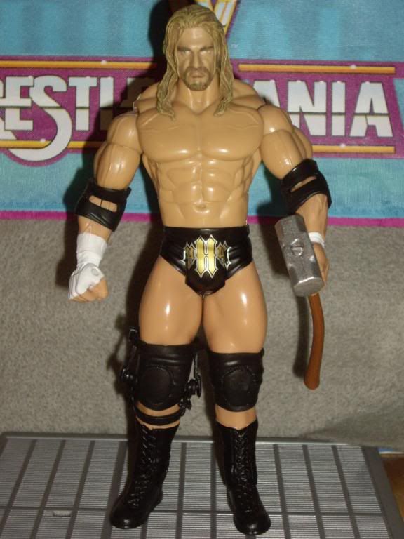
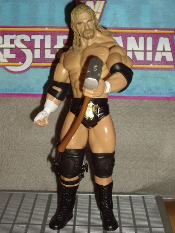
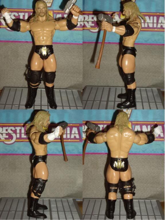
I just want the Taker but the HHH logo being upside down was funny
|
|
derrtaysouth95
Main Eventer
The End is Nigh....
Joined on: Aug 1, 2007 16:30:30 GMT -5
Posts: 3,948
|
Post by derrtaysouth95 on Jul 25, 2009 19:21:57 GMT -5
That set is a downright letdown.
At least the first was good.
Hopefully the 3rd will be solid.
|
|
MakaiClub
Main Eventer
Joined on: Mar 23, 2003 4:34:50 GMT -5
Posts: 3,477
|
Post by MakaiClub on Jul 25, 2009 19:57:41 GMT -5
LMAO! I can't believe the logo is UPSIDE DOWN. So glad I stopped collecting Jakks stuff. Can't wait to see how Mattel handles things.
|
|
Deleted
Joined on: Sept 29, 2024 9:25:21 GMT -5
Posts: 0
|
Post by Deleted on Jul 25, 2009 20:20:27 GMT -5
ah well Im glad I have all the parts on hand to fix this set a DA1 head for HHH and R3 head for UT and this set will be improved tenfold.......I hope  |
|
|
|
Post by King of Kings on Jul 25, 2009 20:44:17 GMT -5
 That's all they freaking had to do was color his hair and goatee and look how much better it would look.. |
|
MVH
Main Eventer
Joined on: May 8, 2008 22:28:38 GMT -5
Posts: 2,597
|
Post by MVH on Jul 25, 2009 20:48:45 GMT -5
I think the RA 14 head will also fit that HHH....shame on the logo....thanks for the pics
|
|
acura143
Main Eventer
Joined on: Mar 29, 2007 13:25:43 GMT -5
Posts: 3,373
|
Post by acura143 on Jul 25, 2009 20:51:38 GMT -5
What a poor set. Will have to wait until WWE Shop reduce the price like they do with all the exclusive they get. Thanks for the pics.
|
|
|
|
Post by Edgeman05 on Jul 25, 2009 21:28:20 GMT -5
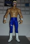
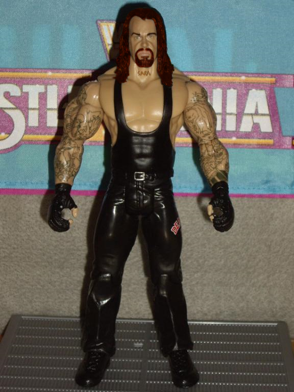
Taker looks AWESOME and HHH looks ok. I didnt know this set was already coming out.
|
|
|
|
Post by LeighD on Jul 26, 2009 4:04:55 GMT -5
NOW I"M READY TO KILL THE WHOLE REASON I BOUGHT THE SET WAS FOR HHH"S TRUNKS AND THE D@MN LOGO IS UPSIDE DOWN ON THE FRONT OF THE TRUNKS!!!  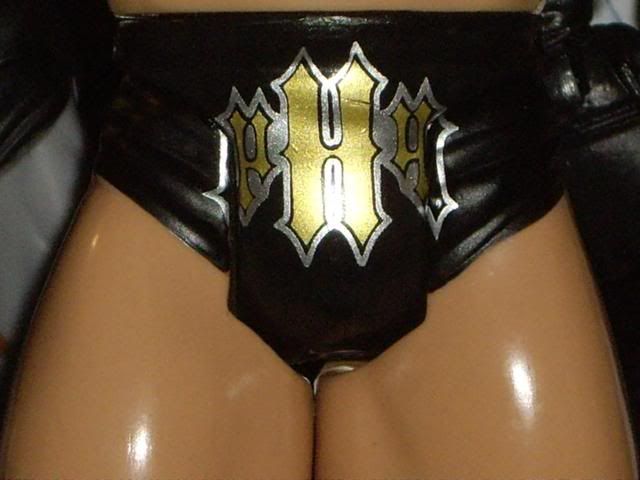 The only good thing about the logo being upside down is that when he's standing on the shelf you can't really notice it. It's only when you have the figure in your hands and are really looking closely at it can you see it's upside down. Still if there had to be a mistake I wish it was the back logo. Wow, now I'm pissed! I'm hoping maybe you got an error. This set was such a clusterf*ck. |
|
|
|
Post by rajinikanth on Jul 26, 2009 4:07:13 GMT -5
i would be buying this taker loose in next week!
|
|
|
|
Post by King Silva on Jul 26, 2009 6:06:43 GMT -5
It looks okay but I guess you don't really like it that much so that sucks.
Thanks for posting pics though.
|
|
|
|
Post by PJ on Jul 26, 2009 6:56:27 GMT -5
|
|
|
|
Post by jfinnomore on Jul 26, 2009 7:14:17 GMT -5
still not very impressed by this set. the trips fix up looks great but im still not pleased with the taker scan they chose.
|
|
|
|
Post by ● kaneisdaman ● on Jul 26, 2009 7:27:27 GMT -5
The scans for both men is a letdown. I know you PJ arent one to complain but the upside down logo is completely ridiculous. Is it a one off or mass produced error? Guess we will find out. Your torso swap as always improves it but as said the change of scan for trips is a MASSIVE improvement. Paint takers hair red and add the rocky boots and youve got a perfect set. But for an IE, so many faults is ridiculous. Enoy your set, its only going to get better the more you work on it.
|
|
|
|
Post by fallbrawl on Jul 26, 2009 8:57:03 GMT -5
I still might get this set because i am a triple h fan.
|
|
|
|
Post by TheChamp420 on Jul 26, 2009 9:25:29 GMT -5
pretty good for RAs, I like the scan you put on
|
|
|
|
Post by PJ on Jul 26, 2009 10:31:05 GMT -5
The scans for both men is a letdown. I know you PJ arent one to complain but the upside down logo is completely ridiculous. Is it a one off or mass produced error? Guess we will find out. Your torso swap as always improves it but as said the change of scan for trips is a MASSIVE improvement. Paint takers hair red and add the rocky boots and youve got a perfect set. But for an IE, so many faults is ridiculous. Enoy your set, its only going to get better the more you work on it. Not sure if it's a mass error or not. Thanks. And until I can get a TTL Taker head out of storage and modify it this will have to do - It came out darker than I wanted. I wanted it more of a wash, but I went one to many coats. 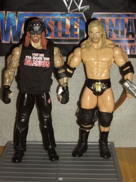 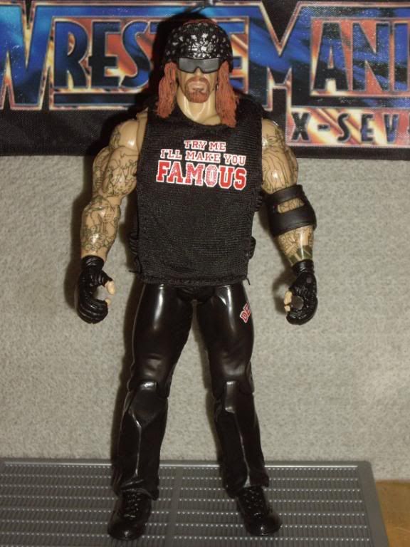 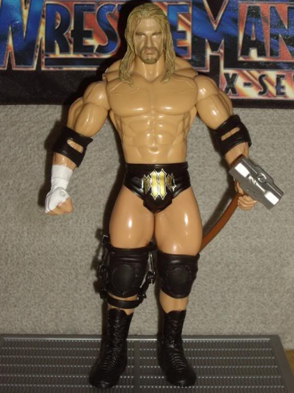 |
|
|
|
Post by Dan88 on Jul 26, 2009 10:41:25 GMT -5
Love that triple H fix-up, hoping if i get ahold of the set can get someone to fix the torso for me. Looking forward to seeing what old taker head you choose for it, no doubt will be an improvement. I guess if all the trips logo's end up like that then the only saving grace is you cant really tell unless you staring right at it, Cant believe my number 1 classic was a trips like this has been half assed by jakks  |
|
|
|
Post by PJ on Jul 26, 2009 16:57:10 GMT -5
Thanks. Yes this was the Trips I've been dying to get released. (Well actually with a silver hHh design) So I was pretty pissed that they dropped the ball on him. And for everyone PMing me about the Taker I am keeping it. I had only said it wasn't a figure I really needed to have, but I was going to keep it anyway.
|
|
Deleted
Joined on: Sept 29, 2024 9:25:21 GMT -5
Posts: 0
|
Post by Deleted on Jul 26, 2009 17:24:34 GMT -5
Very disappointing, but a great job with the fixups PJ, as always...Thanks mate!!
|
|