|
|
Post by Edgeman05 on Oct 19, 2009 23:32:41 GMT -5
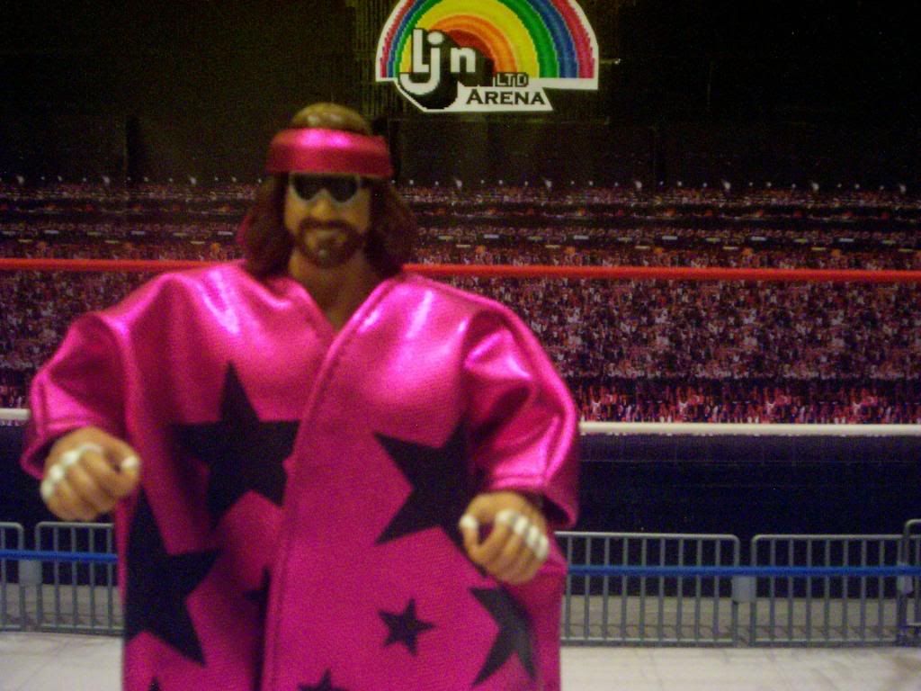
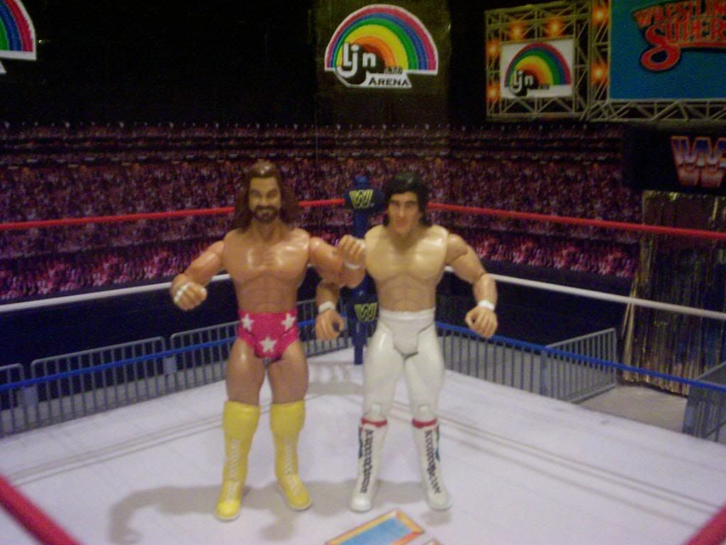
My god man. You have some talent. Its good to see some nice customization compared to just a quick fix up. Shows that your really focused on making that perfect head. Id say the first HEAD is better than the second. But im liking the bandanna and hair on the second one. Minus the hair sticking out pretty far on the sides. Overall though its looking awesome. Keep it up.
|
|
|
|
Post by Smash Ventura on Oct 20, 2009 3:09:32 GMT -5
Savage is tricky to nail...frankly non of us can claim we have a perfect custom of him...but i think a number of us have gotten really close... heres mine...a combo of ddps face and adas macho hair... ill say now it is not a perfect savage but again another one that is close...    |
|
|
|
Post by tdub on Oct 20, 2009 3:39:00 GMT -5
Everyone's definition of perfect is different, because everyone has a different image of Savage in their head. If I go off a specific picture and get it dead-on-balls accurate then it still won't be right because someone else might like him smiling, or angry, or with zero expression.
It's not a perfect plan but I intend to get closer than anyone else has, and I encourage others to do that same.
|
|
Gonzo Customs
Main Eventer
   
Joined on: Dec 24, 2001 4:51:46 GMT -5
Posts: 4,056
|
Post by Gonzo Customs on Oct 20, 2009 9:29:02 GMT -5
Shouldn't the best customizer on the board be able to do things without asking for help? haha j/k
The first head looks like Savage from side to, but nothing like him front to. I'd scrap that one like others have said.
The second one looks good, the problem I see is the beard around the cheeks and chin is too rounded as well as too rounded on the lip. It should move up a little on the lip and be straighter across the lip. Eyes need to look a little more feirce or intense IMO. Otherwise looks good.
|
|
robl7up
Main Eventer
    139 refs
Joined on: Feb 16, 2006 12:34:15 GMT -5
Posts: 2,848
|
Post by robl7up on Oct 20, 2009 18:07:54 GMT -5
Check my sig....
|
|
Sandy
POSSIBLE BAD TRADER
Joined on: Dec 17, 2004 14:33:52 GMT -5
Posts: 5,868
|
Post by Sandy on Oct 20, 2009 18:22:20 GMT -5
^^
thats not perfect
bandana is too big..and the glasses cover up half the face. I hate seeing macho man customs with the glasses..It is cool to include them as an accessory but to sculpt them on( I'm not saying you did rob) is kind of the cheap way out of trying to make it look like Macho Man. One of his distinct features are his eyes, so I'm not sure why so many people choose to cover them up.
|
|
tazftw888
Superstar
   "Beat me if you can. Survive if I let you."
Joined on: Feb 16, 2003 1:37:33 GMT -5
Posts: 526
|
Post by tazftw888 on Oct 21, 2009 11:12:51 GMT -5
As others have said, the second one is better.
I think the second one is damn near perfect except for two parts (not counting the hair): his beard and eyes
I think if you make his beard like you did on the first head it would be much better. Also the eyes should have more "crows feet" around them as well as be a tad bit more detailed on the eye painting.
The whole stucture of his head is perfect in my opinion (cheeks, shape of head) you just need to fix the beard and eyes and I think it will be one of the best Macho Man heads out there.
|
|
|
|
Post by Patrick Bateman (original) on Oct 21, 2009 18:20:34 GMT -5
I think you are really close on 2. And I know everyone has a different image of Macho Man in their head.
But the one thing that is a constant in every Macho Man picture is, he always has the look on his face of one that is straining while flexing. So more defintion in his face. Go look in the mirror while you are flexing really hard and you will know that is the face Macho Man always makes. I think if you could incorperate that you will be dead on.
|
|
|
|
Post by tdub on Oct 22, 2009 0:51:07 GMT -5
I've added Terry Gordy Take One.
|
|
whydraft2
Main Eventer
    WF 15+ Year Member
Joined on: Oct 14, 2006 18:12:49 GMT -5
Posts: 1,209
|
Post by whydraft2 on Oct 22, 2009 1:19:20 GMT -5
Now you're talking !!!
Your Bam Bam is amazing to me, Hogan's eyes are perfect and the double chin!! Amazing !.
Maybe the hair is a bit weird but it works overall. Nice one ;D
|
|
|
|
Post by Smash Ventura on Oct 22, 2009 8:26:12 GMT -5
the gordy is fantastic  |
|
|
|
Post by ß®å¢K$ßâ¢k on Oct 22, 2009 18:32:25 GMT -5
It does look like Bam Bam...But it also looks like Paul Heyman if he were trying to pull off Johnny B Badd.
|
|
T-Phunk
Main Eventer
    T-Phunkamania Runnin' Wild!!!
Joined on: Jun 23, 2004 11:32:19 GMT -5
Posts: 4,265
|
Post by T-Phunk on Oct 22, 2009 19:36:32 GMT -5
Wow that was a great recipe. No one can accuse you of not doing head modifications now. I love it, but somehow it also looks like a perfect John Goodman scan too. Obviously not with that hair.
|
|
Deleted
Joined on: Nov 19, 2024 9:49:05 GMT -5
Posts: 0
|
Post by Deleted on Oct 22, 2009 19:38:06 GMT -5
Wow. The Terry Gordy is dead on. Impressive.
|
|
|
|
Post by tdub on Oct 23, 2009 5:43:14 GMT -5
I've added Gangrel, Take One.
|
|
|
|
Post by hollywoodundead on Oct 23, 2009 6:43:36 GMT -5
The Gangrel looks really good, the eyes look to be dead on, the hair looks superb, why the tongue sticking out is cool I would like to see a version where perhaps his mouth may be open but no tongue
|
|
|
|
Post by legionofsemidoom on Oct 23, 2009 23:18:04 GMT -5
Amazing work man.
|
|
|
|
Post by S on Oct 24, 2009 10:04:12 GMT -5
You know, i think you may have made history as being the only person to have made a good custom gangrel head
|
|
Sandy
POSSIBLE BAD TRADER
Joined on: Dec 17, 2004 14:33:52 GMT -5
Posts: 5,868
|
Post by Sandy on Oct 24, 2009 12:58:46 GMT -5
I like the Gangrel head..I just wish you did a version with him smiling instead...like how he would smile when he would walk down to the ring.. It reminds me A LOT of the BCA head...which is good because that bca gangrel is one of my favorite BCA's ever..
|
|
therealdeal
Superstar
  
Joined on: Jun 4, 2008 13:55:19 GMT -5
Posts: 563
|
Post by therealdeal on Oct 24, 2009 13:09:49 GMT -5
Great job on the Gangrel head.. It looks sick... Keep up the good work...
|
|


