Erdrtyu
Main Eventer

Joined on: Mar 9, 2007 19:07:14 GMT -5
Posts: 4,291
|
Post by Erdrtyu on Jul 20, 2010 14:08:10 GMT -5
|
|
|
|
Post by alexgg on Jul 20, 2010 18:17:49 GMT -5
Awesome Powers vs Sh3rb1 vs SpzAt least 2/3 handed in, I kinda like that sheamus but its very untidy and the black outline ruins it to some extent. Also alot of it looks drawn on, so it dosnt seem very figure like. The edge looks good, good work on the attire and matching skin tones, although hair is a little off. Vote: Sh3rb----------------------------------------------------------------------------------- Alexgg1 vs FullmetaljacketAw seriously?  ----------------------------------------------------------------------------------- Jack vs ErdtryuSadly i don't know either of them but they do look good. Tylor Black looks pretty good, nice work on attire and making the scan plasticy. El Generico looks good also, mask looks good but I'm not found of the recolors. I vote Jack because it just looks more figure type to me. Vote: Jack----------------------------------------------------------------------------------- Kaneisdaman vs KodyWow great stuff, I have to say that the Matt Hardy figure looks incredible, the scan is slightly off but everything else looks stunning to me, so great work. The Jamie Nobel is also good, but not in league imo, The head looks too big and slightly odd to me. Vote: Kaneisdaman----------------------------------------------------------------------------------- Phoenix vs JoshextremeDamn this is kinda hard, The Raven looks brilliant. I love the parts used and the work on it, scan could do with some touching up. Shannon looks great, but too shiny imo, but has a great figure feel to it and I love the work on the face and tats. Vote: Joshextreme----------------------------------------------------------------------------------- Joey vs CassWell... disapointment... ----------------------------------------------------------------------------------- Gazza vs MJH vs Hitman vs CJ vs DielawnWoah nice work on them all. MJH's look great, I love the work on the body's and attires, although I feel the heads don't look right and are a little squashed. Hitmans, holy cow they look brilliant, I love the figures chosen as they work so well... the heads look perfectly done too, great figure work. CJ's are good too, well put together but some bits look a little awkward or not right, like the vest and the faces. Overall good match but... Vote: HitmanNice work to all.
|
|
JXT
Main Eventer
Professional Wrestler JXT
Joined on: Dec 20, 2009 18:53:17 GMT -5
Posts: 2,628
|
Post by JXT on Jul 21, 2010 0:49:25 GMT -5
Awesome Powers vs Sh3rb1
Awesome Powers - For some reason thuis figure looks like its from a video game but the hair is pre good but the untidy ness and just needs more time spent on the outline and detail.
Sh3rb1 - Good solid figure, his legs alittle wonky and the whole figure is rety blurred but it has alot of effort into it.
Vote - Sh3rb1
Jack vs Erdtryu
Jack - I like this figure, good head looks plastic its not unoticable but its pretty good and the figure is solid and has his detail i like the elbow pads as well there a very nice touch.
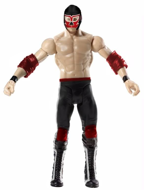
Erdtryu - figure is pretty good, the mask isnt on his face right his neyes dont go threw the wholes properly lol they look squished in.
Vote - There both fairly good but i like jacks part choices and his elbows and head do it for me. Jack
Kaneisdaman vs Kody
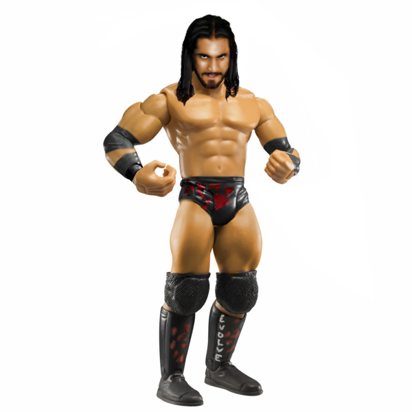
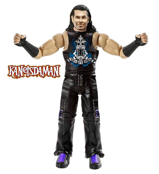
Kaneisdaman - Nice figure i like the singlet and all the logos and detail are placed nicley very good firgue
Kody - Noble has 2 right feet?? and the head hasnt had much work done to it, or not enough for it to look plastic, but the logo on the tights is well done.
Vote - Kaneisdaman
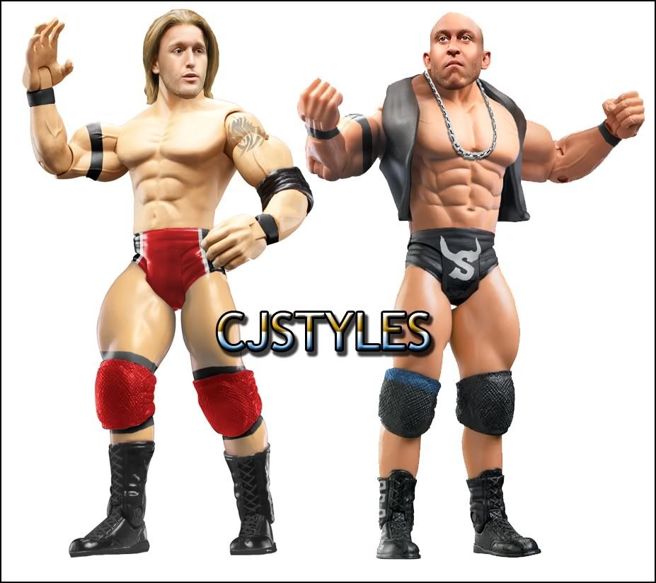
MJH vs Hitman vs CJ
MJH - your wade barnett is very lanky looking and has alot of shadow on his face, th gabrial is a good figure thoe looks preety good.
Hitman - That wade barnett is the best figure on thsi show grat head and the right parts, and his skip is good aswell good parts which i like and his head is very well done
CJ - wats with Skips head it looks like its angled wrong and his jacket goes over his torso wrong, the heath slater is good but his tat needs work.
Vote - Hitman
|
|
Joliet Jake
Superstar
Ya see, me and the Lord have an understanding.
Joined on: Apr 25, 2007 14:11:00 GMT -5
Posts: 738
|
Post by Joliet Jake on Jul 21, 2010 7:54:59 GMT -5
NOTE: Please don't think i'm trying to be ignorant with my reviews, i'm gonna point out problems as i see them to help you guys get better.
Awesome Powers: I like the parts you chose but the execution is rough. The black outline is distracting and the beard is obviously drawn on without any shading to make it look natural. Attire leaves a little to be desired as well, doesn't look complete. If you want some pointers feel free to PM me and i'll help you out.
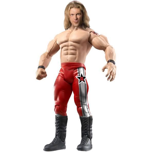
Sh3rb1: Attire design looks pretty good, i like that the silver streak matches to shadows on the tights, although the Rated R star could use some something to make it look more organic since it just looks out of place being completely solid. I wish you would have done kickers instead of lace up boots, not a big deal but i'm a big fan of paying attention to the small details. Head looks pretty good although the skin tones are a bit off.
WINNER: SH3RB1
-----------------------------------------------------
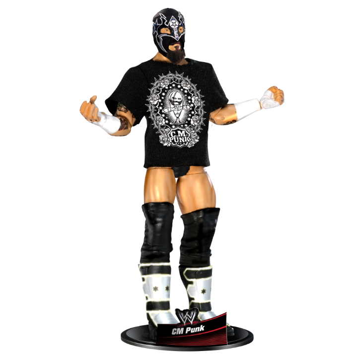
Alexgg1: Like i already said you did a good job on the punk figure. The shirt design looks great, the head is well done and basically my only complaint is that the boot design looks a little rough and blurry. Other than that i think you did a really solid figure.
-----------------------------------------------------
Jack: The head looks a bit too big for the body but your technique looks pretty good, skin tone looks pretty good as well. I like the parts choice you used but the details on the trunks and boots looks rough and almost beveled. On the right hand where the tape on the fist is, it doesnt go all the way to the edge of the hand.
Erdrtyu: Parts choice are good, the recolor on the elbow pads and tights looks good. The waist band looks blurry though, maybe you smudged it too much? The head looks decent but the top of the mask towards the top of the head looks blurry as well. I think if when you get done if you flatten your layers and then use the polygonal lasso and cut the figure out and paste it on a new layer it would look crisper.
WINNER: Jack
-----------------------------------------------------
KaneisDaMan: This is one of my favorite figures this show. head looks great, Attire looks excellent as well. The purple on the boots looks a tad too saturated but it could just be from how the light was hitting the plastic on the proto you used. The logo on the shirt looks good but i wish it had just a bit of shading done to it to match the folds and bends of the shirt. Regardless i think you did a great job as usual.
Kody: I like the attire choices and the design on the trunks looks decent. However the head is too large for the body although due to the angle of the body its kinda tough to match up the scale. The head doesnt look very figure like, tones dont match on the head and body either.
WINNER: KaneisDaMan
-----------------------------------------------------
Phoenix: The tattoos look good, attire choices are good. Shirt design is nice as well. Head looks good too although it still kinda looks like a picture still but its not horrible. Good job, hope you keep making figures to knock the rust off, back in the day you were really getting good.
JoshExtreme: The attire details are insane, awesome attention to detail. I like the part choices you made, the head is proportionate and the tones match up great. My one grip is i wish the tattoos were darker.
WINNER: Josh Extreme
-----------------------------------------------------
MJH: Attires on both figures look good, i like all the parts you chose. Both heads look too far down on the body to where there isnt enough neck showing which also makes the heads look a bit too large for the bodies. Techniques on the heads however look good and it doesnt seem like you have that much rust.
Hitman: Two very solid figures i like the parts you chose, the heads look great although they look a bit too large for the body as well. Attire designs on skip look great. I wish Skip would have had a Nexus armband though. Great job though!
CJ: The attire on Slater looks great, love the parts chosen. The head doesnt look very figure like though and the head looks too big for the body. Skips head looks better although the top of it looks rough to me. I like the chain,vest and attire on skip but why is the left knee pad have a dark blue line across it?
Winner: Hitman
|
|
Erdrtyu
Main Eventer
Joined on: Mar 9, 2007 19:07:14 GMT -5
Posts: 4,291
|
Post by Erdrtyu on Jul 22, 2010 0:52:15 GMT -5
Awesome Powers vs Sh3rb1
Awesome Powers: Yikes. Everything just looks choppy and rough. The skin tone and hair color are both very bad. The eyes are just as bad. I know you just took that preview pic that was on WWE.com and recolored it, which you really shouldn't of done. Don't do it again.
Sh3rb1: Not an amazing figure, but a good one. The head is ok, not really good but could definitely be worse. I like the attire, but the star kind of sticks out and looks weird. I agree with Joshextreme(i believe) that the whole fig looks a little blurry for some reason.
Vote: Sh3rb1. Not even close here.
Alexgg1: Sucks your opponent didn't hand in, but I'll comment on the fig anyway. I really like it. It is easily my favorite fig of yours. The mask looks great as does the face underneath. Like the beard. Like the Logo on the shirt, it's very clean. Only slight downside is the blurriness of the boots.
Jack: Uhh, yeah, you won, haha. Great figure man, good job.
Kaneisdaman vs Kody
Kaneisdaman: Wow. Perhaps my favorite fig on the show. Big fan. The head modding is great, I love how the hair and face match perfectly. The shirt logo also looks amazing. No flaws there. Pants also look great, love all the little details with the studs. If there is one complaint, it is the purple on the boots, but only a slight gripe there.
Kody: Not one of your best figs, at all. I like it, but you've done much better. The head is ok, but the skin tone isn't close to matching the body. The designs on the tights look nice and clean. The boots look weird, like he has two right legs from the knee pads down. The left one looks squished and and deformed a little.
Vote: Kaneisdaman. Better figure, just much better looking.
Phoenix vs Joshextreme
Phoenix: The head looks very minimally edited, like it's still just a picture. It also has a weird green color to it. As for the rest I like it. The shirt logo is crisp, and the tats look great. The kickers look a little off, but I can understand given the lack of protos thus far. Good fig, I like it.
Joshextreme: Wow, I like this a lot. The head is a little over smudged, but still is very good, as is the hair. The real selling point to this is the tats. Amazing work here. They all look so amazing, great work. The attire is also amazing work. All designs look very crisp and clean. Great figure.
Vote: Joshextreme. The tat work and the awesome attire put his figure over Phoenix's for me.
MJH vs Hitman vs CJ
MJH: Big fan of the Justin Gabriel figure. The head looks great. Like the designs on the tights. Really like the recolor on the boots/knee pads. I envy your ability to do this so clean.
Wade on the other hand, not a big fan of. The head isn't as good as Justin's, and looks weirdly placed and oversized. Nice attention to detail putting what little of his tat that could be seen, I know I would overlook something like that.
Hitman: Not a big fan of the Wade head. It has a bunch of weird highlights, and the hair looks too detaied, I can't really explain it, but it just looks off. I'm not sure what reference pics you used, but Wade has never worn this on WWE TV. He usually wore black trunks with the little yellow designs, so I don't like the attire here.
The Skip I like a lot better though. The head is very good, and doesn't have the same problems as Wade. Also I love the attire, the logo and the boots as well look great. Much better than Wade I think.
CJ: The head on Heath isn't too good, and is a little off colored. I do like the hair though, The rest off the figure is great though. I really like the tat, but it's maybe a little off center and light. I like the rest of the attire and recolor look great too.
There is something off about the head placement of the Skip, but regardless it looks great. Good tone matching. Shopping vest on can be hard, but it comes off looking great here. As does the chain. Again, I like the logo, very clean. As I'm sure it's been mentioned, you seemed to miss a big stripe of blue on the knee pad.
Vote: Very hard, all guys put out some great figures, but after a lot of thought I vote MJH. The Justin Gabriel is a near-perfect figure. And inspite of a couple of flaws on the Wade, it still looks good too. But the Gabriel really wins him the match here.
Great show guys, I look forward to many more in the future.
|
|
Jack.
Main Eventer
Probably out Skating
Joined on: Feb 23, 2009 11:06:38 GMT -5
Posts: 4,907
|
Post by Jack. on Jul 22, 2010 9:54:57 GMT -5
Match 1: Awesome Powers: A good choice to go a head a use the mold from WWE.com and the skin tone is good but the recolor's are way to choppy and the outline is distracting plus the eyes look bad. Sh3rb1: A great figure here, the head is very realistic and the tights are pretty good other than the logo which looks seperate to the tights. Would've like Edge to have had kickers too. Winner: Sh3rb1Match 2: Alex: Already commented on this, Is bloody amazing. Good job and congrats on the win. Match 3: Jack: I'm very happy with this figure thanks for the votes guys. Erdrtyu: This in my opinion is a very very good figure. It resembles El Generico alot. The match is good although it looks a little off the face. Ther tights are good and so are the boots. Which head did you use? Match 4: KaneisdaMan: Amazing figure, I which I knew who to do that crapy like you, bvery realistic, the pants are amazing and the boots are perfect. The hands are perfect. The only thing is that I wish you had made your own head however the hair change works and looks very clean. Kody: Another very good figure, the head is very figure like other than the eyes. The tights are perfect and so are the boots. It just didn't have as much detal as Kane's. Winner: KaneisDaManMatch 5 Phoenix: A great alround figure with lots of detail, majorly impressed with the shirt, and tatoos. also the kneebrace over the jeans would've been tricky. The head doesn't look tottally figure like although it is very good. The hair is brilliant. Josh Extreme: Oh man, what to say about this one. Perfect haead, no flaws there, perfect hair, perfect tattoos, great job on the wristtape, correct torso choice. It all flows well together. the boots and pants are great too, Winner: JoshExtreme.Match 6: Dissaponited with the no show was looking forward to it. MAIN EVENT: MJH: Amazing Justin Gabriel to start, I'd say that head is dead on and the whole figure actually looks like something you would buy however his torso looks a little too big. Wade Barrett also has a good head and I love that you remembered hit tat. The whole attire's been done well although he unlike Gabriel looks a little too skinny. Hitman: Another couple of good heads although Barrett's looks a little more animated. Would've liked designs on the trunks. It's a very good figure but some things are a little off. Sheffielsd is perfecty. Very good head, Good designs too. CJ: Found it interesting in the match that some did a Mattel, someone did DA and some did an RA. Heath's head just looks a little to realistic here but other than that it's perfect. Same with Sheffield, amazing attire but the head is a little off, mostly the badly cut head. Great job on both mans boots though. WINNER: MJH |
|
|
|
Post by cjs. on Jul 22, 2010 21:17:44 GMT -5
thanks for all the constructive comments, appreciated. the blue stripe on the knee pad is there on purpous, I saw it on one photo haha and fair play to MJH, honestly some of the cleanest figures I've ever seen. I'll edit with votes later  |
|
Joliet Jake
Superstar
Ya see, me and the Lord have an understanding.
Joined on: Apr 25, 2007 14:11:00 GMT -5
Posts: 738
|
Post by Joliet Jake on Jul 27, 2010 13:06:39 GMT -5
these guys worked hard on these, they need more votes & replys
|
|
JXT
Main Eventer
Professional Wrestler JXT
Joined on: Dec 20, 2009 18:53:17 GMT -5
Posts: 2,628
|
Post by JXT on Jul 28, 2010 1:46:27 GMT -5
yeah i know, not many votes
|
|
|
|
Post by 316austin316 on Jul 30, 2010 18:02:00 GMT -5
Kaneisdaman's Matt Hardy Should Win!
|
|
Erdrtyu
Main Eventer
Joined on: Mar 9, 2007 19:07:14 GMT -5
Posts: 4,291
|
Post by Erdrtyu on Aug 2, 2010 0:33:32 GMT -5
Alright, I' about ready to close up voting here, I've just been waiting on CJ to post his votes. Hurry up See Jay!
|
|
Deleted
Joined on: Apr 20, 2024 6:08:13 GMT -5
Posts: 0
|
Post by Deleted on Aug 13, 2010 14:50:11 GMT -5
how can i join?
|
|