|
|
Post by miserere on Oct 9, 2010 22:18:12 GMT -5
 If I were the boss of the person responsible for this, I would have unleashed hell. When I think Survivor Series, I think a bunch of wrestlers beating the crap out of each other, either 4-on-4 or 5-on-5. Not this. Not John Cena slouched in the mists. It makes no sense to me. I may be absolutely alone on this one, but I miss the days pay-per-view posters would build up the main events. Cena main evented Survivor Series 2008, but there is no way to tell. There is no belt in the picture, no mention of his match against Chris Jericho, no mention of Jericho whatsoever. Just Cena hanging out in some fog. Whoopee. Your turn. |
|
|
|
Post by DTP. on Oct 9, 2010 22:23:57 GMT -5
Alright, I think you're being harsh on this poster, personally.
1) A pay-per-view poster generally does not mean it has to promote specifically what the main event is. The promotional poster is generally for ticket sales, and if you recall, this pay-per-view was in Boston. Cena comes from Boston.
2) Cena's return from injury analyzing it means he is returning from the 'mists of injury'. And he looks angry because he's got unfinished business. A five on five poster or a brawl of guys would have looked cool to the casual viewer, but when you have a distinguishable figure on a poster then it is definitely going to sell more than a poster promoting Survivor Series as being a big brawl.
Looking further into it, Cena is not in a shirt and cap, he's properly prepared looking and perhaps has lost the battle so far and is angrily looking for another attempt.
I'm just throwing these out there and testing my media technique out; I disagree with your opinion of the poster.
|
|
|
|
Post by The UndyTaker on Oct 9, 2010 22:24:14 GMT -5
The only thing I can think of right now is doesn't ShopWWE sell these posters too? Because if they did, I could see why WWE would put something like this out.
Other than that, it is AWFUL advertising.
|
|
|
|
Post by Eat Defeat. on Oct 9, 2010 22:29:45 GMT -5
|
|
|
|
Post by slappy on Oct 9, 2010 22:30:21 GMT -5
Alright, I think you're being harsh on this poster, personally. 1) A pay-per-view poster generally does not mean it has to promote specifically what the main event is. The promotional poster is generally for ticket sales, and if you recall, this pay-per-view was in Boston. Cena comes from Boston. 2) Cena's return from injury analyzing it means he is returning from the 'mists of injury'. And he looks angry because he's got unfinished business. A five on five poster or a brawl of guys would have looked cool to the casual viewer, but when you have a distinguishable figure on a poster then it is definitely going to sell more than a poster promoting Survivor Series as being a big brawl. Looking further into it, Cena is not in a shirt and cap, he's properly prepared looking and perhaps has lost the battle so far and is angrily looking for another attempt. I'm just throwing these out there and testing my media technique out; I disagree with your opinion of the poster. Look at posters from the 80's and early 90's, they show the main event for the most part. Cena was born an hour away from Boston, but he lives in Florida. |
|
MikeMillenium
Main Eventer
    I LOVE THE WWE AND EVERYTHING ABOUT IT
Joined on: Jul 21, 2010 13:45:54 GMT -5
Posts: 1,622
|
Post by MikeMillenium on Oct 9, 2010 22:31:10 GMT -5
Yeah, it's not like John Cena makes any money  I agree it doesn't represent the Survivor Series well, but I mean when was the last time 5 vs. 5 matches were stressed and considered the main attraction? |
|
|
|
Post by miserere on Oct 9, 2010 22:47:36 GMT -5
Alright, I think you're being harsh on this poster, personally. 1) A pay-per-view poster generally does not mean it has to promote specifically what the main event is. The promotional poster is generally for ticket sales, and if you recall, this pay-per-view was in Boston. Cena comes from Boston. 2) Cena's return from injury analyzing it means he is returning from the 'mists of injury'. And he looks angry because he's got unfinished business. A five on five poster or a brawl of guys would have looked cool to the casual viewer, but when you have a distinguishable figure on a poster then it is definitely going to sell more than a poster promoting Survivor Series as being a big brawl. Looking further into it, Cena is not in a shirt and cap, he's properly prepared looking and perhaps has lost the battle so far and is angrily looking for another attempt. I'm just throwing these out there and testing my media technique out; I disagree with your opinion of the poster. Nice input. Allow me to rebut. Yes, John Cena was returning from injury, but I'm not so sure a picture of him, alone, with a goofy look on his face was the best way to get some pay-per-view buys -- similar to the way I don't think the current posters really draw in anybody. Let's compare to this SummerSlam 1997 poster, which is one of my favorites:  Look at that. In one picture you see: A) How imposing and foreboding a presence the Undertaker is, and how big a risk he is to Bret, B) the main match of the night will feature both Bret and Taker, C) Bret looks serious, and he won't go down easily. Here is what I gather from the Cena poster: A) John Cena is angry and/or constipated, B) It's the Survivor Series! It's happening! C) Uh... Other recent posters follow this same formula. Toss in a top-tier guy like Orton, Edge, Undertaker, Kane, Triple H, John Cena, Chris Jericho and photoshop them into some weird, post-apocalyptic scenario or warzone, put their name on it and the name of the PPV, there is your poster. It's boring. Here, check this one out, from Buried Alive: In Your House, a 1996 PPV.  Does that not sell the match, the gimmick and the pay-per-view itself? It's not as pretty by today's standards, but it more than holds its own. At least more than the Survivor Series poster. Oh, and don't get me started on SummerSlam posters of late -- 2008, I am looking at you. |
|
|
|
Post by DgenerationX092 on Oct 9, 2010 23:07:29 GMT -5
Alof of the posters in recent years have been sucking bad.
No Way Out 2009
The Bash 2009
TLC 2009
Elimination Chamber 2010
Fatal Four Way 2010
Summerslam 2010
Night of Champions 2010
Those all suck.
|
|
Jesseversion1
Main Eventer
    :)
:)
Joined on: Aug 8, 2009 4:09:46 GMT -5
Posts: 3,909
|
Post by Jesseversion1 on Oct 9, 2010 23:53:06 GMT -5
Wow, what a crappy poster xD
|
|
SMK
Main Eventer
   
Joined on: Oct 24, 2007 20:02:00 GMT -5
Posts: 1,354
|
Post by SMK on Oct 9, 2010 23:53:29 GMT -5
I think your looking into a bit too much. And the nostalgia is also playing a part. That Dead or Alive poster is awful, in my opinion. Paul Bearer in the moon, and the overall design really makes it.
|
|
|
|
Post by mattoriginal on Oct 10, 2010 2:12:48 GMT -5
inb4tnaposters
|
|
|
|
Post by extreme on Oct 10, 2010 2:25:30 GMT -5
 great ppv. not so great poster. |
|
|
|
Post by alexgg on Oct 10, 2010 5:46:06 GMT -5
I dont think the Summerslam Posters have been bad, maybe people thourght this years looked cartoony but it had bright summer colors.
The biggest superstars were on the front which I think has a good draw, with some action type shots, the stars on it represented the backdrop for the logo and scattered around they looked good.
It might be too cartoony but I think it is pretty awesome.
|
|
|
|
Post by Lord Ragnarok on Oct 10, 2010 5:55:54 GMT -5
 /thread |
|
|
|
Post by Yeezy's Mullet: Team X Blades on Oct 10, 2010 6:09:58 GMT -5
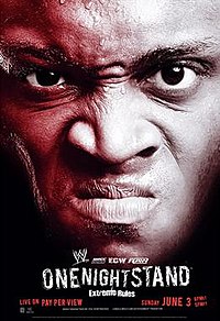
 /thread Bu.....but....it's half Lashley and half Vince. Remember?.....  |
|
|
|
Post by ● kaneisdaman ● on Oct 10, 2010 6:41:39 GMT -5
Alof of the posters in recent years have been sucking bad. No Way Out 2009 The Bash 2009 TLC 2009 Elimination Chamber 2010 Fatal Four Way 2010 Summerslam 2010 Night of Champions 2010 Those all suck. What was wrong with NOC? One of the main champions from one of the main matches clearly displaying a championship which is to be defended on the PPV (the whole point of it). Cant see how anything is wrong there, plus it looked simple and elegant like all NOC posters should. |
|
|
|
Post by gordon on Oct 10, 2010 6:55:07 GMT -5
 /thread Bu.....but....it's half Lashley and half Vince. Remember?.....  Half Monty Brown actually  |
|
Deleted
Joined on: Nov 16, 2024 17:53:52 GMT -5
Posts: 0
|
Post by Deleted on Oct 10, 2010 7:23:27 GMT -5
Remember this fake one for SummerSlam 2009 that did the rounds last year?  Still makes me lmao at how random it is. Jeff Hardy sleeping on a floating bed, with Randy Orton pulling at his feet? OK then... Thank god it was fake. |
|
|
|
Post by gordon on Oct 10, 2010 7:30:21 GMT -5
Remember this fake one for SummerSlam 2009 that did the rounds last year?  Still makes me lmao at how random it is. Jeff Hardy sleeping on a floating bed, with Randy Orton pulling at his feet? OK then... Thank god it was fake. Wow, that's terrible. Clearly fake, but terrible. |
|
|
|
Post by Gazza on Oct 10, 2010 7:31:38 GMT -5
Bu.....but....it's half Lashley and half Vince. Remember?.....  Half Monty Brown actually  Half Marcos Cor Von actually  |
|


