ROCKAJABRONi
Superstar
   The Pride of the Philippines
Joined on: Dec 18, 2001 15:13:21 GMT -5
Posts: 611
|
Post by ROCKAJABRONi on Sept 13, 2011 22:25:13 GMT -5
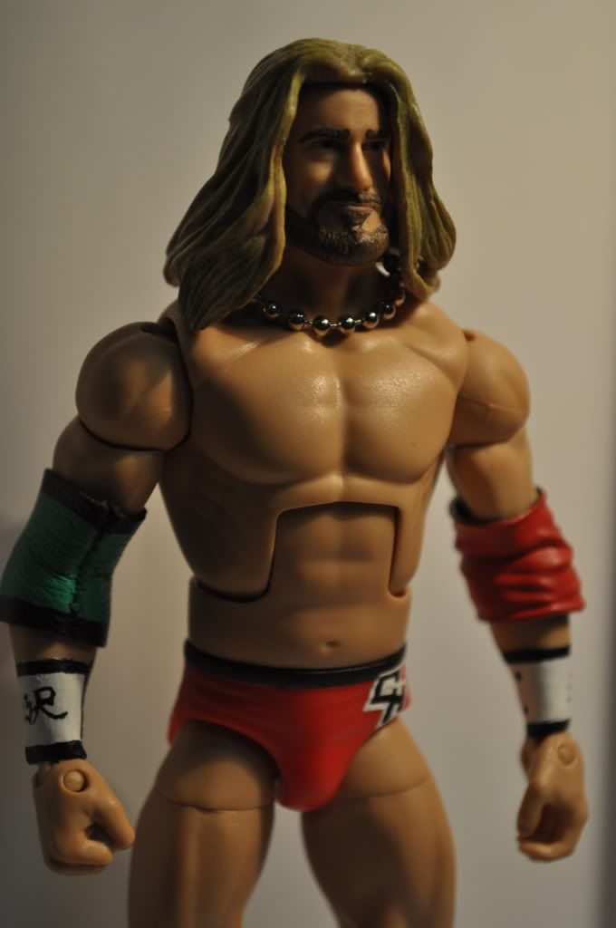
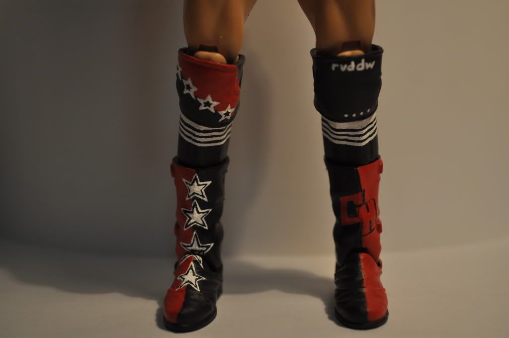
First of all, I just want to say that I have even more respect for customizers on here. Painting really takes a lot of patience and a steady hand. Even though this custom wasn't perfect, I learned a bunch of things that I can improve on for my next one. But anywho, on to the pictures. Chris Hero (9/16/11)Took the advice of classicdas and Hellboy. Fixed some mistakes, took better pictures, and loaded an elbow. Maybe, I shouldn't have take better pictures. I can't hide all the painting imperfections haha. But I think now you guys can judge it more properly and fairly. Hopefully, it doesn't lose too much quality. Chris Hero (9/13/11)This was based off a match I saw on YouTube against KENTA. Lesson #1: Paint a white layer over black before painting with other colors. It would really let the red show much better. Lesson #2: Masking tape works wonders and saved me from even more frustration. Lesson #3: I hate painting stars. Throughout my life, I could never draw stars that looked right to me. Painting them was even harder. Painting Chris Hero's 3-layer stars 8 times was .. holy cow. I had an image of what this would look like before I started. Some parts didn't turn out as planned, others turned out really well. First, I thought the boots would fit more snuggly. It's a little oversized for what I was going for. Second, my first choice for the head was a Basic 2 CM Punk and an Elite 8 Edge hairpiece. I couldn't get those, so I went with the next best option. Shout out to Hellboy. I saw his Hero custom and it inspired me to make my own. So yeah, I would love to hear what you guys think of it. Any comments - good or bad - would be great! Thanks for looking. Oh, any suggestions for my next project? I want to do a Tiger Mask custom, but with sculpting needed, it might be too big of a leap forward from the Chris Hero custom. |
|
|
|
Post by TD#1=My head hurts on Sept 13, 2011 22:39:23 GMT -5
Wow...from what I see it's like you've been doing this for years...Good job
|
|
|
|
Post by nathanielnd on Sept 13, 2011 23:03:23 GMT -5
WOW!!! To be honest, I think this might be one of, if not the best Chris Hero custom I've seen on here! Great job, I can't wait to see more from you  . |
|
christianedge
Main Eventer
   
Joined on: Dec 22, 2009 21:47:07 GMT -5
Posts: 1,743
|
Post by christianedge on Sept 13, 2011 23:06:04 GMT -5
This is a really nice custom. I love the little details, like his wristbands. The Punk head works extremely well.
|
|
jasonphoenix1
Main Eventer
    Just when you think you know the answers. I change the questions!
Joined on: Feb 16, 2011 2:37:31 GMT -5
Posts: 2,377
|
Post by jasonphoenix1 on Sept 13, 2011 23:32:22 GMT -5
Love it. Keep up the work man!  |
|
|
|
Post by The Immortal Antichrist on Sept 14, 2011 0:56:01 GMT -5
that is one fantastic custom. Everything looks great. Keep up the great work.
|
|
ROCKAJABRONi
Superstar
   The Pride of the Philippines
Joined on: Dec 18, 2001 15:13:21 GMT -5
Posts: 611
|
Post by ROCKAJABRONi on Sept 14, 2011 1:34:14 GMT -5
wow, thanks guys! Can't say I was expecting all of these wonderful comments. I actually had a lot of fun doing this and will be doing more in the future. If only I was rich enough to buy better tools and more figures to customize with haha.
|
|
|
|
Post by cooperman on Sept 14, 2011 5:28:44 GMT -5
Details are simply A-M-A-Z-I-N-G D:
Awesome custom
|
|
|
|
Post by Lk™ on Sept 14, 2011 7:52:46 GMT -5
looks amazing dude, great job
|
|
|
|
Post by The Silent Flute (joepetree) on Sept 14, 2011 12:40:41 GMT -5
All I Gotta Say Is That is a Great Custom
|
|
Ruff Figures
Superstar
  
Joined on: Jul 1, 2008 18:06:49 GMT -5
Posts: 786
|
Post by Ruff Figures on Sept 14, 2011 13:32:38 GMT -5
That's really a fantastic figure you got there my friend. One of my favorite Chris Hero customs I've seen here in ages.
The newer CM Punk head works wonders for him with the older TTL HHH hair. I like that combination a lot! The face has that perfect sarcastic smirk that Hero has been known to make. Really nothing to complain about with the head at all. Its simple and works beautifully.
Looks like you used a Funk body as well which is really ideal for him. He used to be a big guy and in the past few years has lost a lot of weight and that torso shows his physique very well. The boot selection too is flawless. Im really glad that Mattel released figures with that mold as it's a very common boot style these days and Jakks never really nailed it.
It, however, is the details of this figure that makes it such an awesome pieces. From the ball necklaces to the sock stripes to the text on the kneepads and the detailed stars, its all awesome. One of my favorite things about it is the wrist cuffs. The detail on those with the little logos as well as the lacing accents are fantastic. I am really a fan of those.
Finally, the painting on this, although somewhat minimal is awesome. It is just my style. You worked with what parts were out there and optimized them to fit the bill. The paint detail on the trunks logos looks like that of a veteran. All customizers will agree with you in that stars are among the most difficult designs to paint, and you did a pretty good job with those too. It is figures like this that are my favorite kind of customs, ones that look like a professionally produced piece.
Overall I am very impressed and you have a great deal to be proud of. I hope you continue to customize and show off your work here. I rarely respond to anything anymore, but every once in a while I will see a piece here that makes me proud to be a member of this community and you should know that yours is one of those pieces. Quality work my friend and I will keep my eye out for more of your work. Thanks for sharing, it was an honor.
-EDIT-
One thing I wanted to mention that may make your work look even better in the future is photography techniques. Generally, I would recommend taking pictures of your work against a plain, solid, white background. Obviously there are exceptions, but generally this is the best background for making your work stand out. There is not that distraction of stuff in the background taking away from the quality of your work. It just gives a very nice, professional look to your customs, so keep that in mind the next go-around.
|
|
|
|
Post by D.B.K. on Sept 14, 2011 14:01:30 GMT -5
 AWESOME work +1
|
|
ROCKAJABRONi
Superstar
   The Pride of the Philippines
Joined on: Dec 18, 2001 15:13:21 GMT -5
Posts: 611
|
Post by ROCKAJABRONi on Sept 14, 2011 21:27:33 GMT -5
I rarely respond to anything anymore, but every once in a while I will see a piece here that makes me proud to be a member of this community and you should know that yours is one of those pieces. Man, you don't know how much that means to me, especially coming from you. I'm truly honored that you even looked through it, even more that you replied with such an encouraging and thorough response. My mindset going forward with this custom was to go the extra mile with the limited skill level and tools I had to work with. So I focused on details. Of course, it isn't perfect (I actually found out that I messed up the star designs on his kneepads  ). And yes, I'll definitely post up better pictures in the future and with a better camera. It kinda slipped my mind throughout the whole process. Thanks again, man. and thanks for the rest of the comments, guys. |
|
|
|
Post by Sound888 on Sept 14, 2011 21:57:56 GMT -5
wow. i've been meaning to reply to this one today. i was really excited to see how it turned out after all the process! and all i can say is that this is one of the best hero customs i've ever seen, including mine. first off, the head choice worked beyond my imagination. i used a smiling jakks punk scan for an older hero, and i don't know if punk actually does look like hero in real life, but it works pretty dang well on figures. second, since i am a huge hero fan, i am going to give you constructive criticism for everything i can think of. but the one thing you have going on perfectly is the stars on the boots. they are the best stars i have ever seen from anyone customizing. i wish i can paint stars as well as you did. but i don't know if you noticed or not, but the stars on hero's kneepads are only two-toned, not like the boots. they are black stars with just a white outline. the boots look amazing. too bad you kept the straps on the back, but you did well for what you had to work with. the kneepads of choice is accurate to the type hero wears, but they are a bit small for the figure. (which makes it even more impressive that you were able to paint perfect stars on them too!) on the other kneepad with "rvddw" on it, there are four plain white stars on the bottom that you missed. the "H E R O" on the back of the trunks is the cleanest i've seen someone do, and i am amazed at your skills. the only problem is that on the front of the trunks, the crotch piece was too small for the CH logo to look good. i would have gone for a different pair of trunks instead with a star on the front, but it's not all that bad. your wrist tapes are done to perfection, and i'm surprised you even got the stars under the side with the YH on it! no one ever notices that. my favorite part of this custom has to be the socks. i was going to do them, but i got lazy and just swooped the elite cody rhodes' socks. i have no idea how you were able to do the thin lines so perfectly, but it is incredible. i look forward to seeing more customs from you. keep up the excellent work!
|
|
ebenj
Mid-Carder
  Never Forgotten
Joined on: Jul 11, 2011 21:25:45 GMT -5
Posts: 295
|
Post by ebenj on Sept 15, 2011 0:31:15 GMT -5
Utterly fantastic  ! Love the head choice! When I first saw it I said "damn that a great hero custom". You have amazing attention to detail. Also to know that you painted all the stars and logos is amazing! I would of buckled down and went with decals just cause I wouldn't have the patience for it ;D. Good work and keep it up! Looking forward to the next ones! |
|
ROCKAJABRONi
Superstar
   The Pride of the Philippines
Joined on: Dec 18, 2001 15:13:21 GMT -5
Posts: 611
|
Post by ROCKAJABRONi on Sept 15, 2011 1:11:14 GMT -5
@hellboy: I was waiting for someone to point out the inaccuracies haha. But really though, thanks for the constructive criticism. About the stars on his kneepads, I used a reference picture of him with just black and white kneepads (no red) and just assumed it was the same. My mistake. I'm gonna fix it though cause it will bother me. OH and good eye with the missing small stars on his other kneepad. I actually saw pictures of it and just pulled a Jakks. For the boots, I didn't know there were buckles there before I bought it and wanted to stay away from major modifications. It's probably the part I'm most disappointed with (the mold at least). And the socks, I would've just swapped it with Cody calves as well, but I wasn't about to buy a whole figure just for it. And trust me, it was not easy. ebenj: I'm with you man, decals would've made life 50x easier. But it was good painting practice (especially with those darn stars). And you just get this different feeling of accomplishment painting instead of using decals, even if it doesn't look as good. But thanks man. |
|
Deleted
Joined on: Nov 24, 2024 22:02:54 GMT -5
Posts: 0
|
Post by Deleted on Sept 23, 2011 16:03:01 GMT -5
Excellent work well done
|
|
|
|
Post by tango2010 on Sept 27, 2011 12:33:38 GMT -5
ace fig love it m8
|
|
ROCKAJABRONi
Superstar
   The Pride of the Philippines
Joined on: Dec 18, 2001 15:13:21 GMT -5
Posts: 611
|
Post by ROCKAJABRONi on Oct 8, 2011 6:22:13 GMT -5
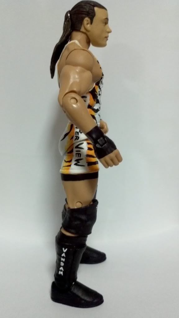
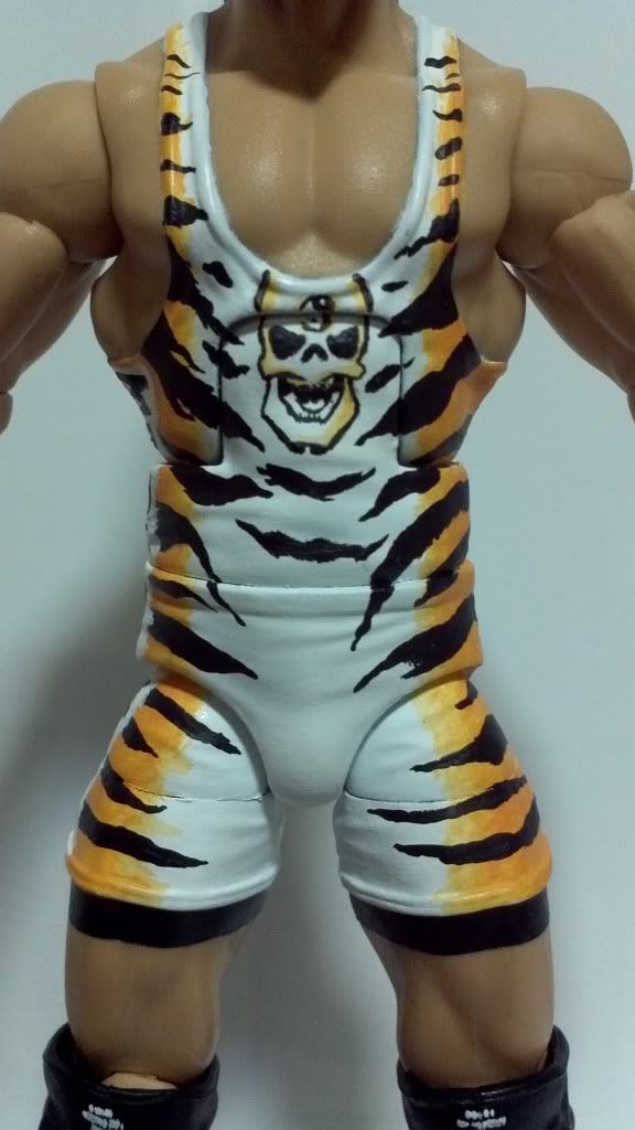
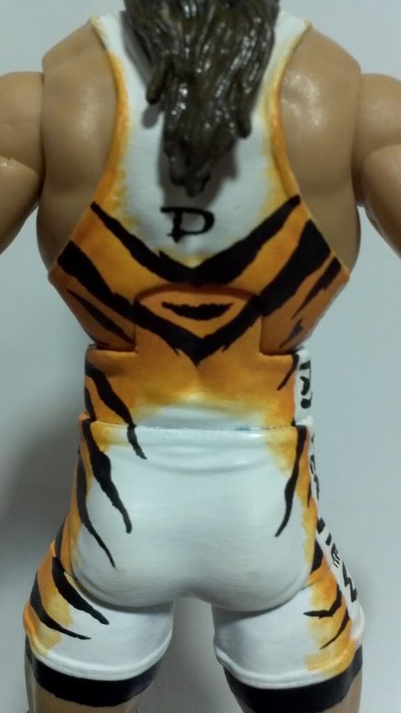
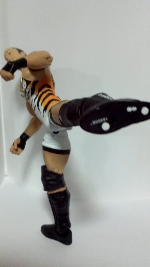
Kurt Angle (10/8/11)This custom was really for sculpting practice. I got some Sculpey III for cheap and wanted to mess around a bit before moving on to better stuff like Apoxie Sculpt. I didn't have any sculpting tools so I had to improvise with a toothpick and a pin (hence, some bumpy areas). The kneepad area is what bugs me the most with it. I had to mod Cena lower legs just to get it to fit. It looks pretty weird underneath the kneepads. Well, just another case of something looking better in my head than what it turned out to be. Rob Van Dam (10/8/11)This was made for a potential order. The singlet style isn't as accurate as I would have liked (specifically, the back). I don't know if anyone even notices it, but I added the circles under RVD's boots just for fun. This will probably be the last customs I'll be able to do until winter break. School will keep me extremely occupied in the mean time. But let me know what you guys think!
|
|
|
|
Post by Sexy White Chocolate on Oct 8, 2011 7:05:27 GMT -5
RVD is perfect. The painting looks really smooth and I love how the orange fades into white. Looks just like the airbrush logos he normally wears.
|
|



 .
.


 AWESOME work +1
 ).
). 


