|
|
Post by /X Metal Sorenges x "Mac Oh J~ on Mar 3, 2012 11:57:36 GMT -5
This will be a Open Graphics challenge proposed by DK Almighty. I though since the other thread looked a little bit unorganized, I would take it a pond myself to make some new rules and regulations. All graphics will be edited and showcased here. New Entries will count towards the challenge and you may vote on them aswell. One graphic per person and anyone who left an entry my not vote in the challenge. 1. Size: 436x195 2. Topic: NFL on a certain player for a team 3. Skill: Any skill level This is what we have showcased at the moment Kill Steen Kill Entry: 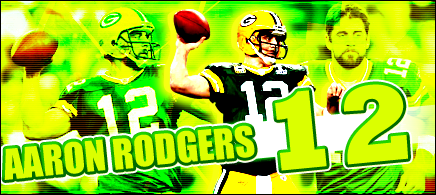 DK Almighty-Graphics MVP Entry: 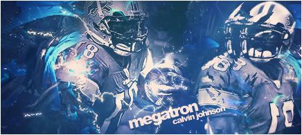 Voting: You may vote by saying which graphic you like the best, give a Voting: You may vote by saying which graphic you like the best, give a
brief reason why or you can critique all the graphics and choose the one
that looks the best designed.Due Date: March 8th
|
|
|
|
Post by Elliot on Mar 3, 2012 23:28:36 GMT -5
I'll give you guys a start...
Kill Steen Kill; This is way too bright, to the point that it's almost hard to look at. And the scan lines going across it make it worse. Definitely don't go this bright for your other pieces. What I do like is the render you used to stand out from the background, that's good. Also, the text is a nice attempt, text is always difficult, just try not to use too much stroke because it sometimes ruins the text.
DK Almighty; I've seen this style before and personally, I just feel like it has ran its course, you should definitely try expanding your horizons to something other than C4D-filled graphics with repeated renders because you have potential. That being said, you've clearly mastered the style and I like the glows and the whole colour scheme, and keeping the text simple is always best on these graphics, because the detail is already in the background.
Overall; I personally believe this one is easily judged, simply due to the execution. My vote, DK Almighty gets the victory.
Like I said, you need to expand your horizons because the style you're using has been done to death, and has been since like 2004. You could use your talent more effectively with bigger graphics, with more resources. Kill Steen Kill, just keep working on your colouring and text work. But yes, to reiterate...
My vote; DK Almighty.
|
|
|
|
Post by DK Almighty on Mar 3, 2012 23:51:16 GMT -5
I'll give you guys a start... Kill Steen Kill; This is way too bright, to the point that it's almost hard to look at. And the scan lines going across it make it worse. Definitely don't go this bright for your other pieces. What I do like is the render you used to stand out from the background, that's good. Also, the text is a nice attempt, text is always difficult, just try not to use too much stroke because it sometimes ruins the text. DK Almighty; I've seen this style before and personally, I just feel like it has ran its course, you should definitely try expanding your horizons to something other than C4D-filled graphics with repeated renders because you have potential. That being said, you've clearly mastered the style and I like the glows and the whole colour scheme, and keeping the text simple is always best on these graphics, because the detail is already in the background. Overall; I personally believe this one is easily judged, simply due to the execution. My vote, DK Almighty gets the victory. Like I said, you need to expand your horizons because the style you're using has been done to death, and has been since like 2004. You could use your talent more effectively with bigger graphics, with more resources. Kill Steen Kill, just keep working on your colouring and text work. But yes, to reiterate... My vote; DK Almighty. Elliot : Thanks for the feedback Its funny bc everytime i start out in a different direction and when it comes time to post something i go back to what i know. At this point i would be keen to learn new styles and if you know were i could find some tuts that would help- TY Derek PS Thanks for the reply on this topic maybe next time you can enter the fun would love to see what you could bring to the contest |
|
|
|
Post by ¡Twist Of Lime Green Jello! on Mar 4, 2012 5:23:10 GMT -5
Kill Steen Kill
The green is way overdone and kills the image. The text is fine though, the two side pics could be a little bit blurred though since they're still somewhat dominant.
DK
Love the colour, I'm a sucker for that blue. Is that a Displace filter used on the right render? Text is great too.
My vote goes to DK.
|
|


