flying-shorty
Main Eventer
    Take a bow
Joined on: Jul 12, 2005 8:30:30 GMT -5
Posts: 4,778
|
Post by flying-shorty on Dec 23, 2007 9:19:25 GMT -5
i kno ul say ur just critiquing hitmans figure..but ur not bein that constructive or nice with it...
bad head and tats are blurry. is pretty pissy.. its christmas
|
|
|
|
Post by [MJH] on Dec 23, 2007 9:32:58 GMT -5
OK. I'll try do it now. Btw He's screaming. Edit: One on the left any better? 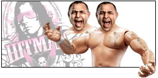 much better but eyes need to have some white in em. |
|
|
|
Post by brethitmanhart on Dec 23, 2007 9:39:17 GMT -5
OK. I'll try do it now. Btw He's screaming. Edit: One on the left any better?  much better but eyes need to have some white in em. OK will do. I CBA doing the tats but I've added his blue Jacket. I'll post in a minute. Edit: Couldn't really do anything with the eyes: 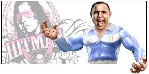 |
|
|
|
Post by duan on Dec 23, 2007 13:09:32 GMT -5
I like it bret. That jacket is pretty sweet. Head is nice also.
|
|
|
|
Post by [MJH] on Dec 23, 2007 13:42:53 GMT -5
- Bret it's a bit blurry try sharpening it, other than that it's good.
|
|
|
|
Post by cjs. on Dec 23, 2007 16:09:50 GMT -5
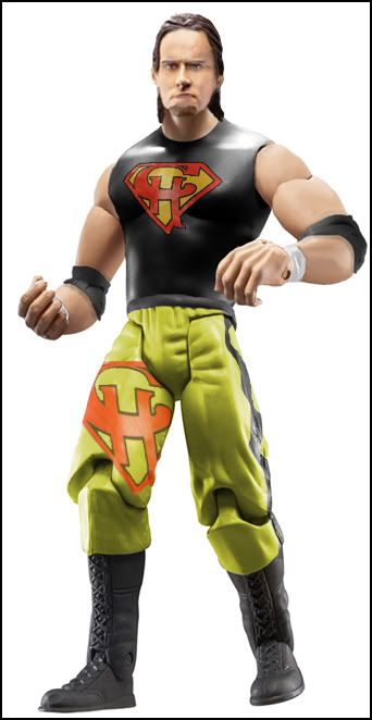 Meh, tried finishing it and pretty much failed it looks horrible imo. |
|
Stewart
Superstar
  
Joined on: Oct 21, 2007 17:14:43 GMT -5
Posts: 616
|
Post by Stewart on Dec 23, 2007 16:11:52 GMT -5
the only problem i see on it is the head.
|
|
|
|
Post by bowdowntotheking on Dec 23, 2007 17:20:44 GMT -5
opps link didnt work last time  |
|
Stewart
Superstar
  
Joined on: Oct 21, 2007 17:14:43 GMT -5
Posts: 616
|
Post by Stewart on Dec 23, 2007 17:26:38 GMT -5
there is something odd about the legs i cant quite figure out.
|
|
|
|
Post by Kody on Dec 23, 2007 23:06:51 GMT -5
 for dtd |
|
|
|
Post by brethitmanhart on Dec 24, 2007 3:40:11 GMT -5
The hair kills it, it looks to sharp and real.
|
|
|
|
Post by [MJH] on Dec 24, 2007 5:48:37 GMT -5
What you talking bout? that figure is badass!
|
|
|
|
Post by cjs. on Dec 24, 2007 10:42:39 GMT -5
Comments on my fig plz
|
|
|
|
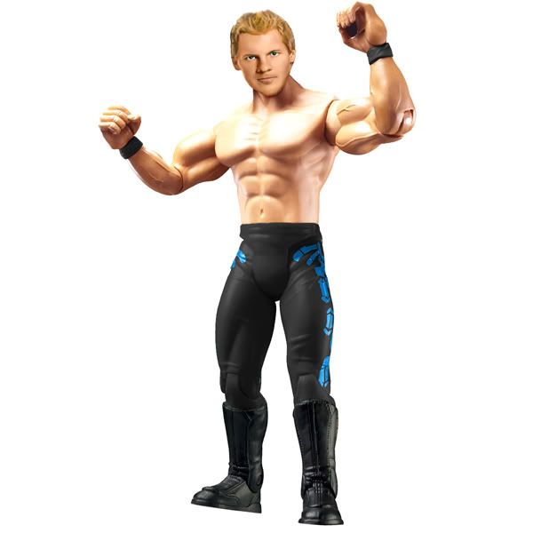
Post by ljs on Dec 24, 2007 10:48:31 GMT -5
CJ, the logo isn't like that, it's on the side. And nice use on the Punk had, I think it looks dead on for him.
And he doesn't wear pants like that, More like The RA ref figs (Eric Bishoff, HBK, Davari)
|
|
|
|
Post by brethitmanhart on Dec 24, 2007 11:16:18 GMT -5
CJ your figure is sweet. The Punk head is working well, it just looks like he hasn't got a chin. The leg logo doesn't look like it's around the leg because it never bends.
|
|
|
|
Post by cjs. on Dec 24, 2007 17:01:22 GMT -5
Thanks for the comments, I didn't bother researching properly, more of a tester fig really to see if I would start doing them again.
Btw, I hope everyone body has an amazing christmas.
|
|
|
|
Post by [MJH] on Dec 28, 2007 5:34:26 GMT -5
aeeing as we went back in time I'll post em again.  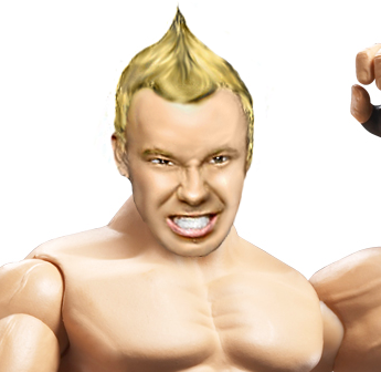 |
|
|
|
Post by brethitmanhart on Dec 28, 2007 8:29:20 GMT -5
The head is really good, pretty flawless. Great job. To be honest I dislike it on the torso, it just doesn't look right, somethings off.
|
|
|
|
Post by Kody on Dec 28, 2007 10:31:36 GMT -5
Head is great. Hair seems a bit too blond though, for Shannon.
|
|
|
|
Post by jomoishollywood on Dec 29, 2007 14:04:17 GMT -5
 Did this quickly... |
|


