|
|
Post by [MJH] on Jan 14, 2008 17:13:20 GMT -5
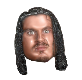
it's a much quicker and more efficient way though, done another head with it:  |
|
|
|
Post by jomoishollywood on Jan 14, 2008 22:09:05 GMT -5
I dont like some things about it...
I mean, the eyes and hair could use some history brushing.
|
|
flying-shorty
Main Eventer
    Take a bow
Joined on: Jul 12, 2005 8:30:30 GMT -5
Posts: 4,778
|
Post by flying-shorty on Jan 15, 2008 7:52:40 GMT -5
Minus the eyes and hair it looks good
|
|
Stewart
Superstar
  
Joined on: Oct 21, 2007 17:14:43 GMT -5
Posts: 616
|
Post by Stewart on Jan 15, 2008 9:19:09 GMT -5
Whats The Full Name For The Program?
|
|
Deleted
Joined on: Nov 1, 2024 3:16:14 GMT -5
Posts: 0
|
Post by Deleted on Jan 15, 2008 9:50:33 GMT -5
Adobe Photoshop cs3
with the plug-in called filter forge.
use plasta rap.
|
|
|
|
Post by bowdowntotheking on Jan 15, 2008 20:24:42 GMT -5
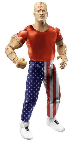
a cs sandman  comments? |
|
|
|
Post by Kody on Jan 15, 2008 20:36:13 GMT -5
body/legs the looks very disproportionate.
|
|
|
|
Post by ocanada on Jan 15, 2008 21:38:56 GMT -5
He looks like ercle
|
|
|
|
Post by Cass on Jan 16, 2008 10:22:59 GMT -5
hmmm  rofl. |
|
|
|
Post by brethitmanhart on Jan 16, 2008 11:03:17 GMT -5
Looks nice. I think you should credit BDTTK. Everything looks good but the head. It looks too small and makes the neck look huge. The shirt would be better with an logo.
|
|
|
|
Post by [MJH] on Jan 16, 2008 11:05:03 GMT -5
Looks nice. I think you should credit BDTTK. Everything looks good but the head. It looks too small and makes the neck look huge. The shirt would be better with an logo. why? |
|
Deleted
Joined on: Nov 1, 2024 3:16:14 GMT -5
Posts: 0
|
Post by Deleted on Jan 16, 2008 11:31:00 GMT -5
Didnt Cass make his sandman a while back?
|
|
|
|
Post by brethitmanhart on Jan 16, 2008 11:40:35 GMT -5
Looks nice. I think you should credit BDTTK. Everything looks good but the head. It looks too small and makes the neck look huge. The shirt would be better with an logo. why? Sorry, I thought he used BDTTK's legs. |
|
|
|
Post by [MJH] on Jan 16, 2008 12:09:11 GMT -5
Sorry, I thought he used BDTTK's legs. Cass made that about 4 months ago |
|
|
|
Post by brethitmanhart on Jan 16, 2008 12:10:35 GMT -5
Sorry, I thought he used BDTTK's legs. Cass made that about 4 months ago OK, I didn't know until Swanton said. |
|
|
|
Post by jomoishollywood on Jan 16, 2008 14:03:07 GMT -5
Where's Mania's Sandman?
That was an amazing figure.
|
|
|
|
Post by brethitmanhart on Jan 16, 2008 16:46:10 GMT -5
Where's Mania's Sandman? That was an amazing figure. Shortys was also awesome. |
|
|
|
Post by bowdowntotheking on Jan 17, 2008 20:40:13 GMT -5
i was looking threw and this was the oldest fig i could find to redo  |
|
|
|
Post by Gazza on Jan 18, 2008 16:37:12 GMT -5
 Just a quick head test, not the best. But I need to practice before my Rumble match. |
|
|
|
Post by [MJH] on Jan 18, 2008 16:42:40 GMT -5
 Just a quick head test, not the best. But I need to practice before my Rumble match. cut is a bit jagged and the head is too smudged, set the smudge tool to about 20% then when your done use smart sharpen. don't use that filter for hair it really doesn't look good. If you use higlight go over the orangey part with the brush tool set to colour with the main colour being a bit from the face, the less shadows on the face the more plastic it will look bit make sure there is still contrast. |
|


