|
|
Post by ultimateenigma on Jul 23, 2012 14:21:00 GMT -5
It reminds me of an indy promotion style logo.
|
|
|
|
Post by done on Jul 23, 2012 14:30:39 GMT -5
Looks really cool, but I think it would debut this week, since they would have the 1000th logo everywhere, so probably next week?
|
|
|
|
Post by prodigy on Jul 23, 2012 15:10:17 GMT -5
Like everyone else is saying, is nice and simple.
i don't mind it
|
|
Deleted
Joined on: Jun 14, 2024 6:04:08 GMT -5
Posts: 0
|
Post by Deleted on Jul 23, 2012 15:52:00 GMT -5
Plain and simple i like it. It doesn't have to be over the top
|
|
Deleted
Joined on: Jun 14, 2024 6:04:08 GMT -5
Posts: 0
|
Post by Deleted on Jul 23, 2012 15:56:31 GMT -5
Looks like the 2005/2006 style logo a bit.
|
|
|
|
Post by alexgg on Jul 23, 2012 16:03:41 GMT -5
If the Raw ring ropes are Red, wfigs will explode.
|
|
|
|
Post by Scotty on Jul 23, 2012 16:04:37 GMT -5
its kind of bland but I like it
|
|
|
|
Post by BladeDJK on Jul 23, 2012 16:31:10 GMT -5
I am a fan of it.
|
|
WWE Common Terry
Main Eventer

Joined on: Dec 17, 2003 13:48:53 GMT -5
Posts: 3,803
|
Post by WWE Common Terry on Jul 23, 2012 16:35:53 GMT -5
What's the old logo?
|
|
|
|
Post by wwesupersmackdown2 on Jul 23, 2012 16:39:48 GMT -5
Looks classic! I think tonight will be a new direction for the wwe! A GOOD ONE possibly
|
|
Deleted
Joined on: Jun 14, 2024 6:04:08 GMT -5
Posts: 0
|
Post by Deleted on Jul 23, 2012 16:51:15 GMT -5
 The image on page 1 didn't come up for me; it's okay I suppose. |
|
Biff Slamkovich™
Main Eventer
WF 10+ Year Member
Joined on: Nov 21, 2009 22:53:58 GMT -5
Posts: 3,614
|
Post by Biff Slamkovich™ on Jul 23, 2012 16:54:08 GMT -5
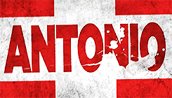
I like how they got rid of all the silver garbage in the background. Much more simplified and does a better job of standing out because of it.
|
|
|
|
Post by King Silva on Jul 23, 2012 17:00:31 GMT -5
Eh, it's by no means bad, but I just don't feel like it's anything special. I can appreciate the simplicity of it, but, at the same time, it just kind of looks unfinished. Agreed. I don't like it or hate it. It's just okay to me.  |
|
Unit/V-C2/4
Main Eventer
A Superior Country
Joined on: Dec 8, 2010 14:18:45 GMT -5
Posts: 1,668
|
Post by Unit/V-C2/4 on Jul 24, 2012 3:18:00 GMT -5
It's not bad by any means, but not completely new, either.
Basically a streamlined version of the previous logo, which I also grew to like, after not caring for it at first.
Just grateful to find out the scratch logo isn't going anywhere.
|
|