|
|
Post by Valbroski on Jul 10, 2014 21:31:57 GMT -5
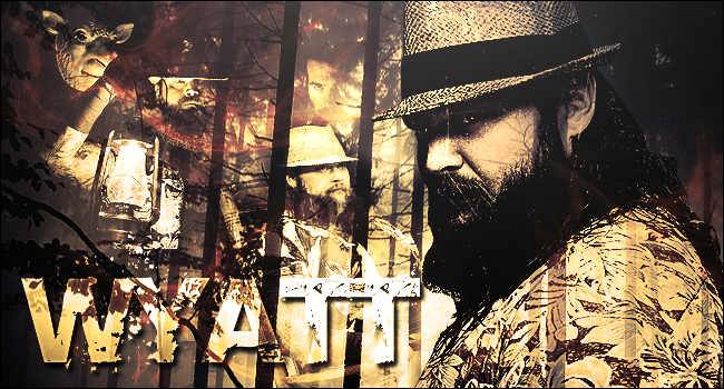 so I'm trying to get back into this but rusty af so any criticism/advice would be highly appreciated. also might be motivation for me to kick start doing crap like this again. Update: Threw this together today. on season 8 of dexter and It's quickly become one of my favorite shows. 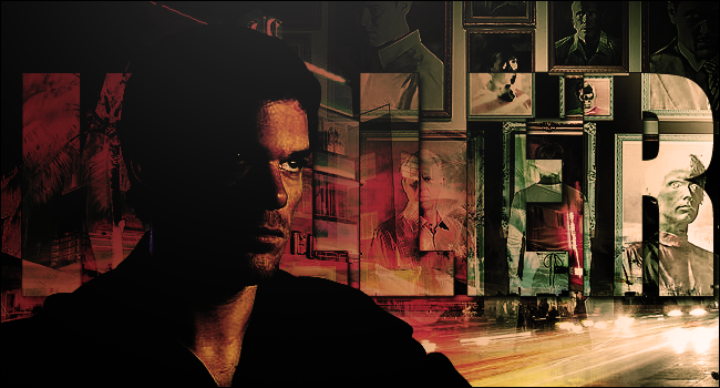 just to note the text is supposed to say "Killer". I know it's hard to read but I'm actually really happy with how it looks so I don't want to mess with it too much. Feel free to critique regardless though I'm still open to it. |
|
|
|
Post by /X Metal Sorenges x "Mac Oh J~ on Jul 11, 2014 10:20:39 GMT -5
I really like the look that you were going for here Valbroski. The dark deep bred southern forest feel that was portrayed in this graphic really emphases Bray Wyatt's persona imo. The way in which you executed the design was really sharp, but perhaps it would have been a little bit more appealing if you tuned down the contrast next to Wyatt's name just a tad. One key component in this that you may want to work on is productive blend overlays, I didn't seem that Wyatt/Harper suited in the position that they were placed within the graphic, but it wasn't that bad overall. Nice to see another one of your works Valbroski.
|
|
Deleted
Joined on: Apr 18, 2024 11:32:26 GMT -5
Posts: 0
|
Post by Deleted on Jul 11, 2014 23:57:35 GMT -5
I dig it, gj!
|
|
|
|
Post by Valbroski on Jul 13, 2014 19:03:00 GMT -5
Updated it with dexter
appreciate the feedback but if you're just gonna write good job I'd rather you just not reply, haha. Really want feedback I can use.
|
|
|
|
Post by ¡Twist Of Cinnamon! on Jul 14, 2014 3:08:34 GMT -5
Wow... I wouldn't have thought yellow would work for Bray but you made it. The dark and creepy vibe it has fits him perfectly. I'm not sure if it was your intentions but the pic of him holding the lantern does look like hes watching from the forest. The Dexter one is impressive as  . I love the frames of his victims and the inverted colours (I think) inside the text is a nice touch. The frames and the darkness give it a creepy vibe, much more than Brays. And again, you've captured the subject perfectly. You've got part of him in light with the rest in darkness. No rust at all, I always love seeing your work. |
|
|
|
Post by Valbroski on Jul 14, 2014 23:33:55 GMT -5
Wow... I wouldn't have thought yellow would work for Bray but you made it. The dark and creepy vibe it has fits him perfectly. I'm not sure if it was your intentions but the pic of him holding the lantern does look like hes watching from the forest. The Dexter one is impressive as . I love the frames of his victims and the inverted colours (I think) inside the text is a nice touch. The frames and the darkness give it a creepy vibe, much more than Brays. And again, you've captured the subject perfectly. You've got part of him in light with the rest in darkness. No rust at all, I always love seeing your work. Hey, thanks buddy! Appreciate the positive feedback.The inverted colors happened by accident and I just kinda left it because I didn't mind how it looked. Also the photos were a last minute decision, originally it was just Dexter in a dark Miami looking setting but idk I found the picture online and really thought it fit the piece nice. I'm trying to get back into this as motivation to get a portfolio together and try to get into the field. went to school for web design but have seriously been slacking in pursing an actual job but I'm more geared towards graphic design than coding. |
|


