Raine
Main Eventer

Joined on: Aug 8, 2006 12:11:52 GMT -5
Posts: 1,505
|
Post by Raine on Aug 19, 2014 8:03:44 GMT -5
Where is the $9.99 logo?
|
|
|
|
Post by punksnotdead on Aug 19, 2014 8:08:32 GMT -5
Good lord that's a lot of money. The only new title I would buy right now is the IC Title. These are so ridiculously over priced though. Replica belts should be like $200 or less.
|
|
|
|
Post by greenjack1992 on Aug 19, 2014 9:18:26 GMT -5
Beautiful.
|
|
|
|
Post by King Silva on Aug 19, 2014 9:43:29 GMT -5
I don't care for that logo much but I guess eventually I'll have to get it since I collect belts and still need the current WWE and IC Titles. that IC Title needs to come with a protective drool coating - looks amazing LOL I agree. It looks really nice and I am so happy Dolph is the current champion.  |
|
|
|
Post by Mr. PerpetuaLynch Motion on Aug 19, 2014 11:42:03 GMT -5
I wonder what the timeline is to get the new logo on the other replicas. I want the IC Title but don't wanna get it if it's going to be out of date already
|
|
|
|
Post by Kanenite on Aug 19, 2014 12:27:23 GMT -5
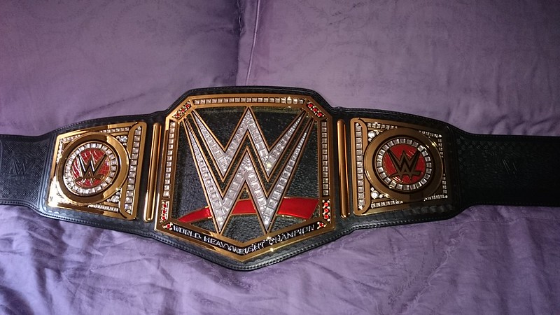
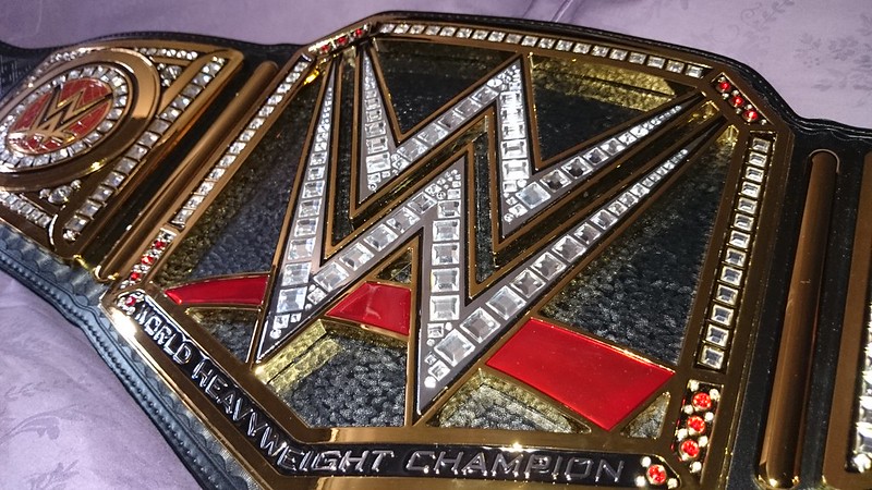
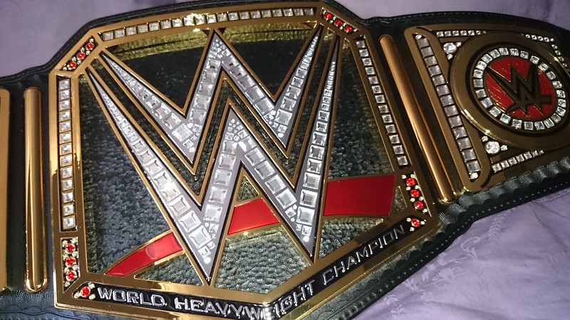
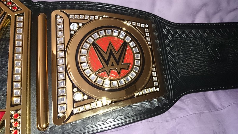
The "World Heavyweight Champion" part makes it look better than when we seen that leaked picture of it from a far distance.
I still prefer the older Scratch version though for the Logo and the more noticeable "Champion" banner. Also I like the WWE Championship name over WWE World Heavyweight Champion.
But all in all, not bad. I Don't hate it, and it still does say (World Heavyweight) Champion.
|
|
|
|
Post by perfectlyrude on Aug 19, 2014 22:11:51 GMT -5
This is the worst gimmick belt of all time. At least the spinner had an eagle. There's nothing traditional or regal about this belt.
No globe, no eagles no banner's it barely says world heavyweight champion. I NEVER EEEEEEVER....Thought I'd miss the spinner, but this belt made that happen. HATE IT!
|
|
|
|
Post by Adam on Aug 19, 2014 23:43:12 GMT -5
This is the worst gimmick belt of all time. At least the spinner had an eagle. There's nothing traditional or regal about this belt. No globe, As you can see, there are globes on the default sideplates. This is true. There are no "prestigious" birds on this championship. Why does every belt have to have a bird on it? Also true, but how many belts in history had banners? Unless I'm not clear on what you meant. The text looks about the same size as the Winged Eagle belt that is held up as the standard. |
|
amitdoc2b
Mid-Carder
Joined on: Nov 8, 2006 23:46:53 GMT -5
Posts: 146 
|
Post by amitdoc2b on Aug 20, 2014 0:02:40 GMT -5
What's the difference between the new commemorative and replica WWE heavyweight belts? Why is one cheaper than the other that justifies the huge price difference?
|
|
|
|
Post by The Mask of Truth on Aug 20, 2014 2:50:16 GMT -5
What's the difference between the new commemorative and replica WWE heavyweight belts? Why is one cheaper than the other that justifies the huge price difference? Commemorative is made of a hard plastic, the replica is made with metal plates and is heavier. |
|
becks007
Main Eventer
BELT MARK
Joined on: Aug 14, 2011 9:11:57 GMT -5
Posts: 2,185
|
Post by becks007 on Aug 20, 2014 4:41:56 GMT -5
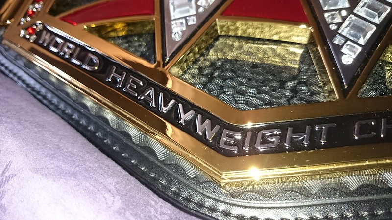
The words WORLD HEAVYWEIGHT CHAMPION looks really out of place on the belt and kinda sloppy. The CHAMPION banner was done so nicely on the previous Big Logo and looked really neat.. 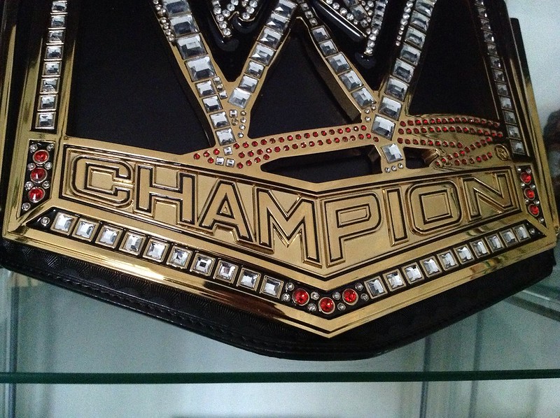 |
|
amitdoc2b
Mid-Carder
Joined on: Nov 8, 2006 23:46:53 GMT -5
Posts: 146
|
Post by amitdoc2b on Aug 28, 2014 18:22:35 GMT -5
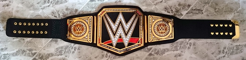
Is the WWE World Heavyweight Championship the same shape and dimensions as the previous WWE Championship? I am interested in getting the title diplsay case from WWE Shop but it says its designed for the old belt. From a visual perspective, the shapes look the same to me? Also, why are not the discount coupon codes working for the new WWE belt? It would have been so sweet if could get it signed by Brock and/or Cena.
|
|
becks007
Main Eventer
BELT MARK
Joined on: Aug 14, 2011 9:11:57 GMT -5
Posts: 2,185
|
Post by becks007 on Sept 2, 2014 11:52:18 GMT -5
Is the WWE World Heavyweight Championship the same shape and dimensions as the previous WWE Championship? I am interested in getting the title diplsay case from WWE Shop but it says its designed for the old belt. From a visual perspective, the shapes look the same to me? Also, why are not the discount coupon codes working for the new WWE belt? It would have been so sweet if could get it signed by Brock and/or Cena. Yes, they are the same size and length. That display case wld work just as well with the newer one.. |
|
Deleted
Joined on: Apr 29, 2024 10:20:32 GMT -5
Posts: 0
|
Post by Deleted on Sept 2, 2014 14:28:02 GMT -5
I adore wrestling belts. But the prices are a joke these days. The first wrestling belt that I purchased was the WCW Championship. It was the first belt to be made available. This was 1997 or so. My mom and grandmother each paid half and gave it to me as a birthday present. If I'm not mistaken, they ordered it from QVC and paid $75 each. That would be $150. This was 17 years ago during the .com boom. There was extra money to be had. It's insane to think that now the championships are $300 more and we (the US) are just emerging from a recession. It seems like the prices would have stabilized or went down. The belt is awesome though. |
|
becks007
Main Eventer
BELT MARK
Joined on: Aug 14, 2011 9:11:57 GMT -5
Posts: 2,185
|
Post by becks007 on Sept 9, 2014 23:49:33 GMT -5
|
|
Mr. K.O
Main Eventer
Joined on: Mar 24, 2010 19:04:14 GMT -5
Posts: 4,094
|
Post by Mr. K.O on Sept 9, 2014 23:58:38 GMT -5
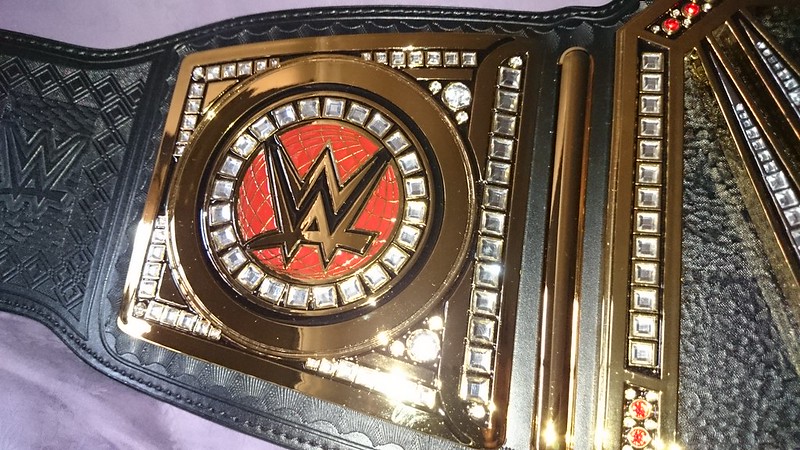
Nice man! It looks good there. I do wish they put something behind the center logo though, it feels so empty with it just being a leather backing. |
|
becks007
Main Eventer
BELT MARK
Joined on: Aug 14, 2011 9:11:57 GMT -5
Posts: 2,185
|
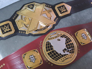
Post by becks007 on Sept 10, 2014 10:35:05 GMT -5
Here it is with my scratch Big Logo... 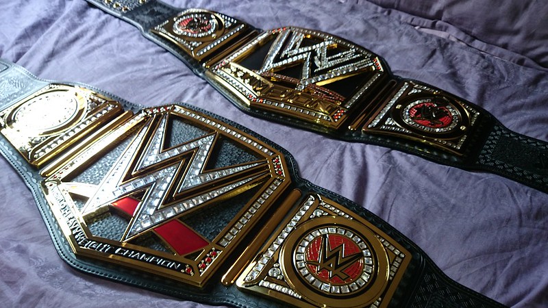 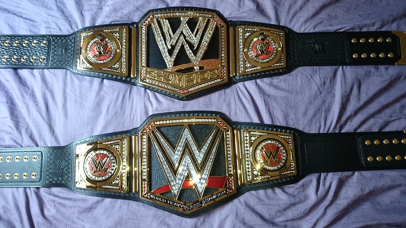 |
|
|
|
Post by HVMMONS on Sept 10, 2014 11:36:06 GMT -5
|
|
|
|
Post by Kanenite on Sept 10, 2014 16:20:35 GMT -5
Here it is with my scratch Big Logo... I personally like the Scratch Logo more than the Current logo, but I gotta admit the current version of the Big Logo title is more photogenic looking, due to the red in the logo really standing out. I think the Network version is really starting to grow on me, I might like it more than the older one. |
|