|
|
Post by Elliot on Nov 22, 2015 7:22:10 GMT -5
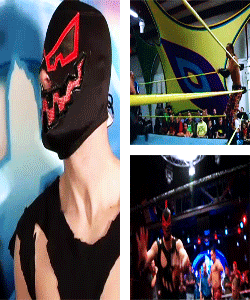
Made this a week or so ago.  |
|
|
|
Post by screech on Nov 23, 2015 4:50:28 GMT -5
I love everything about this except the placement of the Survivor Series logo. I think moving up the "25 YEARS" text and placing the SS logo underneath would be much more visually pleasing. I love your color scheme and the effects are great with the lights and the lightning. Your main image choice is excellent and the effect is bold and very effective. One other thing I would recommend is flipping the top left photo of Undertaker (in the hat) so he's facing inward and towards the right. This would create a pyramid effect in the way both sides have photos of Taker facing inward towards the middle. It would help the overall flow just that much more. Great work.
|
|
|
|
Post by Valbroski on Nov 23, 2015 12:47:16 GMT -5
I'd reduce the blue glow a little bit around Taker's neck and shoulders. That way the main pic of taker gets brought forward a little bit more and gives more depth for your graphic's background. Definitely would change the dimensions for the 25. If you're restricted because you're using a picture of a font instead of an actual font I would switch to an actual font. The 25 isn't wide enough and looks squished. I also wouldn't leave it bigger than the "Years" text because it looks top heavy. I would take advantage of the space you have at the bottom of the graphic and figure out a different text placement. The blending for the background pics is good, I like the lightning. There is an odd glow between the two top left pics of Taker that I would get rid of.
Overall pretty good man, just some little tweaks and it would be even better.
|
|
|
|
Post by ¡Twist Of Cinnamon! on Nov 30, 2015 5:24:59 GMT -5
Jinkies.
First off, I'm a sucker when it comes to blue / teal images like this and the grey tint tops it off. I like that you didn't go overboard with it and use blue lightning. The white compliments the blue lighting up the top, and the subtle flames above his arms are a nice touch too. I'm a bit mixed on the 25. It doesn't seem necessary to have it that tall because that along with the Survivor Series logo and the Years text makes it seem a little too stacked. And those stadium lights? Love it. I've used them before and they work great.
|
|
|
|
Post by Wicked on Dec 12, 2015 2:54:43 GMT -5
That is so nice. It looks really professional.
|
|
|
|
Post by Epic Z on Feb 1, 2016 23:01:49 GMT -5
This is awesome. I love the color scheme and think everything flows together nicely. Really like the text and font choice as well.
|
|