buddyboy101
Superstar

Joined on: Dec 26, 2004 12:34:57 GMT -5
Posts: 926 
|
Post by buddyboy101 on Dec 21, 2018 1:19:01 GMT -5
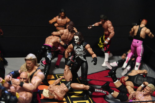
So far Mattel has released three figures of the Undertaker in his debut grey attire (ok ok ok....only 1 in his dark grey gloves  ). Anyways, here are all three for comparison. The first is the Entrance Greats (2011). The next is from the Wrestlemania 31 Heritage line (2015). And the third is from the Fan Central Battle Pack with Sting (2018). It's been debated, but it is believed that all three share the same scan. The second and third are definitely the same scan. I still go back and forth on the first. Either way you can tell how Mattel has really taken so many shortcuts over time. The first paint job is immaculate. The second is meh. And the third looks like Sensational Sherri lol. And yet Mattel includes a bunch of throwaway accessories like a comical purple shovel, a tombstone (kinda cool), and a freakin surf board...wtf. Why this budget was not spent on the figure itself and a quality paint job is beyond me. I also don't care for the eras portrayed in the Battle Pack. Nobody in their right mind fantasized about Taker and Sting facing off in 91. It was not until Sting tapped into his darker Crow character in 96 that fans clamored for the two to clash. I think purple era or all-black Taker against this Stingwould have been pretty sweet. Anyways, here are the pics. Enjoy!   |
|
Papi Joker
Main Eventer
INTERNATIONAL COLLECTORS LIVES MATTER
Joined on: Feb 23, 2016 23:56:30 GMT -5
Posts: 1,520
|
Post by Papi Joker on Dec 21, 2018 1:52:25 GMT -5
The first head is the best one, but he is tanned!!!!!!!!!!!!!!!!!!!
|
|
Deleted
Joined on: Apr 25, 2024 12:44:46 GMT -5
Posts: 0
|
Post by Deleted on Dec 21, 2018 1:55:12 GMT -5
Even though it is a different headsculpt you should include the TNF Taker to that lot.
|
|
|
|
Post by PJ on Dec 21, 2018 6:22:06 GMT -5
See now I always though surfer Sting vs The Undertaker made better sense than crow Sting vs Undertaker. While the crow gimmick vs the deadman works I think Surfer vs Debut Taker works better with the Light vs Dark or good vs evil angle. Sort of like how people always love a Superman vs Batman story because they are so opposite.
|
|
slaughendazs
Mid-Carder
Joined on: Dec 10, 2018 17:25:09 GMT -5
Posts: 67
|
Post by slaughendazs on Dec 21, 2018 6:33:08 GMT -5
Wow that head on the EG is so much better!
|
|
|
|
Post by Thought Collector on Dec 21, 2018 7:31:41 GMT -5
The first one def. looks the best I think. The paint looks great and they captured the expression/persona really well. And I love that they gave him the darker grey gloves like he had very early on. But the cloth outfit is a big take away though imo. It makes him look more like Viscera. I think the overall look of the middle one is the best. Despite the rigid plastic of the coats that I've seen complaints on, I think it just makes for a much better displayed figure.
|
|
|
|
Post by Mongo Bears on Dec 21, 2018 7:35:21 GMT -5
The last one looks like bobcat goldthwait
|
|
buddyboy101
Superstar
Joined on: Dec 26, 2004 12:34:57 GMT -5
Posts: 926
|
Post by buddyboy101 on Dec 21, 2018 8:40:15 GMT -5
Even though it is a different headsculpt you should include the TNF Taker to that lot. The TNF figure is based on WM13, which is five years after the era pictured. I did not include it since the scan is totally different and based on completely different reference material. The first one def. looks the best I think. The paint looks great and they captured the expression/persona really well. And I love that they gave him the darker grey gloves like he had very early on. But the cloth outfit is a big take away though imo. It makes him look more like Viscera. I think the overall look of the middle one is the best. Despite the rigid plastic of the coats that I've seen complaints on, I think it just makes for a much better displayed figure. Yeah the soft goods on the EG are way too baggy, but I'm will to forgive it for the detail that went into the face. |
|
|
|
Post by Mongo Bears on Dec 21, 2018 8:54:22 GMT -5
This reminds me I’m still waiting for Mattel to give me my undertakers missing tie  |
|
|
|
Post by stc13 on Dec 21, 2018 9:25:42 GMT -5
Even though it is a different headsculpt you should include the TNF Taker to that lot. The TNF figure is based on WM13, which is five years after the era pictured. I did not include it since the scan is totally different and based on completely different reference material. The first one def. looks the best I think. The paint looks great and they captured the expression/persona really well. And I love that they gave him the darker grey gloves like he had very early on. But the cloth outfit is a big take away though imo. It makes him look more like Viscera. I think the overall look of the middle one is the best. Despite the rigid plastic of the coats that I've seen complaints on, I think it just makes for a much better displayed figure. Yeah the soft goods on the EG are way too baggy, but I'm will to forgive it for the detail that went into the face. The TNF figure is definitely not WM13. By that point, Taker had full sleeve tattoos on both arms. The tattoos on the TNF figure match up with the elbow high tattoos he had from '93 through the casket match with Yoko at RR 94 before he returned in the purple. The head isn't perfect for that era, but it is what it is. |
|
buddyboy101
Superstar
Joined on: Dec 26, 2004 12:34:57 GMT -5
Posts: 926
|
Post by buddyboy101 on Dec 21, 2018 10:07:33 GMT -5
The TNF figure is based on WM13, which is five years after the era pictured. I did not include it since the scan is totally different and based on completely different reference material. Yeah the soft goods on the EG are way too baggy, but I'm will to forgive it for the detail that went into the face. The TNF figure is definitely not WM13. By that point, Taker had full sleeve tattoos on both arms. The tattoos on the TNF figure match up with the elbow high tattoos he had from '93 through the casket match with Yoko at RR 94 before he returned in the purple. The head isn't perfect for that era, but it is what it is. The artwork on the box is from 96 era Taker. The scan is also fro m Mattel's 96 era Taker. To me this trumps a less major detail like tats. And even if you want to go there, Taker had the full sleeves in 96, yet Mattel's figure based on this era did not have the tats. So you can't hang your hat on that. |
|
|
|
Post by Gorilla on Dec 21, 2018 10:11:32 GMT -5
I'd take the entrance greats head and put it on the WrestleMania heritage line body
|
|
|
|
Post by Artie Kendall on Dec 21, 2018 10:28:54 GMT -5
I'm not entirely sure what figure you linked to that is a basic but the Elite 22/Legends Taker in purple has full sleeves. |
|
|
|
Post by GreyHaze:Big Bad Booty Daddy on Dec 21, 2018 10:47:14 GMT -5
The entrance greats has the best paint job as far as that goes, but it’s slightly ruined by the inaccurate skintone which was corrected later on. The wm fb takes is good except that I feel that the torso is way too slim for Taker period. Taker was always a bit heavy imo and his mattel figures are usually a bit too slim. I get that they’re idealized, but some of parts look unproportionate when they start changing physiques. The battle pack I didn’t understand either... We never got the actual match and it’s also a shame that the fantasy figures didn’t match the era most people wanted them in. If it were up to me I’d make them elites. Sting in his ‘98 singlet with a new thicker singlet, new scan with his hair covering his ears, DM jacket and new NON WOODED bat and a late 90s undertaker with a new kickpad mold.
|
|
|
|
Post by stc13 on Dec 21, 2018 11:05:00 GMT -5
I'm not entirely sure what figure you linked to that is a basic but the Elite 22/Legends Taker in purple has full sleeves. The basic has the half sleeves, which Taker had in 94 when the purple look debuted. By the time he ditched purple, they were full sleeves. So I think Mattel is intentionally offering figures that offer slight differences by year, of course within the limitations of their budget. I think the tattoos are a pretty clear way to id the year the figures represent, because realistically we aren't going to get brand new head sculpts on every Taker. With the number of Taker figures they've made, I think it's cool to see the evolution of the character, even if the figures aren't perfect. |
|
cantu1984
Superstar
Joined on: Sept 16, 2005 2:21:37 GMT -5
Posts: 801
|
Post by cantu1984 on Dec 21, 2018 12:48:46 GMT -5
Wish we could get that Undertaker coat again.
|
|
|
|
Post by qdogg on Dec 21, 2018 20:06:40 GMT -5
I want to see a basic Taker with a molded on gray tie or see the gray tie again with a elite figure
|
|
tenup
Superstar
Need to draw more
Joined on: Oct 2, 2007 14:00:40 GMT -5
Posts: 795
|
Post by tenup on Dec 21, 2018 20:49:32 GMT -5
Always wanted the hair covering the eyes look. Interesting topic.
|
|
|
|
Post by Glorydaysofwrestling on Dec 21, 2018 21:21:56 GMT -5
Always wanted the hair covering the eyes look. Interesting topic. Same here |
|