|
|
Post by greenjack1992 on Jun 23, 2020 3:19:13 GMT -5
|
|
|
|
Post by McBlake on Jun 23, 2020 5:10:19 GMT -5
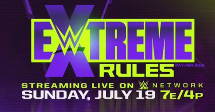
I'm not sure how I feel about the new Extreme Rules one, seems kinda strange to make it now that Matt is in AEW.
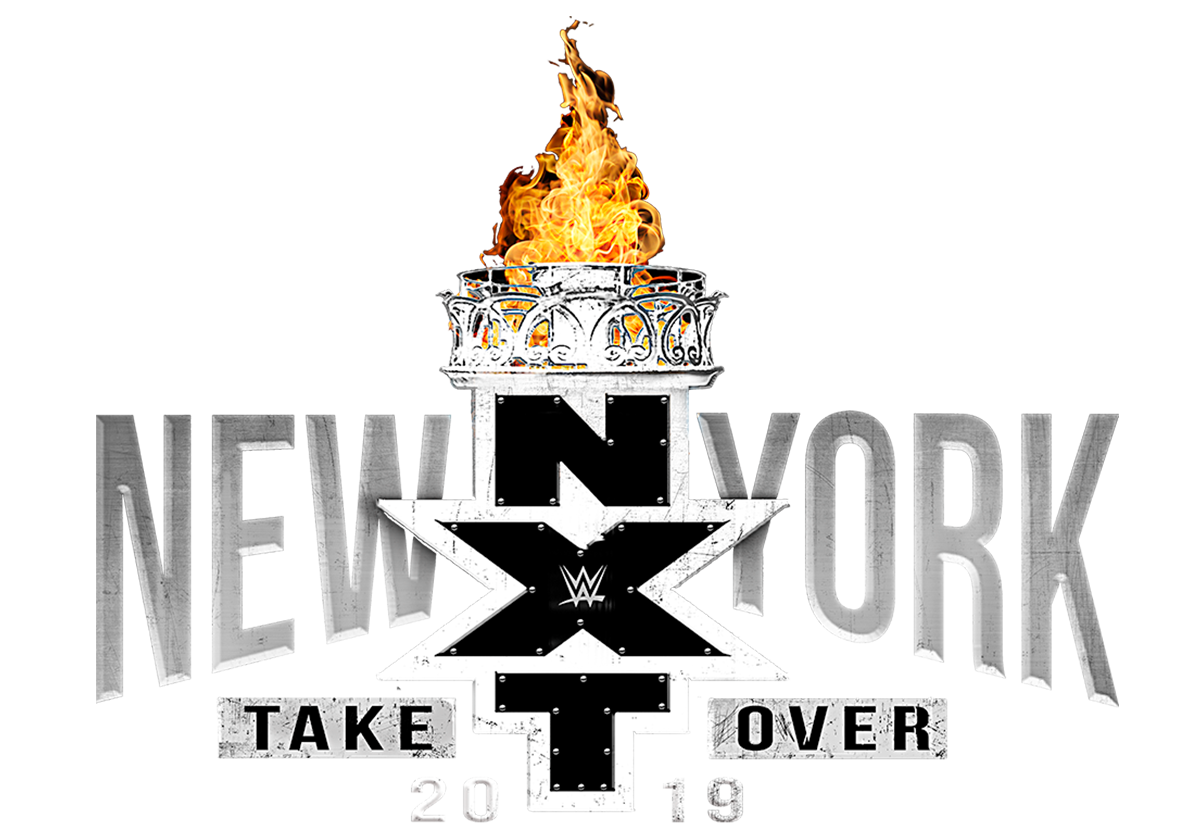
The Takeover In Your House one is actually one of my favourites, and I'm not even that nostalgic towards the old In Your House events.
As for the worst, surely the original Great Balls of Fire needs a shout. The one that actually featured a cock and balls before they realised and changed it.
|
|
|
|
Post by Decky on Jun 23, 2020 5:36:02 GMT -5
Lost me at Takeover In Your House lol its awesome!
|
|
|
|
Post by LA Times on Jun 23, 2020 5:37:05 GMT -5
The great balls of fire penis and balls logo
|
|
|
|
Post by finnbalor1 on Jun 23, 2020 6:10:58 GMT -5
I'm not sure how I feel about the new Extreme Rules one, seems kinda strange to make it now that Matt is in AEW. The Takeover In Your House one is actually one of my favourites, and I'm not even that nostalgic towards the old In Your House events. As for the worst, surely the original Great Balls of Fire needs a shout. The one that actually featured a cock and balls before they realised and changed it. I agree I really liked the In Your House one too. Don't know which is the worst but the Extreme Rules one is up there. |
|
|
|
Post by LK3 on Jun 23, 2020 7:36:53 GMT -5
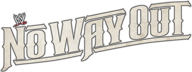
I think the Extreme Rules logo is bad in the sense that it doesn’t give off the impression of anything being extreme. Not that anything “extreme” would happen anyway, so maybe it’s perfect. But just looking at it as a logo I think it’s fine. That No Way Out one is bad, as well as Stomping Grounds.
|
|
voicesinmyhead
Main Eventer

Joined on: Mar 4, 2009 19:21:00 GMT -5
Posts: 1,526
|
Post by voicesinmyhead on Jun 23, 2020 7:44:56 GMT -5
I don't see a problem with either NXT Takeover logo, but the first three logos you posted are definitely rough. The No Way Out one makes sense with the poster for that event, but it definitely does not work on its own.
|
|
|
|
Post by ~ Cymru ~ on Jun 23, 2020 9:04:12 GMT -5
The new extreme rules logo just makes me think of the Hardys.
I actually like the slightly "Western" font of No Way Out. I can't remember a stand out poor logo but after seeing the stomping grounds one I'll vote for that.
|
|
|
|
Post by Valbroski on Jun 23, 2020 9:09:40 GMT -5
Most of them. Also any changes that were ever made to Raw and Smackdown logos in recent years have been garbage.
|
|
|
|
Post by Ben - #6 Munchie on Jun 23, 2020 10:51:55 GMT -5
That IYH logo is fantastic imo
|
|
|
|
Post by tylerbreezee on Jun 23, 2020 11:19:43 GMT -5
2014-2019 extreme rules logo was a lot worse than this one
|
|
|
|
Post by kennyw86v2 on Jun 23, 2020 20:57:39 GMT -5
It's pretty bad. At a quick glance it reads Ewtreme Rules. Nice
|
|
hbkowns
Main Eventer
Joined on: Aug 15, 2011 23:33:52 GMT -5
Posts: 4,257
|
Post by hbkowns on Jun 23, 2020 21:15:52 GMT -5
Only 2 of the 5 you put up there are “bad”
|
|
|
|
Post by RuthlessFigs on Jun 24, 2020 0:34:23 GMT -5
I like a good Purple/Green combo, but for Extreme Rules it just doesn't work, at all...
As for other logos, i never liked these:
- Great Balls of Fire
- WrestleMania 21
- The Bash (2008-2009)
- Every SummerSlam logo after the Green 'S' was retired (2009 - Present)
- Breaking Point
|
|
|
|
Post by rkmo: Cheats & Geeks on Jun 24, 2020 0:59:16 GMT -5
It's pretty bad. At a quick glance it reads Ewtreme Rules. Nice Superliminal advertising lol |
|
|
|
Post by hbkjason on Jun 24, 2020 2:14:07 GMT -5
The logos like the sets these days and many of the actually PPVs themselves just lack personality. The whole thing is so sterile and manufactured that it is just very off-putting and unappealing to me.
|
|
ℍ𝕒𝕣𝕕 𝕋𝕠 𝕂𝕚𝕝𝕝
Main Eventer
ask me about how Verizon owes me over $4,000
Joined on: Nov 4, 2016 15:44:22 GMT -5
Posts: 2,528
Member is Online
|
Post by ℍ𝕒𝕣𝕕 𝕋𝕠 𝕂𝕚𝕝𝕝 on Jun 24, 2020 11:51:32 GMT -5
I actually love this year's Extreme Rules logo and color scheme, and the TakeOver: In Your House is awesome, I think.
I think there are some pretty cheesy WrestleMania logos. The ones that are too heavy on the theme always make me think they won't stick very well. The early WM logos were iconic no matter where the event was held. The logos for like WM27, WM29, WM32, WM33 were bad. Maybe even WM36.
Stomping Grounds was pretty bad. I hated that Backlash 2018 logo with the big red L. There are some logos that are just lame because of lack of creativity, like Roadblock, Night of Champions, Payback, Battleground. They just aren't exciting on a poster or on a stage set.
|
|
toki
Main Eventer
Joined on: Jan 7, 2017 16:50:47 GMT -5
Posts: 4,101
|
Post by toki on Jun 24, 2020 15:03:22 GMT -5
I hated that Backlash 2018 logo with the big red L. There are some logos that are just lame because of lack of creativity, like Roadblock, Night of Champions, Payback, Battleground. They just aren't exciting on a poster or on a stage set. i'll see your 2018 backlash logo and raise it with a 1999 iyh: backlash logo 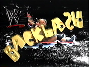 |
|
|
|
Post by Fighter Hayabusa on Jun 24, 2020 15:13:33 GMT -5
WrestleMania 14 X rated cube is bad.
|
|
|
|
Post by theoutlaw1999 on Jun 24, 2020 20:02:02 GMT -5
I was never a fan of the giant green Summerslam logo used in the 00's.
|
|