|
|
Post by classicfan on Dec 20, 2006 17:43:40 GMT -5
|
|
|
|
Post by Cass on Dec 20, 2006 17:54:07 GMT -5
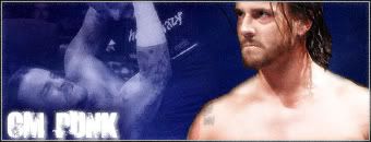
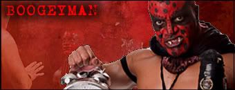
bad cuts on all of the main pics except for punk and mysterio, the worst cut being kennedy and the worst sig being kennedy because the tkenton bomb covers most the left pic, the outline on edge looks stupid because of the bad cut.
The best is the punk and mysterio sigs, mysterio could some better text and punk could sue some easier text to read, try downloading some brushes for your program w/e it is and try not to use the main pic to cover up most of the bg pic, and not use the bg to cover up the pics in the bg and the bg on eddie just looks horrible for the effect
|
|
|
|
Post by classicfan on Dec 20, 2006 17:58:45 GMT -5
do u ever have anything good to say?
|
|
|
|
Post by Cass on Dec 20, 2006 18:05:09 GMT -5
for good stuff, yes
|
|
|
|
Post by Mr. PerpetuaLynch Motion on Dec 20, 2006 20:05:49 GMT -5
Awesome response. And to be honest, I agree with Cass here, the cuts on the majority are pretty bad with the exception of Punk's and Mysterio's. I can't tell WHAT the hell is going on in the Ken Kennedy one and the Main pic is TERRIBLE. The Eddie one is... odd, what the hell is in the Back Ground? looks like a phone cord. The glow on Edge looks bad, take it off. The Boogeyman one is alright. In conclusion, make things in the background atleast slightly visible. Don't just take random crap and toss it in the BG and like Cass said, don't use Pics to cover up like half the Background... |
|