Importracer
POSSIBLE BAD TRADER
Joined on: Dec 1, 2006 18:36:40 GMT -5
Posts: 1,383
|
Post by Importracer on Jun 4, 2008 22:13:45 GMT -5
Shouldn't you tell them you were inspired by the fake Diesel i did last year...lol...you probly don't even remember that No must have been around the time i was out of customs.if you have a link send it to me i would like to see it. |
|
|
|
Post by The Canadian Killer Deen on Jun 4, 2008 22:26:18 GMT -5
wait a minute
that devon guy voted for gonzo in his post but angus quoted him voting for me
im confused
|
|
|
|
Post by pimpmaster5000 on Jun 4, 2008 22:36:02 GMT -5
wait a minute that devon guy voted for gonzo in his post but angus quoted him voting for me im confused i qouted him cause he had the matches typed out and i was lazy but i changed the votes to how i feel they should go so they are my votes in the qouted passage |
|
The Watcher
Main Eventer

Joined on: May 1, 2006 10:16:01 GMT -5
Posts: 2,331
|
Post by The Watcher on Jun 4, 2008 22:39:54 GMT -5
OK i havnt posted anything in the comps for a while i hope to be in the next 1 but for now ill do a bit of judgeing....
Match 1
The CW match.... KO you did pretty good i really liked your shane its been said how the trunks could have been cleaned up a touch as they dont look as neat as they could have been,but apart from that a solid custom. Celtics #1 fan yours was a nice figure also you did alright it was realitvly neat keep it up. Peace to the gods i like your aj. its nice clean but the skin painting looks blothchy to me it might be my eyes but the shorts and boots dont so im guessing its the skin tone, im not a big lover of painting the skin but i know it involes alot of work. keep it up mate a solid custom from you there. Onto abyss... i like the 100% originality as ive never seen that torso used for him but imo i dont think it works, i love the moulding but when you have finished moulding it try sanding it down a little to make it smoother as the paint looks alot better on the mold. all in all nice custom. hmm tough choice as you have all done well keep it up and my advice is to try be as adventrous as you can next time. my vote goes to KO
WINNER: KO
Match 2-
You both did awsome in this match. Texacide did great with the whole lot. The part choices were great. It has a real factory produced look to it and im really impresed with the demin painting on the jeans not many people can pull it off (im one of them LOL) but you did it perfectly..... Gonzo you did really good on this one. The sculpting is top notch as usual as i love seeing your work, I like the head molding and the painting on the attire. and i like how he is only half posed. another great match but my vote goes to Texacide. i try to make my customs look like they belong with my collection I.E not to much detail but not little and i think Texacide has done the same with hi necro butcher i think that would look ace in anybodys collection.
WINNER: Texacide
Match 3
AMAZING AS USUAL!!!!!!!!! famousj dous amazing work as usual but this Homicide takes the cake. famousj's sculpting and skintone is the best ive seen PERIOD!. I love that tattoo work on Homicide and his intence attention to detail. All in all Amazing job.
NYDREAM i think you are coming on great, the difference in your customs each time is getting better and better, your custom was a real surprise to me as it really looked nice, as you proberly know im not a fan of painted skin tones but i think if you left the skin tone and took abit more time in preping the modding before you painted it would have been a bit better keep it up dude i look fwd to seeing more from you in the future.
WINNER: Famous J
Match 4
Gonzo's Steiner is really awsome. The sculpting he did on the body and the molding on the head is a real nice touch to the custom you did it so well. The little goatee sculpt is class and really well done and i know frm experience that its a pain in the ass when trying to sculpt something coming off a body part as it likes to bend out of shape. but awsome work. The logos on the attire are really accurate and look really good the only thing i dont like are te lower legs on the boots they really scream ttl to me but apart from that solid custom.
TCKDeen i like the idea or the custom Eddie. It is very smooth and looks really clean. The parts choices were perfect and all of your joint sculpting is good too. The paint job is really neat and im likeing the whoe thing. This was a real hard choice but im going to go with gonzo as i think it just looks that little bit nicer
WINNER: Gonzo
Match 5
When i first saw this, I was like OMG that Ozzy is AMAZING. I thought i have to have it if not just the head and id stick it on the pink suited biilly graham lol. The head is a great mish mash of parts that turned out beautifully. the painting then on from the parts it started as just made the character.. I never saw the body until now and i like the body parts choices he gave to him, which gave him the accurate look. Its a shame warsman didnt turn in but with the site being down im sure there were problems and guess as to what was going to happen, but gutted for you to win by forfit as this was truley an amazing custom, you are one of my favs. keep it up dude.
WINNER: Rozz
|
|
becca
Main Eventer
Joined on: Dec 13, 2005 11:20:18 GMT -5
Posts: 4,042
|
Post by becca on Jun 4, 2008 23:11:13 GMT -5
Deen vs. Gonzo
Gonzo: This is one of your better customs, imo. I like the tattoo work and the head is great. Skintone is good too. However, I am really let down by the painting of the red. The kneepads look like they could use another coat, and the pants don't look so smooth. The black diamond logo looks pretty bad. I don't get how you could do the more difficult logo so much better. Take your time, I guess, and always reevaluate. Finally, the sculpting of the back just seems to cut off, you know? it looks very off, particularly from the front.
Deen: I think you did a great job posing this, making the joints look really smooth. Your sculpting has gotten way better. I think you drybrushed the pants for some texture or something, which worked to an extent. However, you didn't really give us that good of shots of the design, and they just don't look that crisp. The head is a bit bizzare looking for some reason as well. The belt looks pretty nice though, and the kneepad sculpting was great.
Winner (of a close one): Gonzo
CW TITLE MATCH
Angus - you brought a great effort here. Way to step it up for your title match. The likeness is good, good modding, and the tattoos look good as well. I can't really attest to their accuracy though. What I don't like here is that I think he looks skinnier than he should, and the TTL legs contribute to that. Also, despite the good likeness, I think he doesn't look old enough for the recent Smackdown appearance.
Titan - The body on this looks great, the painting is good. Stripes down pants are fecking hard and you pulled it off well. The likeness is pretty good, the glasses definitely are a great touch. However, I feel like the face is a little lopsided or something, and the head fro the side looks a bit too wide, which gives away that this was a transplant. We shouldn't be able to tell.
Winner, and still champ, Titan. But BRK you should be proud of a good figure and a closer match than many might have thought.
IC TITLE MATCH
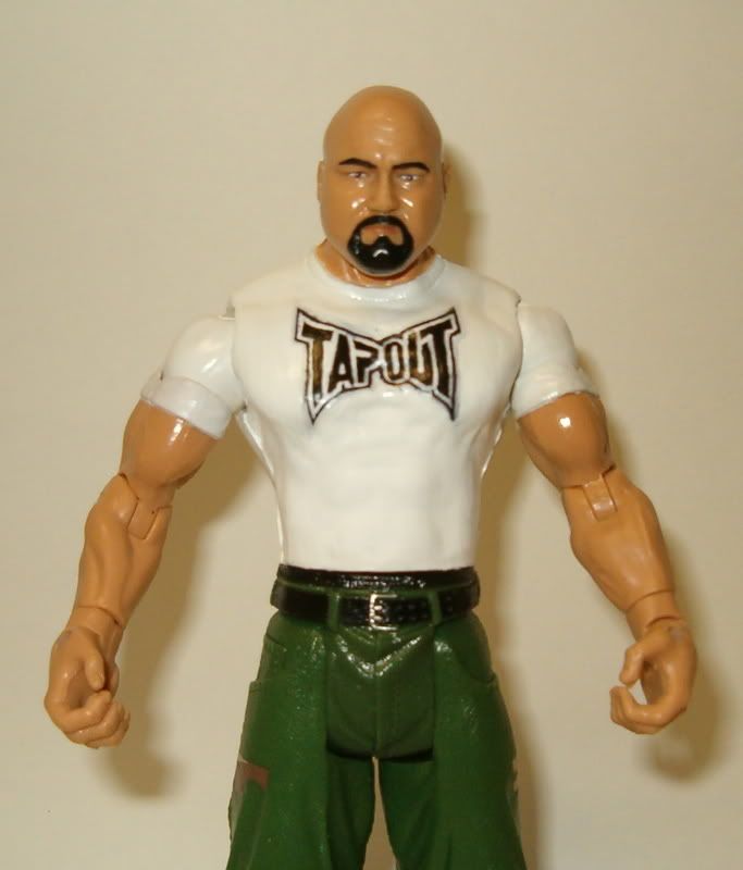
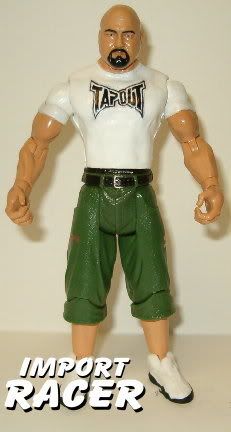
Import - Fake Diesel, lol. This is really good, very clean and basically flawless. Probably some of the best tassles I have seen on Diesel/Nash figure. A vest would have been a nice touch.
Gate - Well, what can I say. I don't care what Guster says, because I haven't been on the board for 7 years to see the two other half-and-half customs, this really blew me away. I mean, it could've gone south really quickly, but the seams between each half are so perfect, and the thin sculpting on Doink's bodysuit/head thing is really expertly done. The chest hair looks jakks-done (or better) and the accessories just top it all off. To nitpick, the color roll of the jeans doesn't look exactly right, like it would look a bit different - it doesn't look like a lighter version of the jeans color.
Winner, and still champ: Gate. Import, it's hard to vote against a really flawless custom, but when you have two, originality and "wow" win out.
HEAVYWEIGHT TITLE
Beyondo - Skintone is too dark for Link. I am leading with this, because I really love everything else. The texture on the under shirt and the hair is fantastic, and the depth of painting really emphasizes that. Really, a fantastic figure, if the skintone was better, it would be perfect.
Gore - The sculpting on the hair and armbands is really, really impressive here. I love the hair actually, because the way it sticks out from the body is like just how video game hair like, floats. The accessories are great, and the sash looks good. I am not sure that people are appreciating the modding done to the pants and shoes, but they are sculpted really nicely. I guess my big issue is in the painting of the pants, which in parts looks a bit shaky.
Winner, and new champ: Beyondo. Gore was close, but the overall smoothness and finish goes to Beyondo. I look forward to seeing another match between these two.
|
|
Importracer
POSSIBLE BAD TRADER
Joined on: Dec 1, 2006 18:36:40 GMT -5
Posts: 1,383
|
Post by Importracer on Jun 4, 2008 23:20:13 GMT -5
Gate i want to take this time to applaud you for a great one of a kind custom.All i can say is you always bring your best to face me.The 2 matches we have had you have done your best work.And i really enjoy working matches with you.
Is voting over i have only seen nelly and becca vote
|
|
|
|
Post by NYdream™ on Jun 4, 2008 23:21:57 GMT -5
Gate i want to take this time to applaud you for a great one of a kind custom.All i can say is you always bring your best to face me.The 2 matches we have had you have done your best work.And i really enjoy working matches with you. Is voting over i have only seen nelly and becca vote im assuming hat voting ends when all the judges have all voted |
|
|
|
Post by The Dude on Jun 5, 2008 3:36:17 GMT -5
Famous J gets my vote
|
|
|
|
Post by oozingmachismo on Jun 5, 2008 9:51:42 GMT -5
CW Open:
NYDream's Abyss - Overall, I think this is a nice looking piece. I like that you chose to go with DA parts, since Abyss seems to usually have that bowlegged look to him. Nice touch. I can see why you chose the Umaga torso for its thickness, but it does look a little too round at the belly. A little more texture to the hair would've been nice, also. Great work on the tats, and I like the mask. You also did a very good job on the edge of the hair, giving it alot of "stringiness". Painting looks fine too, no real complaints there. Great entry, Dream!
Peace to the Gods's AJ Styles - This is a very well finished figure, and looks great, but I agree with the previous assessments of it being a little too simple. A different attire with a few slightly more colorful and complicated logos would've pushed this figure forward big time. The painting is done very, very well with a nice skintone and smooth touches all the way around. I keep going back and forth on the head - from some angles it looks alot better than others. I do wish you could have jazzed up the front of the hair a bit too, maybe giving it a bit of a flip. NO big deal, though. But like I said, overall, the finished product does look great, if a bit simple.
Celtic Fan's Colin Delaney - I like the head choice here. Nice resemblance. The addition of the body tape is cool and looks realistic and not too bulky, as can happen with stuff like that. It also covers up the ripped-ness of the CW torso. Clever! I think Regal arms would've been the way to go for Colin, however. The painting looks nice on the pants (nice drawstring!!) except in the crotch area - it looks like some black and red paint might've rubbed off around the joints. The finish on the tights looks to be a bit too much, also. A less glossy sealer might be the way to go in the future.
KO's Franchise - I love a Shane Douglas figure, but honestly, the painting here looks a little rushed, most noticeably around the tights. Some more careful coats of yellow could clean this up a bit. Also, I appreciate that you attempted to blend a few different colors for different shades of hair color. Nice idea, but it looks like it could have been blended a little better. Try not to lay the upper layer on so thick in the future, or try to choose colors that are a bit closer in shade. The blend will look much more natural. I also appreciate the tassles, but I think they could've been cut a bit thinner. I do love the logo on the back of the trunks though. The lines can be straigtened out a bit, but I think the "F" looks great. I think there's alot more going on with this figure than meets the eye, and you should be commended for that, dude. Keep up the small stuff you did here, but just take your time on it on your next fig.
I'll be checking in today and tomorrow when I can to give thoughts on the rest of the matches.
|
|
Peace To The Gods
Superstar
Destined To Be The Greatest Intercontinental Champion Ever...
Joined on: Jan 24, 2002 17:25:37 GMT -5
Posts: 518
|
Post by Peace To The Gods on Jun 5, 2008 13:02:18 GMT -5
Oozing: When AJ first debuted in TNA he rocked bangs for a solid amount of months. If it was the flip, i woulda just left the existing hair... Thanks glad you like it. Im all about painting and smoothness..
|
|
|
|
Post by Gore on Jun 5, 2008 14:04:07 GMT -5
As far as the cruiser matches go, I'm very impressed with PTTG's AJ Styles. Judging by this figure, I could easily see him making a jump into the IC division in the near future. Granted I haven't seen how is sculpting/detailed logo painting skills are, I'm still very impressed.
I wouln't say any of the figures are bad by any means, and it's really neat seeing these younger guys improve.
|
|
Gonzo Customs
Main Eventer
Joined on: Dec 24, 2001 4:51:46 GMT -5
Posts: 4,056
|
Post by Gonzo Customs on Jun 5, 2008 14:21:03 GMT -5
No voting on my part, just reviews.
Nydream - Your improvements continue to show with every custom you make. The mask is very well done as is the hair sculpt. The hair is lacking a little detail and I'd like to see the hair have a two toned shading for more realizm. Sculpting appears very smooth compared to your previous, though it's rough in a couple spots. Your painting is very clean and looks very good. I like the detail on the shirt adding the metal buttons on the shoulder. Great job.
Peace - This figure looks very simply done, but is very smooth and clean. I can't tell if there was any sculpting done or not, as I do not know what the AJ head normally looks like. The AJ and diamond on the shorts are well done. I really like the skintone as well. Great job
KO - I'm still iffy on the head on this one. It works, but it's not quite there. The hair color is still off. I think it should have been more yellow, with just a light dry brushing of brown in the mix. The addition of the tassles to the boots helps this figure. The logo on the butt looks well done as well. Too bad you were unable to make the jacket as you planned, maybe we'll see that soon. Great job.
Match 2
Texacide - Once again another smooth and clean custom. I really like the head choice and parts choice on this one. Tats are well done and looks great. This really does look like it came out of the factory.
Myself - The semi posed is something I've done before and I think it helps keep it a figure vs a statue. I don't know why, but somehow I do it almost every time, but the figure is leaning awkwardly forward, same thing happened on my Steiner a month or so ago. The beard sculpting is a tad too thick and needs to be shaved down a bit. The hair sculpting looks too square an needs to be sanded or resculpted to be more round, like a normal head would be. Otherwise I'm happy with the figure, though it's not perfect.
Match 3
FamousJ - Konnan - The Konnan is superb. Everything on this figure looks perfect. The chest hair to me is the standout part as chest hair is very hard to nail. Sculpting is great all around as is the painting.
Famous J - Homicide - Again, another superb figure. Sculpting looks perfect. I like how you did the shirt tied at the shoulderes and not just a regular sleeveless shirt. Paintjob is flawless.
Nydream - I know this one was made long before the abyss and it shows. Definitely an improvement from the custom before, and definitely see the improvement from this one to the Abyss. Sculpting is a bit chunky in places and so is the paint. However I really dig the shorts designs you did them nicely. There's a bit of rough on the designs, but as you do more you'll figure out how to get rid of that. Great job.
Match 4
Deen - I really like how you captured this one. The pose is great and pull off well. Your sculpting of the joints seems to be done very well and looks natural. I really like the hair sculpt on the back of the mullet, gives it that vibrance to the hair. Two things I do not like about the figure are the skintone, seems it should be a slight bit darker, but that's minor. The other is the side logos. There are no good shots of it to really tell if it was done well. From the picture given it looks good, but at the same time looks rough.
Myself - Overall I am happy with this figure and I would say it's one of my favorite Steiners I've done(of the 19 or so). I'm not particularly fond of the Jakks Steiner scan but I had one and decided to use it. I painted over the eyes on accident and ended up messing up the overall look of the figure because of it. One lat is sculpted thicker than the other and it stands out unfortunately. The only logo I was not happy with was the Diamond with the face. The white border was a bit shakey and I somehow got a black dot in the glasses, sometime between painting it and doing some touch ups. Another coat of red on the tights and the kneepads would help, but does give it that weathered in ring look. The chainmail was something I wanted to get perfect, but I was unable to. I got it to a point where I was satisfied, but not completely satisfied. I do have another chainmail in the works that will be with much smaller links and will look a ton better once finished. I tried doing a sculpt of a removable chainmail, that came out ok, but was rather large and reminded me of the Darth Vader helmet in Space Balls.
Match 5
Rozz - I've seen Ozzy done a few times years ago, and this would have to be the best one I've seen. The suit down to the sleeves is perfect. The hair sculpt is very detailed and the hair color blend is great. Face modding is spot on and tats look good. Great job.
Match 6
Angus - I really like this Ozzy as well. It's in the middle of the line as far as Ozzy's I've seen ,but I have honestly seen worse. The head choice is good, but I think a smiling Ozzy would have carried out better. Tats look well done as well.
Titan - I like the parts choice as far as the body goes. Drew did lose some weight there and looks about like that now. The suit paint job is well done as well. The only thing I'm not digging is the head. The head looks completely off to me. I think the head needs to be fatter or skinnier, I'm not sure.
Match 6
Import - I had never seen this figure done before, though I guess we were wrong. I really like how you captured it. The pose is on, and the sculpting is smooth and clean. I really like how you did the tassles. Overall I think this is a great custom.
Gate - To many this is an original concept, however I have seen it several times before. The ones I had seen years ago like this were much better done. Though I commend you on how well you made the two halves come together. Overall I'm not a fan of this type of figure, though it has wow factor. The Skintone on the Doink side vs the Skintone on the Big Josh side do not appear to match, maybe It's just me. It doesn't look like you painted the skintone at all, but I may be wrong. I am however very shocked that you sculpted as much as you did. Your sculpting looks well done and very clean. I see a lot of chunkiness in the paint job on Doink. Chunkiness on a figure is very uncharacteristic for you. Also the jeaned leg and the doink leg are different thicknesses.
Match 7
Oozing - You captured the pose nicely and the sculpting and painting both look great. I would have also liked to have seen this with a removable mask. But otherwise great job.
Gore - This figure is a total let down. I know you said you have issues and what not and this figure was not "complete". However the sculpting is very chunky throughout and the painting is very shakey all over.
Match 8
Beyondo - I love everything about this figure. I do not see any flaws as far as sculpting and painting. My only complaint and it's minor is the head. Link looks too old and serious for Link. But this maybe how he is in the newer versions which I have no played.
Gore - Again another letdown. The hair sculpting is very rough and chunky. Paint job is clean for the most part, but I see a lot of rushed shakiness in places. The sculpting on the blade holder is very chunky as well. I like what you did on the blades, looks like you took a lesson from that Jim guy using the needles he recommends using for Wolverine.
Great job to everybody all around. This was a great event as expected. Yes I commented on my opponents, but also bashed myself, get over it.
|
|
|
|
Post by oozingmachismo on Jun 5, 2008 14:37:56 GMT -5
Texacide vs. Gonzo
Tex's Necro Butcher - I think the biggest factor here might be my ignorance of the indy scene. I can't comment on the accuracy of Necro's look or appearance, since, well, I'm just not that familiar with him outside of briefly seeing a few pics of him. Your work, however, is fantastic, as usual, Texacide. The only thing that bugs me about this is the feet - and I hate to say that because it's not that noticeable, and we all know how Snuka feet are so rare around here. They just look a little too swollen to me. Other than that, I think it looks great. Very, very smooth painting, especially in the face with the eyes, hair, and beard. The scars are also very well done, noticeably a different color from the rest of the forehead, but not standing out unrealistically. Skintone is a very good shade of pale flesh. I like the white drybrushing on the jeans, also. Tats are very sharp too. Great work, dude.
Gonzo's Dr. Death - I do like the resemblance in the face. A little on the cartoony side, but I like that in a custom job. I really like the texture done on the hair, but the shape seems a little too squared off, and maybe even a little high in the shot of the front. Nice color skintone, although I feel you might benefit from a little bit of sealer on the flesh. Great sculpting on the outfit. The upper torso part of the singlet looks very natural. Those little wrinkles you sculpt into the cloth areas seems like a nice little trick to keep the sculpting from looking too rounded. Very nice job on the kneepads, too. I'm not too crazy about the skull logos and the "DEATH" on the boots, though. I also would've liked you to make the area where the upper leg meets the crotch a little thicker with some more clay. It just looks a little off the way it is. Your decision to leave the articulation in the upper body and sculpt over the lower is interesting. Not a bad thing, just gives it a different look. Your reason for doing it is understandable, and, hey, that's the way all the Hasbros were made and it never bothered me then. Nice work!
Peace to the Gods - you're right, man. My bad!
|
|
|
|
Post by HR2X on Jun 5, 2008 15:33:28 GMT -5
Gonzo.. I believe you mean Jin... the steel claws aren't that easy to pull off.. getting them straight is the hardest part.. I know because I've done them before on my Wolverine.. 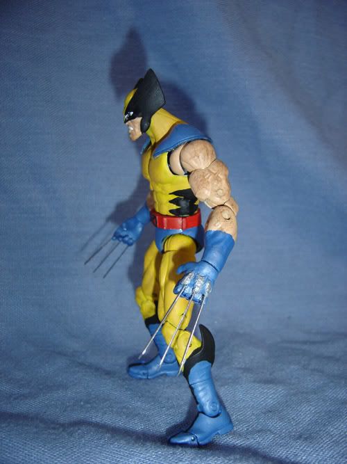 |
|
Gonzo Customs
Main Eventer
Joined on: Dec 24, 2001 4:51:46 GMT -5
Posts: 4,056
|
Post by Gonzo Customs on Jun 5, 2008 15:36:28 GMT -5
Texacide vs. Gonzo Tex's Necro Butcher - I think the biggest factor here might be my ignorance of the indy scene. I can't comment on the accuracy of Necro's look or appearance, since, well, I'm just not that familiar with him outside of briefly seeing a few pics of him. Your work, however, is fantastic, as usual, Texacide. The only thing that bugs me about this is the feet - and I hate to say that because it's not that noticeable, and we all know how Snuka feet are so rare around here. They just look a little too swollen to me. Other than that, I think it looks great. Very, very smooth painting, especially in the face with the eyes, hair, and beard. The scars are also very well done, noticeably a different color from the rest of the forehead, but not standing out unrealistically. Skintone is a very good shade of pale flesh. I like the white drybrushing on the jeans, also. Tats are very sharp too. Great work, dude. Gonzo's Dr. Death - I do like the resemblance in the face. A little on the cartoony side, but I like that in a custom job. I really like the texture done on the hair, but the shape seems a little too squared off, and maybe even a little high in the shot of the front. Nice color skintone, although I feel you might benefit from a little bit of sealer on the flesh. Great sculpting on the outfit. The upper torso part of the singlet looks very natural. Those little wrinkles you sculpt into the cloth areas seems like a nice little trick to keep the sculpting from looking too rounded. Very nice job on the kneepads, too. I'm not too crazy about the skull logos and the "DEATH" on the boots, though. I also would've liked you to make the area where the upper leg meets the crotch a little thicker with some more clay. It just looks a little off the way it is. Your decision to leave the articulation in the upper body and sculpt over the lower is interesting. Not a bad thing, just gives it a different look. Your reason for doing it is understandable, and, hey, that's the way all the Hasbros were made and it never bothered me then. Nice work! Peace to the Gods - you're right, man. My bad! I thought the same thing on the thigh crotch area. Just never went back and redid it. The thighs in general are too skinny IMO. The eyes again I screwed up on just like Steiner and painted over the jakks eyes on accident. There is a clear coat on the whole figure. Also, you're the first to catch that Hasbro thing. Hasbros were always my favorite and indeed were only articulated on the neck, arms, and occasionally the waist, with the exception of eartchquake and typhoon who had leg articulation. Glad you noticed that. |
|
|
|
Post by NYdream™ on Jun 5, 2008 15:45:01 GMT -5
Here are the updated votes....
CW Open
Popular/Judges
NYdream989 3 / 2
Peace TT Gods 1 / 0
#1 Celtics Fan 1 / 0
KO One 2 / 0
Gonzo 3 / 0
Texacide 5 / 2
famousj 5 / 2
NYdream989 0 / 0 <- lol
Gonzo 3 / 2
Deen 4 / 0
Rozz TKO
BRK 2 / 1
Titan 3 / 1
GCS 5 / 2
Import 2 / 0
Powers of Paint New Champs
Beyondo 5 / 2
Gore 2 / 0
we have 4 judges left if im not mistaken
|
|
|
|
Post by Gore on Jun 5, 2008 15:53:32 GMT -5
Texacide vs. Gonzo Tex's Necro Butcher - I think the biggest factor here might be my ignorance of the indy scene. I can't comment on the accuracy of Necro's look or appearance, since, well, I'm just not that familiar with him outside of briefly seeing a few pics of him. Your work, however, is fantastic, as usual, Texacide. The only thing that bugs me about this is the feet - and I hate to say that because it's not that noticeable, and we all know how Snuka feet are so rare around here. They just look a little too swollen to me. Other than that, I think it looks great. Very, very smooth painting, especially in the face with the eyes, hair, and beard. The scars are also very well done, noticeably a different color from the rest of the forehead, but not standing out unrealistically. Skintone is a very good shade of pale flesh. I like the white drybrushing on the jeans, also. Tats are very sharp too. Great work, dude. Gonzo's Dr. Death - I do like the resemblance in the face. A little on the cartoony side, but I like that in a custom job. I really like the texture done on the hair, but the shape seems a little too squared off, and maybe even a little high in the shot of the front. Nice color skintone, although I feel you might benefit from a little bit of sealer on the flesh. Great sculpting on the outfit. The upper torso part of the singlet looks very natural. Those little wrinkles you sculpt into the cloth areas seems like a nice little trick to keep the sculpting from looking too rounded. Very nice job on the kneepads, too. I'm not too crazy about the skull logos and the "DEATH" on the boots, though. I also would've liked you to make the area where the upper leg meets the crotch a little thicker with some more clay. It just looks a little off the way it is. Your decision to leave the articulation in the upper body and sculpt over the lower is interesting. Not a bad thing, just gives it a different look. Your reason for doing it is understandable, and, hey, that's the way all the Hasbros were made and it never bothered me then. Nice work! Peace to the Gods - you're right, man. My bad! I thought the same thing on the thigh crotch area. Just never went back and redid it. The thighs in general are too skinny IMO. The eyes again I screwed up on just like Steiner and painted over the jakks eyes on accident. There is a clear coat on the whole figure. Also, you're the first to catch that Hasbro thing. Hasbros were always my favorite and indeed were only articulated on the neck, arms, and occasionally the waist, with the exception of eartchquake and typhoon who had leg articulation. Glad you noticed that. The Hasbros only had those 3 points of articulation. When you leave 11 points of articulation open, it isn't the same. Plus, if you were going the Hasbro route, you'd need to give him some kind of action, like Oklahoma Stampede action, haha. |
|
Deleted
Joined on: Sept 29, 2024 22:40:24 GMT -5
Posts: 0
|
Post by Deleted on Jun 5, 2008 16:32:34 GMT -5
or dancing action  |
|
|
|
Post by pimpmaster5000 on Jun 5, 2008 16:37:39 GMT -5
I know it's early, but I was very bored, so I went through and tallied the votes so far. Not official, but I think they are accurate: Official Judge VoteMatch 1: NYDream/PTTG/Celtic/KO -- 2/0/0/0 Match 2: Texacide/Gonzo -- 0/2 Match 3: Famousj/NYDream -- 1/0 Match 4: TCKDeen/Gonzo -- 0/1 Match 5: Rozz wins ------------- Match 6: Titan/BRK -- 0/1 Match 7: GCS/Import -- 1/0 Match 8: Horsemen win --------------- Match 9: Beyondo/Gore -- 1/0 Popular VoteMatch 1: NYDream/PTTG/Celtic/KO 1/1/1/1 Match 2: Texacide/Gonzo 4/1 Match 3: Famousj/NYDream 4/0 Match 4: TCKDeen/Gonzo 2/3 Match 5: Rozz wins ---- Match 6: Titan/BRK 2/3 Match 7: GCS/Import 5/1 Match 8: Horsemen win ---- Match 9: Beyondo/Gore 4/2 hey nydream i think you got the popular vote wrong this was yesterdays so you switched mine and traps |
|
Peace To The Gods
Superstar
Destined To Be The Greatest Intercontinental Champion Ever...
Joined on: Jan 24, 2002 17:25:37 GMT -5
Posts: 518
|
Post by Peace To The Gods on Jun 5, 2008 16:52:36 GMT -5
As far as the cruiser matches go, I'm very impressed with PTTG's AJ Styles. Judging by this figure, I could easily see him making a jump into the IC division in the near future. Granted I haven't seen how is sculpting/detailed logo painting skills are, I'm still very impressed. I wouln't say any of the figures are bad by any means, and it's really neat seeing these younger guys improve. Thanks Gore, coming from you I really appreciate it. The bangs were sculpted and the knee pads under the jakks removables are sculpted. AJ wore the good old wraps with the open back ones over them, and always looked bulky to me so thats why I added the jakks ones for the bulky effect. I would love to make the push to the IC division, it seems like all the judges so far are interested more into sculpting then painting skills, so the next figure I have in mind will deliever. |
|