Sandy
POSSIBLE BAD TRADER
Joined on: Dec 17, 2004 14:33:52 GMT -5
Posts: 5,868
|
Post by Sandy on Jun 22, 2008 5:44:40 GMT -5
Honestly. I'm not impressed by either custom. Both of you are way better than this. This is a huge match and you both just kind of let it go.
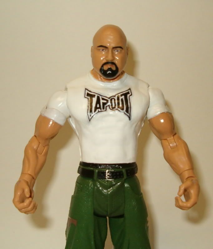
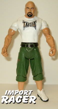
HR2X. The head looks nothing like Matt Serra. I can see where you were going with it but you didn't pull it off. The head is not skinny enough or should I say "peanut shaped" enough. The body looks good though. The torso is nice. The shorts are nice.
Beyondo. The head isn't Tito. The jaw captures his likeness but the eyes and the smile or smirk really kill it. The torso is far too ripped for Ortiz. The shorts are nice...I can't tell if they are decals or you painted them. So I suppose that can be a really great compliment or an insult.
Either way this match seems anticlimatic for me as you both are such great customizers. I understand MMA fighters are harder to do but still. I would love to see a rematch with regular wrestlers.
These customs are still amazing. But not up to the level of where you both are at.
|
|
|
|
Post by saveus1 on Jun 22, 2008 7:17:25 GMT -5
tough call but I going to have to go with beyondo's tito ortiz
because the figure,the painting,the sculpting is amazing but HR2X done really well
but beyondo wins
|
|
Deleted
Joined on: Sept 30, 2024 0:20:55 GMT -5
Posts: 0
|
Post by Deleted on Jun 22, 2008 10:30:14 GMT -5
Beyondo. The head isn't Tito. The jaw captures his likeness but the eyes and the smile or smirk really kill it. The torso is far too ripped for Ortiz. The shorts are nice...I can't tell if they are decals or you painted them. So I suppose that can be a really great compliment or an insult. No decal! Di di mao! |
|
Sandy
POSSIBLE BAD TRADER
Joined on: Dec 17, 2004 14:33:52 GMT -5
Posts: 5,868
|
Post by Sandy on Jun 22, 2008 16:48:16 GMT -5
Beyondo. The head isn't Tito. The jaw captures his likeness but the eyes and the smile or smirk really kill it. The torso is far too ripped for Ortiz. The shorts are nice...I can't tell if they are decals or you painted them. So I suppose that can be a really great compliment or an insult. No decal! Di di mao! wow. then it completely changes everything. that is very very impressive. very clean lines. |
|
|
|
Post by [x] TEXACIDE [x] on Jun 22, 2008 17:23:05 GMT -5
Yeah it really turned out pretty, rawr!
|
|
|
|
Post by oozingmachismo on Jun 22, 2008 21:00:10 GMT -5
I feel weird voting on this one. Like Titan, I don't follow MMA, I don't prefer their custom figs, and I'm not one to comment on their accuracy. And, like Sandman, I feel like both competitors could've done a little better. I'll write that off to the suddenness of the match, stip, and deadline, though. This kinda came outta nowhere.
SERRA: Judging from the ref pics, I can almost kinda see what you were going for with the head choice, but the Lashley just doesn't seem to work. Like someone else pointed out, the facial features still seem to be African American rather than... whatever nationality Serra is. The painting on the hair and beard look very strange also. It kinda looks like they could've been blended a little better. From the neck down, I'm a big fan. The torso modding is very, very smooth, and the skintone is great. The "UFC" on the left glove could be a bit sharper, but I don't think that takes too much away from this fig overall. I love all the painting done on the shorts. And Snuka feet... are you showing off your new casting/molding skills? Impressive. Most impressive.
ORTIZ: You know how I said I like Serra from the neck down? Well, I like this fig from the nose down. The mods done on the jawline look great, but I just think there's something about the eyes that don't sit well with me. Ortiz's eyes look a little more beady and smaller to me. I think it takes away from the likeness more than just a bit. But everything else looks great. Skintone is fantastic, and I love the painting on the trunks. Great work with all the logos, especially the checkerboard pattern and the fire. Great stuff. Tats look sharp and very well blended. Atta boy, champ.
Gotta vote with Beyondo.
|
|
Importracer
POSSIBLE BAD TRADER
Joined on: Dec 1, 2006 18:36:40 GMT -5
Posts: 1,383
|
Post by Importracer on Jun 22, 2008 23:19:31 GMT -5
HR2X - Matt Serra The head kills this figure imo looks to have alot of flat spots on it.The 5 o'clock shadow looks like it covers his whole face making it look more like his face is dirty.Skintone looks good and ab mods look smooth.I dont mind decals but facing a guy like beyondo they should be hand painted.
Beyondo - Tito Ortiz I was not sure on the head until i looked at the ref pics and it looks good.the painting on the shorts with flames and logo's is great.the tattos look real so you nailed them great.
my vote beyondo
|
|
|
|
Post by Gore on Jun 22, 2008 23:55:52 GMT -5
Looks like HR2X is pulling an import. Getting defensive and relpying to those critiquing his figure.
haha.
I'd type longer replies, but It'd be saying the same things everyone else has said. Beyondo wins, mainly because it looks cleaner. Serra looks like he's turning into the wolfman with the out of control facial hair.
|
|
|
|
Post by gatecitysinner on Jun 23, 2008 11:20:55 GMT -5
How the hell did you get a title shot? Who in the world do you think you are? Have you even done anything? Your custom is what happens when shame swallows too much misery.
Is there a reason why he basically only has one eyebrow? Is that supposed to be a five o'clock shadow or did he just get done going down a sh*t covered slip and slide? Good work on the eyes too, I've seen lots of solid black eyes with pinhole sized pupils. Is he Satan?
It takes a real professional to do the designs on his shorts like you did. So tell me, how much time did you spend printing those things out? You're a genius my friend.
And what is going on with his upper lip, it's like he has a flesh colored slug for a mustache.
When did people decide you were a serious customizer, because this is opening match stuff right here.
You didn't even try, you got a bald head and said "what the hell, close enough". You wasted the board's time with this monstrosity and the simple fact that people are calling this close makes me want to vomit in terror. You made some skintone and called it a day, my oh my how we all must admire you.
I feel like I need a thesaurus to find all the different words I can use to describe how much this custom both sucks and blows, and shame on you for having this unaccomplished sense of self satisfaction that you parade around with. You've never made anything that didn't look like snot and I can't imagine that at anytime did you make something that was in the same ballpark as decent.
Your customs are bad and you should feel bad.
|
|
|
|
Post by skribbel24 on Jun 23, 2008 17:00:02 GMT -5
Ortiz looks awesome! I love the head modding (down to the cleft chin) and the detail on the shorts. I would have to go with Ortiz on this one. Great work, Beyondo!
|
|
|
|
Post by cmkman on Jun 23, 2008 17:02:24 GMT -5
Beyondo
|
|
|
|
Post by justicesmith12 on Jun 23, 2008 17:09:15 GMT -5
I gotta go with Ortiz, to me the head looks better for Ortiz than Serra. Good job on both though and good luck to the competitors.
|
|
|
|
Post by tibbs1984 on Jun 23, 2008 22:50:45 GMT -5
All the reasons have been stated. My vote Beyondo.
|
|
Sandy
POSSIBLE BAD TRADER
Joined on: Dec 17, 2004 14:33:52 GMT -5
Posts: 5,868
|
Post by Sandy on Jun 23, 2008 23:33:20 GMT -5
How the hell did you get a title shot? Who in the world do you think you are? Have you even done anything? Your custom is what happens when shame swallows too much misery. Is there a reason why he basically only has one eyebrow? Is that supposed to be a five o'clock shadow or did he just get done going down a sh*t covered slip and slide? Good work on the eyes too, I've seen lots of solid black eyes with pinhole sized pupils. Is he Satan? It takes a real professional to do the designs on his shorts like you did. So tell me, how much time did you spend printing those things out? You're a genius my friend. And what is going on with his upper lip, it's like he has a flesh colored slug for a mustache. When did people decide you were a serious customizer, because this is opening match stuff right here. You didn't even try, you got a bald head and said "what the hell, close enough". You wasted the board's time with this monstrosity and the simple fact that people are calling this close makes me want to vomit in terror. You made some skintone and called it a day, my oh my how we all must admire you. I feel like I need a thesaurus to find all the different words I can use to describe how much this custom both sucks and blows, and shame on you for having this unaccomplished sense of self satisfaction that you parade around with. You've never made anything that didn't look like snot and I can't imagine that at anytime did you make something that was in the same ballpark as decent. Your customs are bad and you should feel bad. Ouch. I'm a little shocked and confused as to what is happening on the board right now. It seems as though the fun of it all has just disappeared and there are now rivalries with customizers? I thought Gore and HR2X were friends? Well not genuine friends but e-friends...or whatever it is called. Gate and Beyondo seem to be buddy buddy these days. I honestly didn't think it was THAT bad of a custom. The beard and the back of the head are bad. The blending on it do not look good at all. If you weren't able to do it by painting it you should have just added a touch of gray and brown to your skintone mixture and then paint it around the hairline and the five o'clock shadow. and then take a colored pencil...brown black, gray...doesn't matter...and fill it in to look like real stuble. But yeah. Don't ever use printouts in a heavyweight title match. Other than that I didn't think it was half-bad. |
|
|
|
Post by The Dude on Jun 24, 2008 2:06:22 GMT -5
I gotta go with the Tito... I love how he made the head so big just like him, LOL.
|
|
|
|
Post by runbymunkyinc on Jun 24, 2008 12:08:43 GMT -5
The Tito Ortiz is super-neat.
|
|


![[x] TEXACIDE [x] Avatar](http://i42.tinypic.com/2kj7a1.png)