|
|
Post by duan on Jul 14, 2008 22:08:49 GMT -5
World Photoshop Federation Presents:
Domination: "The Prayer" CardDate: July 14th 2008 Live From: A Church in Southwest Asia Dark Match:Ultimate vs. BeavermanStip: Chris Sabin Beaverman picks up the DQ victory! 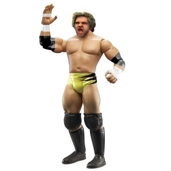 Spencer vs. PagelsStip: Spencer vs. PagelsStip: JBL Spencer: C+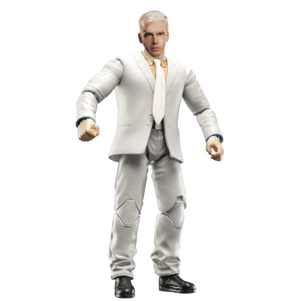 Pagels: B Pagels: B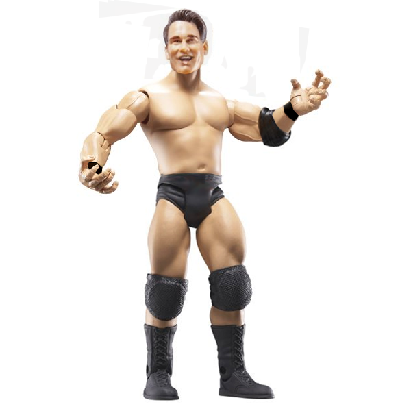 Duaner Vote: Duaner Vote: I gotta go with Pagels, on account that more was done and his just looks overall better. Brady & Double B vs. SPZ & Mattie!Stip: Ted Dibiase Jnr. & Ted Dibiase Snr. SPZ & Mattie! pick up a DQ win! 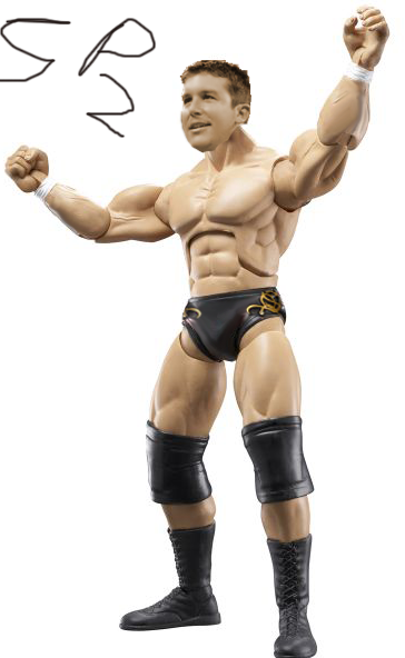 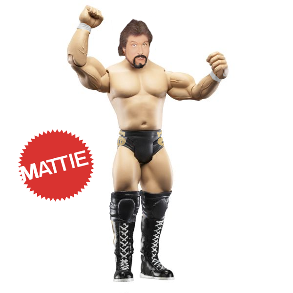 Cabana vs. DuanerStip: Cabana vs. DuanerStip: TAKA Michinoku Cabana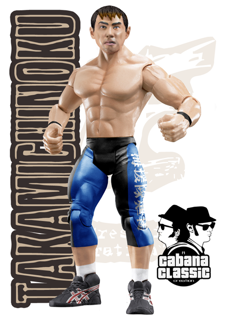 Duaner Duaner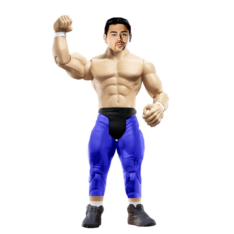 Dielawn, Swanton, & Phoenix vs. GreatBretOne & CJStip: Dielawn, Swanton, & Phoenix vs. GreatBretOne & CJStip: Any 3 People Who Were Just Drafted Dielawn/Swanton/Phoenix: B+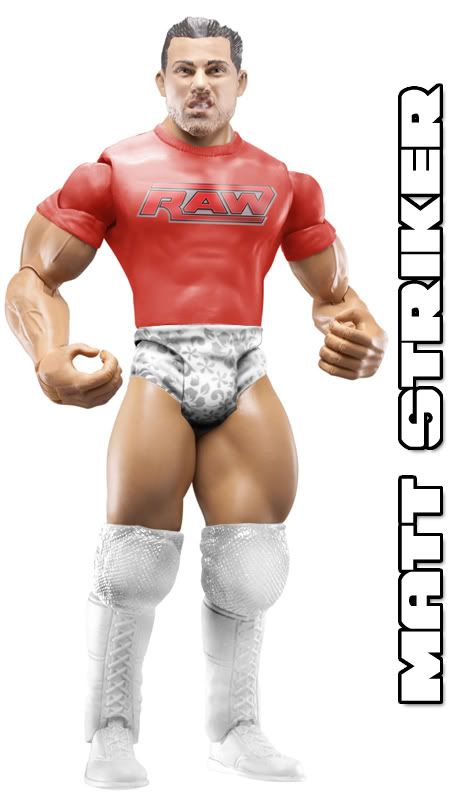 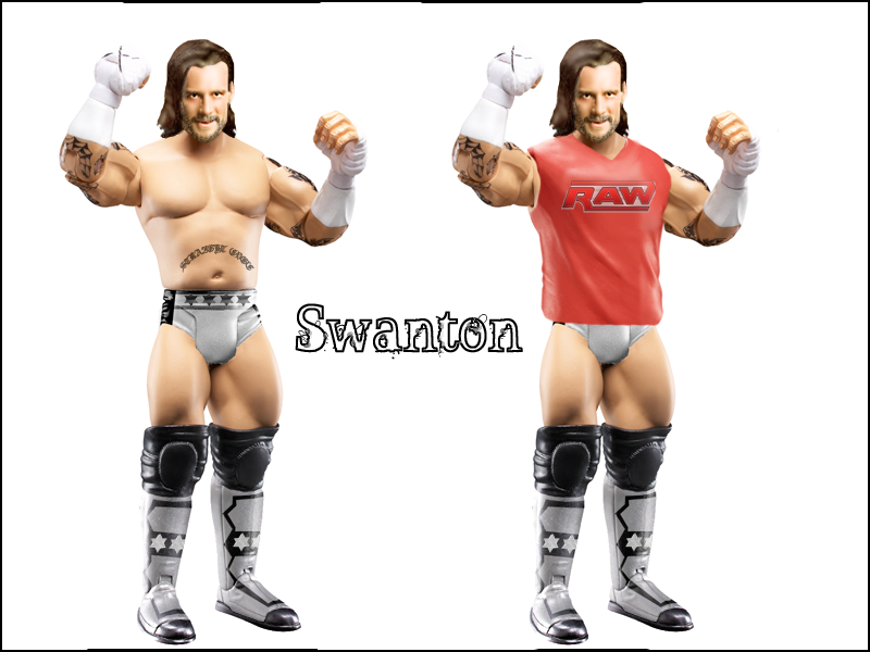 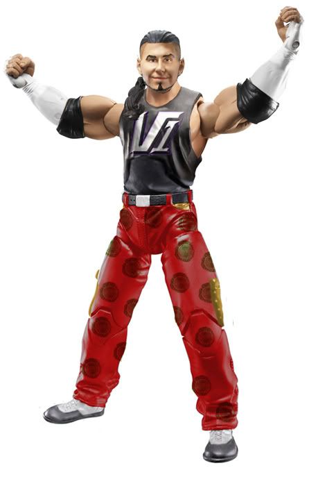 GB1/CJ: A GB1/CJ: A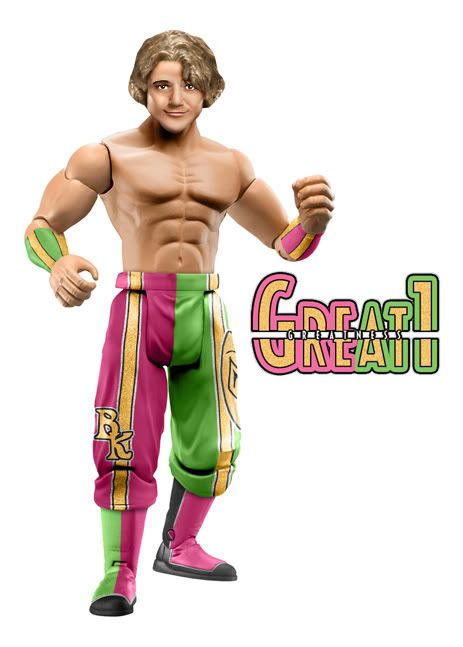 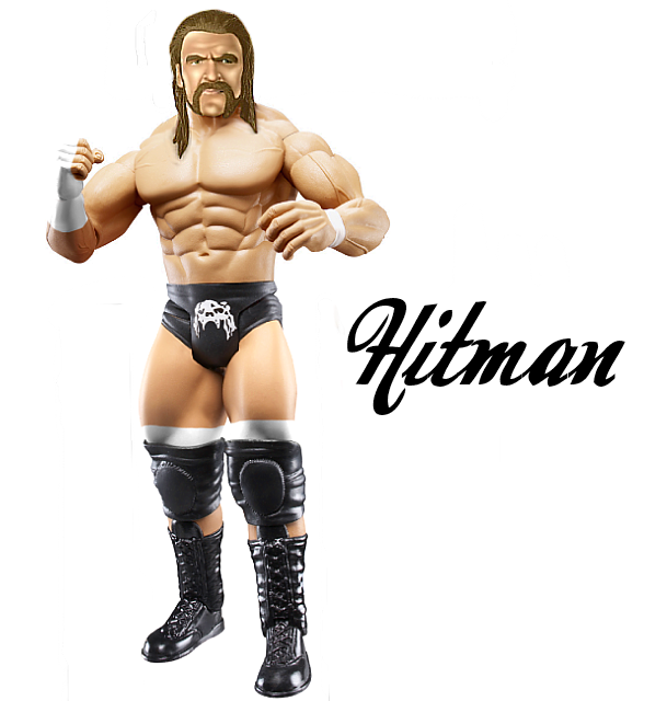 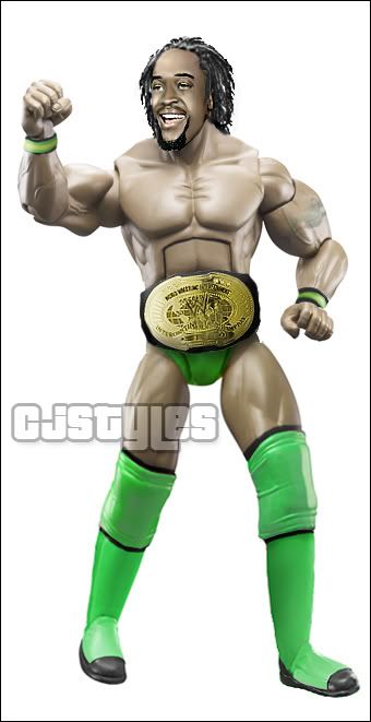 Duaner Vote: Duaner Vote: Pretty Close, but I feel that Swanton brings down team Dielawn and all of GB1/CJ's figures are just solid. Good match. WPF United States ChampionshipGazza (c) vs. Teh GameStip: Kofi Kingston Teh Game: B+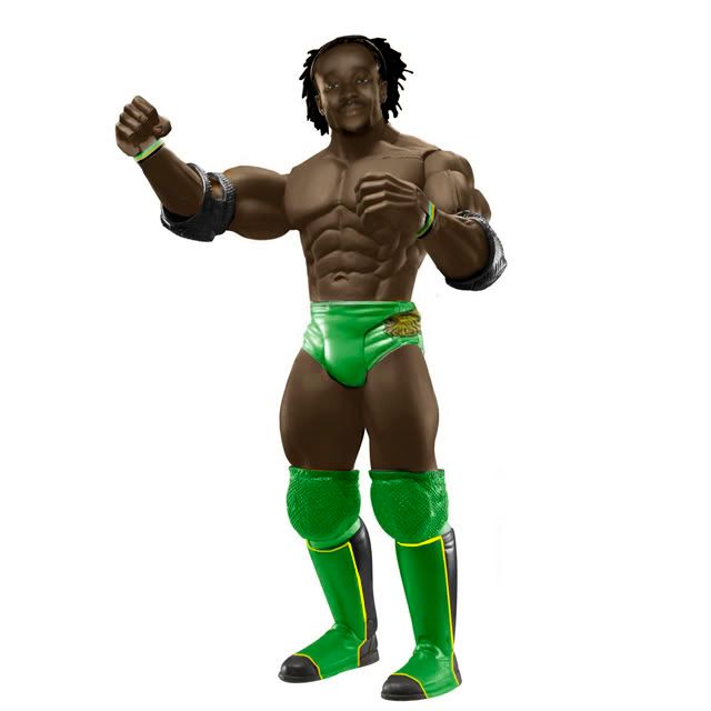 Gazza: A Gazza: A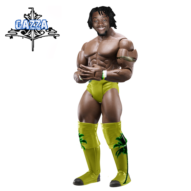  Duaner Vote: Duaner Vote: My vote goes to Gazza. Gazza get the vote because Teh Game's head is a little too dark and Gazza's heads are solid. Both did great! Main Attraction; FINALLY!MJH vs. CassStip: The Missing Link MJH: B+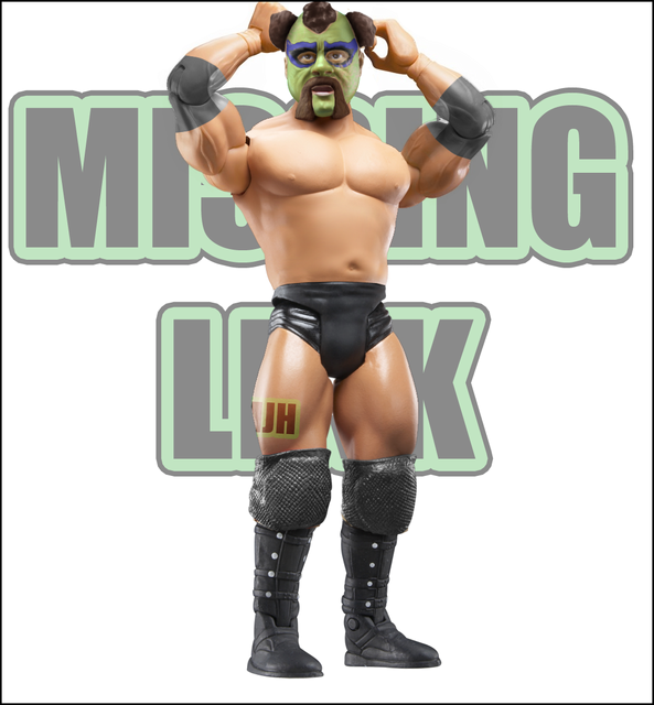 Cass: A- Cass: A-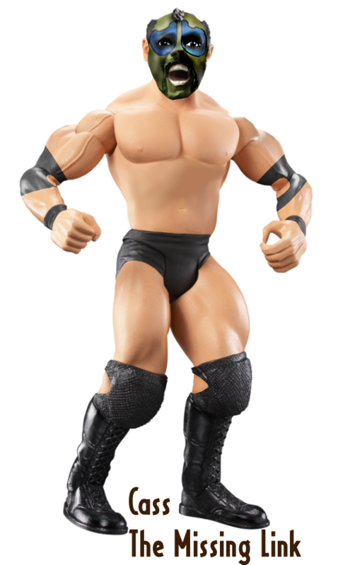 Duaner Vote: Duaner Vote: Cass gets my vote, because MJH's "logo" on the leg is just unneeded and brings down his figure. Also, Cass' head looks more like the Missing Link, as Link is crazy, not dopey. Also, Cass' torso is more smooth. BOTW: CABANERZ |
|
|
|
Post by Gazza on Jul 14, 2008 22:17:43 GMT -5
Pagels - More work was done on this,and I have no clue what Spencer did with the hair.
Cabana- I like both figures, Duaner i realy like yours, you did a good job. But cabans attire is amazing. The head is great too.
Dielawn, Swanton, & Phoenix- CJs Kofi isnt that good,IMO. The whole figure all looks in differnt angles. The head is one way, the torso is the other, and the legs are too. Hitmans head looks meleted, Sorry but it does. G1s attire is great though, but One figure cant beat 3 Solid figures. I realy like Dielawns attire, it looks figure like and is clean. Swantons figure is great, but i realy dislike the hair, it looks smudged. Phoenixs figure is great too, the attire looks good and head too.
Cass- I like this, The torso is more smooth than MJHs. and the head is more realistic to his facial expression. The fact that MJHs has "MJH" tatto'd on the leg, is awful.
BOTW: Cabana
|
|
imdielawn
Main Eventer
 watch.imdielawn.com
Joined on: Jul 16, 2003 10:42:29 GMT -5
Posts: 1,864
|
Post by imdielawn on Jul 14, 2008 22:41:17 GMT -5
Beaverman- The tape isn't that good, nor the elbow pads. Good attempt at the head, but its very blurry and doesn't match up with the body's skin tone. VOTE:---------
Spencer- The hair is too blonde, not too bad of a recolor, there's blue all around the cuffs and the neck has some white and blue under the shirt. Pagels- The head is blurry and the background is a mess.
VOTE: Pagels because the figure itself is cleaner.Spz- The head needs work and the background is really dirty around the fig. The tight design isn't too bad, but is overlapping the tights. Mattie- The head doesn't match the body's skin tone, the boots are too big. Your $ is backwards on the right side. VOTE: -------------
Cabana- Epic? Duaner- The head is a bit weird and the pants recolor is sloppy. VOTE: Cabana because his figure is very clean and professional looking.Dielawn- Before people say "You didn't do anything do it" I made the black boots white, I molded the attire to fit on this proto, modded the head and shirt. Swanton- I really don't like the hair, awesome attire though. Phoenix- This is a really good figure. The pants need to be a bit darker in the joints and the wrist tape doesn't match up. Great 1- Amazing, I don't know if the body parts are completely in proportion, but it's a great figure. Hitman- The head needs work. It's a great improvement from your last figures. CJ- The feet/legs are mad goofy. and the right hand is weird. VOTE:------------Teh- Your fig is a bit too dark and lacks dark shadows. Gazza- I don't like the tattoo. The boot designs are pretty good, but hang off the knee pads so it doesn't look right. I like the second one 
VOTE: Gaz mainly because of the skin tone.MJH- I love the torso mod and the elbow pads. The head is really clean as well. Christopher- The torso is a bit off and the elbow pads aren't placed on the figure correctly. The head is too dark and the mouth and eyes are too big. VOTE: MJH- The figure is in a lot better shape. |
|
|
|
Post by tehgame on Jul 14, 2008 22:53:01 GMT -5
Gazza good luck.Very well done fig.Also Dauner i didnt know we were supost to make 2 of them.
Edit-Dielwawn the second dosent count we were supost to make only one.
|
|
imdielawn
Main Eventer
watch.imdielawn.com
Joined on: Jul 16, 2003 10:42:29 GMT -5
Posts: 1,864
|
Post by imdielawn on Jul 14, 2008 23:04:34 GMT -5
I can still like it though.
|
|
|
|
Post by tehgame on Jul 14, 2008 23:11:15 GMT -5
CC-Cleaner and better attire.
Dielawn/Swanton/Phoenix-Swanton first of all ur figures are great but the hair is abit bad.Bret also did a good job.
MJH-I dont like Cass's torso for some reason.
Botw
Swanton-I just think it looks great.
|
|
|
|
Post by Cass on Jul 14, 2008 23:14:51 GMT -5
CC-Cleaner and better attire. Dielawn/Swanton/Phoenix-Swanton first of all ur figures are great but the hair is abit bad.Bret also did a good job. MJH-I dont like Cass's torso for some reason. Botw Swanton-I just think it looks great. LAME. |
|
|
|
Post by tehgame on Jul 14, 2008 23:15:27 GMT -5
I can still like it though. I know i just thought that Gazza would have got more vote's for making another one when the stip was not 2. |
|
imdielawn
Main Eventer
watch.imdielawn.com
Joined on: Jul 16, 2003 10:42:29 GMT -5
Posts: 1,864
|
Post by imdielawn on Jul 14, 2008 23:16:43 GMT -5
I only commented on his first figure.
|
|
|
|
Post by tehgame on Jul 14, 2008 23:18:35 GMT -5
I only commented on his first figure. My bad for being a **** like that.I just dont want to lose because he did 2 figures and I only did one. |
|
|
|
Post by duan on Jul 15, 2008 1:07:13 GMT -5
CC-Cleaner and better attire. Dielawn/Swanton/Phoenix-Swanton first of all ur figures are great but the hair is abit bad.Bret also did a good job. MJH-I dont like Cass's torso for some reason. Botw Swanton-I just think it looks great. EPIC FAIL |
|
|
|
Post by tehgame on Jul 15, 2008 1:10:19 GMT -5
Man lately i suck on comments and votes.
|
|
|
|
Post by Gazza on Jul 15, 2008 4:00:44 GMT -5
Honestly, there is no rule that says one figure. Swantons done 2.... Its just entrane gear and wrestling gear. no rule says i can not do that.
|
|
|
|
Post by PhoeniX™: Valoween on Jul 15, 2008 8:29:13 GMT -5
Spencer vs. Pagels: I vote for Pagels. I really am not a fan of Spencer's head. He has Dave Spikey hair. Cabana vs. Duaner: I vote for Cabana. As usual it is so clean and put together well. Really nice work. Gazza (c) vs. Teh Game: I vote for GaZzA. It was very close, but the Kofi in entrance gear stole it for me. MJH vs. Cass: I vote for MJH. It is a better figure. The attire is better, the boots are better, the torso is better. Cass's eyes lool like anime eyes. I feel people are voting against MJH because they don't like him. And that is very  ing unprofessional, if you ask me. |
|
|
|
Post by brethitmanhart on Jul 15, 2008 8:46:08 GMT -5
Cabana - Awesome as usual, this guy is the next big thing. His head is brilliant for an head mod and it looks like a real proto. Duaner's is good, head looks figure like and attire is good. The tights looks oversaturated though. Both great figures though. Godd efoort seen here in my eyes. Gazza - Teh Game's attempt at lighting here is poor. Gazza's attire wins it. The palm tree's look brilliant. Love the tones on both figures, they look really good. TG's is just too dull overall. MJH - Cass' torso is really poor compared to MJH. Cass' is a great figure but MJH's mask is perfect. Love the whole figure. I would rate it more than a B but thats just me. Cass' green is the wrong colour and it's hair is too short. Picky stuff I know but they ar eboth excellent figures. BOTW - G1, truly awesome. Attire is perfect and the head tones are amazing. At the minute I'm wanting to break up Greatbretone. I love G1 he is pure awesome but I feel I'm pulling him down in the tag division. His figures carry me through the matches we win. The matches we loose are because of my figures too.  |
|
imdielawn
Main Eventer
watch.imdielawn.com
Joined on: Jul 16, 2003 10:42:29 GMT -5
Posts: 1,864
|
Post by imdielawn on Jul 15, 2008 9:35:23 GMT -5
MJH vs. Cass: I vote for MJH. It is a better figure. The attire is better, the boots are better, the torso is better. Cass's eyes lool like anime eyes. I feel people are voting against MJH because they don't like him. And that is very ing unprofessional, if you ask me.
I agree with that. The whole "MJH's leg has has name on it" is a bullcrapreason. Mania used to do that with all of his figures and no one ever said anything. How is Cass's torso smoother? It has a huge dark smudge mark under the chest. Not to bash Cass, but is anyone really looking at the figures before the vote? |
|
|
|
Post by Gazza on Jul 15, 2008 9:49:10 GMT -5
MJH vs. Cass: I vote for MJH. It is a better figure. The attire is better, the boots are better, the torso is better. Cass's eyes lool like anime eyes. I feel people are voting against MJH because they don't like him. And that is very ing unprofessional, if you ask me.
I agree with that. The whole "MJH's leg has has name on it" is a bull **** reason. Mania used to do that with all of his figures and no one ever said anything. How is Cass's torso smoother? It has a huge dark smudge mark under the chest. Not to bash Cass, but is anyone really looking at the figures before the vote?I said on AIM. Everyone is alowed differnt opinions. The fact people are bitching about votes in others matchs is stupid. Honestly, this is getting so ****... People vote who they want to vote, on which figure they like the best. You act like that their opinions are wrong.  |
|
Joliet Jake
Superstar
Ya see, me and the Lord have an understanding.
Joined on: Apr 25, 2007 14:11:00 GMT -5
Posts: 738
|
Post by Joliet Jake on Jul 15, 2008 9:50:52 GMT -5
Beaverman: Your heads are still off, but they are getting better. Work on matching your tones. The smudging looks good but the head is too blurry. Atire is ok, the hand tape should be curved and not straight. The logo on the tights is a good attempt, work on adding in highlights using the dodge tool.
Spencer vs. Pagels:
Spencer: Head looks blurry and the tones are too dark, also why does JBl have white hair? Work on matching your tones and making the head more crisp and not so blurry.
Pagels: The head looks pixilated and too big for the body. Also there are a bunch of light grey areas around the head and shoulders that didnt get erased. You did a good job matching tones and the head works well for the figure.
Vote: Pagels - overall better, figure is more effective.
Spz: The head tones don't match, the head doesnt look plastic/figure like. It also looks too big for the body. Tights design looks good.
Mattie: You're heads are still too washed out and pixilated, check out dielawns tutorials i think it will help you out a ton. Torso works well and the tight designs are effective.
Dielawn • Swanton • Phoenix vs. G1 • Bret • CJ
Dielawn: Perfect figure, tights mod, head mod are awesome... definetly the dark horse figure of the week. beard looks great too. Cant pick out anything i don't like.
Swanton: I'm not a big fan of the head tbh, doesnt look figure/plastic too me. Tones do match though but does look to have too much contrast. Attire looks pretty good, i dont like logos going over the joints without them either being erased or darkened though.
Phoenix: Another great fig by phoenix. Head looks great and fits the appropraite perspective. I like the logo on the shirt, the wrist bands are correct and i like the pants, logo look good. Pocket could use some more shading to give it some depth though but overall an excellent figure.
G1: Another incredible figure as always, the attire is insane! Excellent torso choice and the head looks great albeit a little too big but its pretty minor.
Hitman: I think the attire looks good, i really like the tights logo, torso works well too. Im not a big fan of the head, it doesnt match the same highs and lows of the body so its kinda distracting. I think if the tones were matched a little closer together and not intense it would ahve looked cool.
CJ: I like the tattoo. Color looks great on the figure, but the attire looks plain and is lacking any real details. Head looks plastic/figure like but the tones are off a bit and the goatee looks weird.
My Vote: Dielawn • Swanton • Phoenix - overall a better group of figures. Dielawn & phoenix's really stand out in this match.
Gazza vs. teh Game
Teh Game: The tones are really really dark and you lose a lot of the detail because of this. I think you did make an effctive figure though despite that. If the head was lighter i think it would have looked really good. The attire is hit or miss in some areas, i think the color overall is great but i dont like the logo on the side of the tights and the missing palm tees on the kickers is disappointing.
Gazza: Not a fan of the head or tattoo. Sheltons body works good for this figure. The cut on the tights looks rough and im not a big fan of the tights logos. I however think the entrance attire figure is completely different and looks great. Head looks good although it could still look more plastic imo. But the entrance gear fig looks cool.
My Vote: Im gonna go with gazza, for the fact that overall im a bigger fan of the entrance gear figure than tehgames. I think its teh games fig wasnt so dark it would have gotten my vote but its really distracting to me for some reason. It was a close match for sure.
MJH vs. Cass
MJH: I dont see how anyone couldn't like this figure, i think its excellent and looks just liek him. The only thing i dont like is the tag on the leg but i can easy overlook that. its even cool how MJH made the arms go up by the head like link used to do. Easily one of my favorite this week.
Cass: I think the body works well, not a big fan of the elbow pads though. I dont really like the head much tbh, i feel it looks way to cartoony and really doesnt capture Links resemblance well. its also a little too dark and too big for the body.
My Vote: MJH - I really like his figure and think he did the better job overall on a hard stip.
|
|
|
|
Post by [MJH] on Jul 15, 2008 10:02:13 GMT -5
Spencer vs. Pagels: Both are equal imo, both decent attires and meh-ish heads, I'm gonna go with Spencer as, and bare with me on this I'm on my pc atm so the colours are ed and I may be wrong but, I feel Pagels head is too contrasted and harder to look at. My apologies if it's just my screen and it isnt too contrasted. Vote: Spencer Cabana vs. Duaner: I like both figures but I feel cabana did alot better this time, his head IS basically Taka, only thing I would change is the hair, I think the fringe is too long but that's just a minor flaw I thought I'd bring up as I cant really say anything else about this fig other than it's good. With duaner's, I dunno if it's my screen again but, the head looks too bright in large places and looks off the skin also looks rough and could use more smoothing. Vote: Cabana GB1 & CJ vs. Dielawn, Phoenix and Swanton: Great match imo, I think everyone bought out there A-game. Dielawn, great figure very smooth and attire is brilliantly done, simple but awesome. Swanton, the worst of the team? Yes, but that doesn't mean it's still not good, imo it's your best; attire looks great and head is pretty good, keep up the good work. Phoenix, like Dielawn great figure not really any flaws. G1, perfect attire, your best attire in a while, the head im not so fond of it kind looks like an old man in the way you smudged it and the hair looks a bit off, I know people are gonna say im nitpicky but I feel you can do a hell of a lot better with your heads than you have been recently, that being said they're still some of the best heads ever just not as good as one's you've done. CJ, I dunno if it's me but the figure looks stretched and I'm not a fan of the right boot, it's not a great figure but not bad. Hitman, probably my favourite figure, I know I've given you a hard time about your heads but I think you stepped up from melted rubber to painting, which is the type of looks I try to go for as imo it looks awesome, great work. I'm going with GB1 and CJ as I think GB1 win it for them. Vote: GB1 and CJ Gazza vs. Teh game Both pretty good figures, I feel gazza did a better job as teh game's skintone lacks colour and contrast im gonna ignore gazza's second figure as teh game only did one figure and it's not much point in picking out extra stuff to use against someone. Overall I feel teh game has a better attire but gazza's head an skintone is better. Vote: Gazza BOTW: Hitman |
|
imdielawn
Main Eventer
watch.imdielawn.com
Joined on: Jul 16, 2003 10:42:29 GMT -5
Posts: 1,864
|
Post by imdielawn on Jul 15, 2008 10:09:20 GMT -5
I agree with that. The whole "MJH's leg has has name on it" is a bull **** reason. Mania used to do that with all of his figures and no one ever said anything. How is Cass's torso smoother? It has a huge dark smudge mark under the chest. Not to bash Cass, but is anyone really looking at the figures before the vote?I said on AIM. Everyone is alowed differnt opinions. The fact people are bitching about votes in others matchs is stupid. Honestly, this is getting so ****... People vote who they want to vote, on which figure they like the best. You act like that their opinions are wrong. All I'm saying is people need to have REAL reasons. Cass's is obviously not smoother than MJH's. That isn't an opinion that is a fact. Saying MJH's watermark on his figure ruins it completely is a intellectually- disabled reason, it doesn't lower the quality of the figure. People can vote who they want to but have real and smart reasons. Everyone really lacks being able to see flaws and positives in figures and it baffles the crapout of me. Every week we get matches that aren't even close to each other, one figure is always flawless and the other figure needs a ton of work but people think they are close. |
|


![[MJH] Avatar](http://i56.tinypic.com/5x3ote.jpg)
