|
|
Post by duan on Jul 27, 2008 23:49:19 GMT -5
 WPF's Hot Summer Nights WPF's Hot Summer Nights
Live Sunday July 27th 2008
ONLY ON PAY-PER-VIEW!Double B vs. Mattie! vs. SpencerStipulation: CM Punk Double B
Head: B
Attire: B+
Creativity: B
Overall: B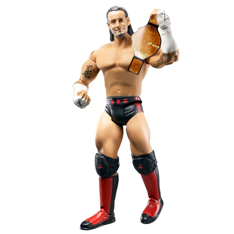 Mattie! Mattie!
Head: C+
Attire: C+
Creativity: B+
Overall: B-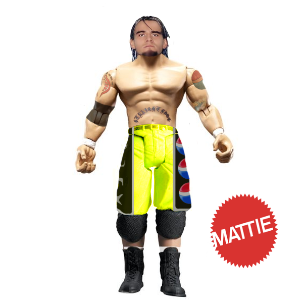 Spencer Spencer
Head: C+
Attire: B
Creativity: B
Overall: B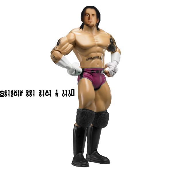 I'm going to go with Double B here. Kinda of a throwout match, but B's Attire work is clean and probably the most overall clean figure. Not a good match, but seeing the improvement/effort I wanted. I'm going to go with Double B here. Kinda of a throwout match, but B's Attire work is clean and probably the most overall clean figure. Not a good match, but seeing the improvement/effort I wanted.Brady vs. SPZ vs. PagelsStipulation: Any Actor SPZ picks up the win!  BDTTK & JOeY vs. Phoenix & Teh GameStipulation: BDTTK & JOeY vs. Phoenix & Teh GameStipulation: Matt Hardy vs. Chavo Guerrero BDTTK/JOeY
Heads: B+/ n/a
Attires: B+/B
Creativity: B+/B+
Overall: B+/B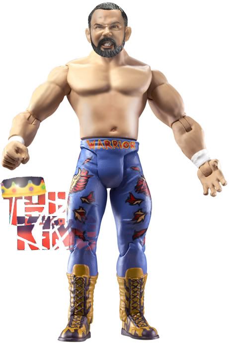 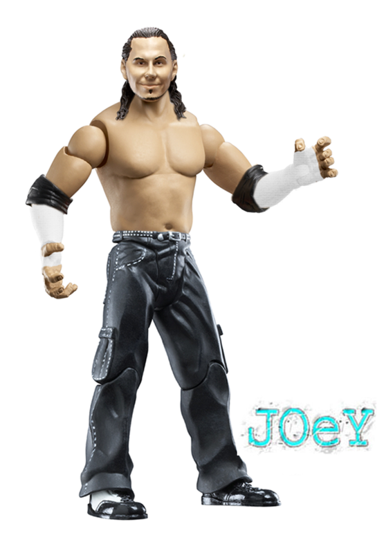 Phoenix/Teh Game Phoenix/Teh Game
Heads: A/B+
Attires: A/A-
Creativity: A/B+
Overall: A/B+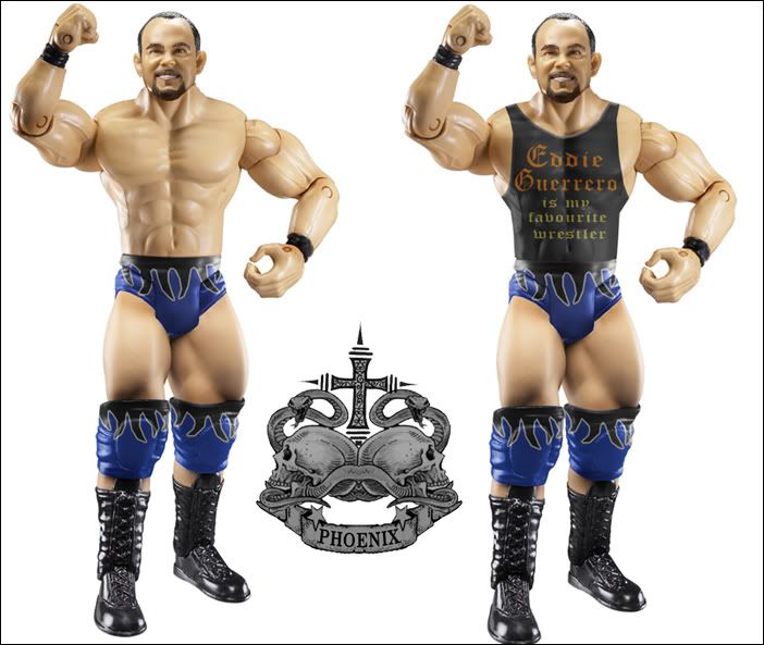 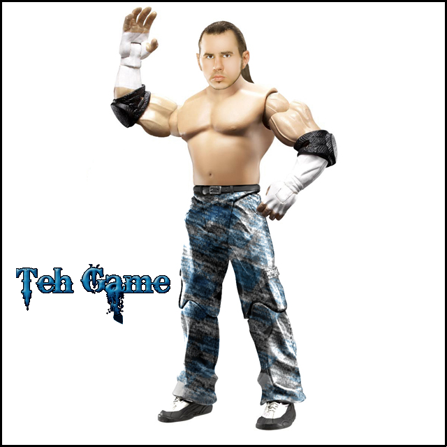 Phoenix/Teh Game win this one for me. Phoenix's figure REALLY helped his team out, but Teh Game still had an overall solid figure. Phoenix's head is on point and BDTTK/JOeY just lack cleanness and seemed rushed.Cass vs. DuanerStipulation: Phoenix/Teh Game win this one for me. Phoenix's figure REALLY helped his team out, but Teh Game still had an overall solid figure. Phoenix's head is on point and BDTTK/JOeY just lack cleanness and seemed rushed.Cass vs. DuanerStipulation: Any Superstar who made a Custom Championship (ie: Edge/Cena/Austin) Cass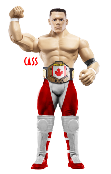 Duaner Duaner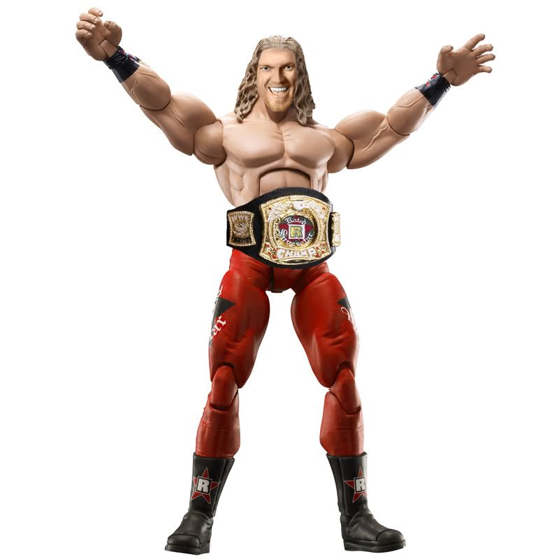 CJ vs. CJ vs. JomoStipulation: Chris Jericho vs. Shawn Michaels CJ scores the victory! 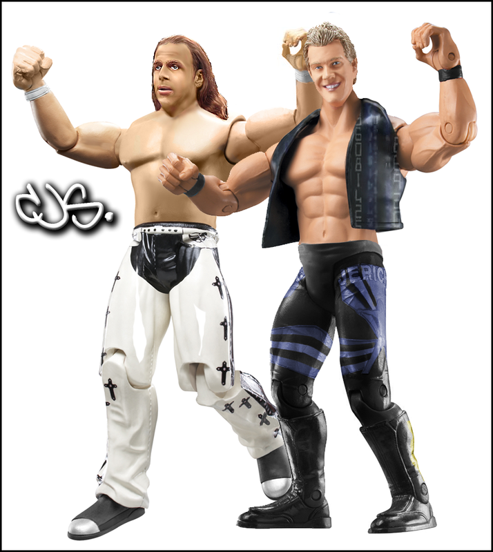 #1 Contender to the United States ChampionshipCabana vs. KodyStipulation: #1 Contender to the United States ChampionshipCabana vs. KodyStipulation: Paul Burchill Cabana
Head: A
Attire: A+
Creativity: A
Overall: A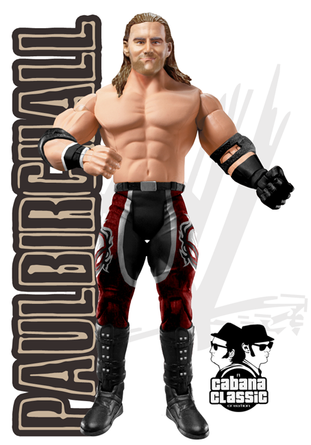 Kody Kody
Head: B+
Attire: A-
Creativity: B+
Overall: B+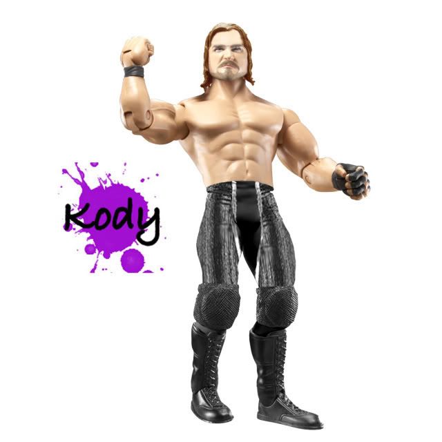 Cabana wins this one. Another awesome head mod and the attire is perfectly spot on. Kody did do a very nice job, one of his bests in some time and the head editing came out well. Good Solid match!WPF International ChampionshipDielawn vs. SwantonStipulation: Cabana wins this one. Another awesome head mod and the attire is perfectly spot on. Kody did do a very nice job, one of his bests in some time and the head editing came out well. Good Solid match!WPF International ChampionshipDielawn vs. SwantonStipulation: Any Former WCW Cruiserweight Champion Dielawn
Head: A
Attire: A
Creativity: A
Overall: A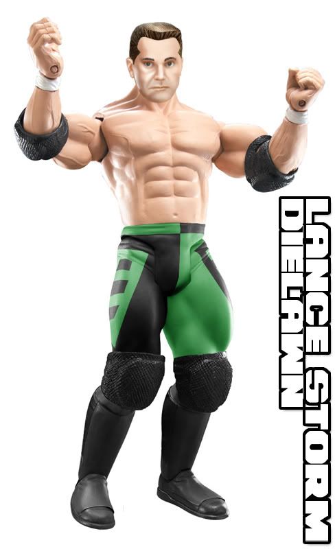 Swanton Swanton
Head: B+
Attire: A-
Creativity: B
Overall: B+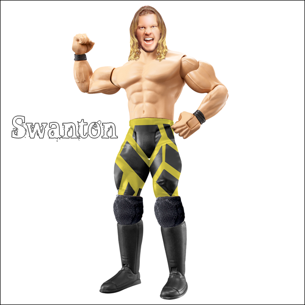 Without a doubt, Dielawn takes this one. Dielawn makes one of his best figures ever, with it being near flawlessness. Swanton gave a good try, but still fell short. Head is a little weak, but the attire work is amazing!WPF United States ChampionshipGazza (c) vs. BretStipulation: Without a doubt, Dielawn takes this one. Dielawn makes one of his best figures ever, with it being near flawlessness. Swanton gave a good try, but still fell short. Head is a little weak, but the attire work is amazing!WPF United States ChampionshipGazza (c) vs. BretStipulation: Any member of the Nation of Domination Gazza
Head: B+
Attire: A
Creativity: B+
Overall: A-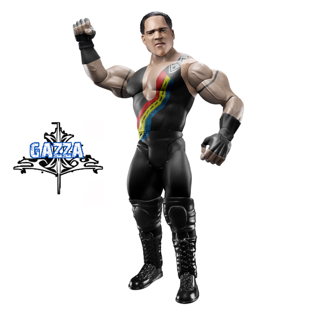 Bret Bret
Head: A
Attire: B+
Creativity: B+
Overall: A-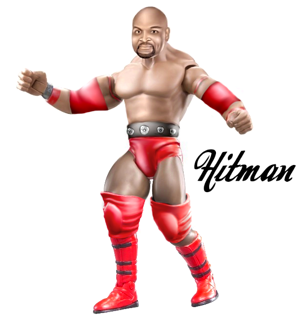 EXTREMELY close matchup, both have eachother beat in a key area. I feel Gazza's attire beats Bret's, but Bret beats Gazza in the head area. After some thought, I feel as Gazza gets my vote, for an overall cleaner figure. Bret's seems too blurry on the bottom, but still amazing work.WPF World Championship; MJH Cashes InGreat One (c) vs. MJHStipulation: EXTREMELY close matchup, both have eachother beat in a key area. I feel Gazza's attire beats Bret's, but Bret beats Gazza in the head area. After some thought, I feel as Gazza gets my vote, for an overall cleaner figure. Bret's seems too blurry on the bottom, but still amazing work.WPF World Championship; MJH Cashes InGreat One (c) vs. MJHStipulation: Evan Bourne (Matt Sydal) & Brandon Walker (Chris Harris) Great One
Heads: A
Attires: A
Creativity: A
Overall: A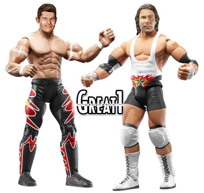 MJH MJH
Heads: A
Attires: A-
Creativity: A
Overall: A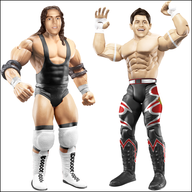 MOTY candidate in my honest opinion. Both did their best work on their figures and it really took me awhile to decide on a choice. G1's attires are superior to MJH's, but the heads are equally, maybe with an advantage to MJH. After 10 minutes of comparing their figures, Great One gets my vote, as his figures look nearly professional. EXCELLENT AWESOME MATCH! MOTY candidate in my honest opinion. Both did their best work on their figures and it really took me awhile to decide on a choice. G1's attires are superior to MJH's, but the heads are equally, maybe with an advantage to MJH. After 10 minutes of comparing their figures, Great One gets my vote, as his figures look nearly professional. EXCELLENT AWESOME MATCH!No Reason, NO VOTE! THANK YOU TO EVERYONE WHO PARTICIAPTED. NO BOTW ON PPVS! |
|
|
|
Post by Gazza on Jul 28, 2008 0:35:24 GMT -5
Double B vs. Mattie! vs. Spencer-
Double B takes it here. The attire is alot cleaner than the others and the figure looks more realistic. Although i dislike the belt on Double Bs, its takes nothing away from the figure. Matties figure is quite good, but its not clean enough imo. Like the tattos are too big and just go over the joints. I don't Like The head on spencers although the recolour looks jakks like. He missed some blue of the origanl proto.
Vote- Double B
BDTTK & JOeY vs. Phoenix & Teh Game
I realy like BDTTKs figure the modded torso is great, as is the head mod.Overall a good looking figure.Joeys figure is good but i dislike the flabby torso choice. Matt isn't flabby.I love phoenixs figure and it is what wins the match for me. The figure is clean, the head mod is great and the attire is awesome. I like teh games attire, it looks smooth and realistic.
Vote- Phoenix/TehGame
Cass vs. Duaner
A close match,IMO. THe attire on cass fig is good and smooth and the belt is alright too. But i realy dislike the head, It looks too much like Cena.So unless Cena had a gimick change, it realy brings downt he figure. I love the recolour on duaners attire, its so smoth and jakks like. The modded belt looks great and i like the head.
Vote- Its close but I'm going with Duaner due the fact, Overall I think its the better figure. If cass figure had a better head, it would have gotten my votee. but i hate the fact it looks s much like Cena
Cabana vs. Kody
No offence to Kody but this is a no contest. Cabanas head mod is great the attire is awesome and overall its a great figure. On kodys the head is good and the attire is too, only thing i dislike is the bluryness of the desings in the inner thigh.
Vote- Cabana
Dielawn vs Swanton
Dielawn grabs it here. The attire is awesome and well done. The head is greatly done. On Swantons I like the attire but not so sure on the head, but overall i think its a good figure but just dosn't hold its self up to dielawns.
Vote-Dielawn
Great One (c) vs. MJH
Holy Crap,this is close.
Brandon Walker- I prefer MJHs head here but prefer G1s attire. It looks so smoth and there is more too it than MJHs. I know he wore a plain attire but I think G1 made the better choice by doing his dark match attire.
Evan Bourne- This is what takes my vote to G1. I prefer G1s figure all around here the head is great and the attire is too. MJHs figure is great, the attire is well done so is the head, but overall I prefer G1s.
Vote- G1
|
|
|
|
Post by tehgame on Jul 28, 2008 2:53:37 GMT -5
DoubleB-Better head Mod and cleaner out of the 3.For mattie the attire is way to bright and the elbow pad should be gray.
Duaner-Cass's Lance Storm head has wierd eye's and the elbow pad isnt very well done.
ColtCabana-Kody could has done abit better.
Dielawn-Both did a great job.Swanton did a great attire and a simple head but Dielawn has a overall 10/10 figure here.
Bret-Very hard choice but i Have to go with Bret.Gazza's gloves are abit sloppy and the head mod just was you smudged the beard from Ron Simmons.Brets figure is nice abit abit blurry in spots.
MJH vs G1=I would vote but its a very hard choice because G1 wins on the attires, but MJH wins on the head.
Great Show.
|
|
|
|
Post by brethitmanhart on Jul 28, 2008 5:24:33 GMT -5
Mattie - I think all figures are of equal quality. I just feel he put in the extra touch here and didn't do a recolour and went and created a whole new attire. Double B, your belt and torso mod is really nice, the belt has too much highlighted area on the tips. It also looks slightly blurry. Mattie your figure is an improvement from your previous ones. The tattoo's are good and just need to be rubbed out over the joints. Heads really good just slighty off with the tones. I would just desaturate the shorts a little and make sure the logo's aren't as straight and it would be a great figure. Spencer, your head is too blurry. It looks good but the smudged hair is a major turn off for me. The recolour is bad but you can still see the original colour coming through. Good match guys.
SPZ - Since you put effort into making the figure I will give you some tips. The head is really good for you. It's a vast improvement from your old figures. It is very clean and really nice part choices. If the head was a little more smudged, not too much though, and the hair was modded it would be brilliant. Nice attempt here. Glad to see your improving.
Pheonix and Teh Game - Overall better figures. Loving Fee's attire. The blue flames are perfectly done, really like what you did there. The vest is too opaque but thats not really a problem as the logo's on it are good. The head mod is also very decent. Teh Game, your figure is also good. Not really liking the attire but it's a very clean figure. The head is really good, it just needs tweeking here and there. BDTTK, I love your head mod. It's brilliant. Your torso mod is excellent. Waist up I love your figure. It's just the lack of creativity on the tights which lets your figure down. Joey, nice figure. Would be nice to see a real head, the unedited Hardy head is a let down for your figure really. The wrist tape also covers the joints. Not a bad figure though just needs some improvements. Another good match here.
Cass - Duaner, I love your figure. It seems as though you didn't do anything to the attire though. The blet looks like you just took it from a figure. The face is too big for the hair. The face is really good though, tones are perfect and you really nailed the lighting there. Cass, love how you choose the old Cena head to mod for Storm. The belt looks pretty good but could do with been a bit lighter in my opinion. The attire is also good, a little roughly cut though. Will be interesting to see which way this one goes.
Cabana - Woah, he just nailed this one perfectly. The only thing I would change in his whole figure is the torso choice. Thats really minor though. The head is a brilliant head mod. The attire is really good, I'm guessing them logo's took you a while? Kody, lovely figure there. The head is great, really shows your improving. Nice attempt at the attire too. Only thing I dislike about yours is the lines on the attire cut off at different points on the legs. Other than that it's great.
Dielawn - Easily won this match, his figure is brliiant. The attire is perfect. The head mod is really good too. Only thing I would suggest is making the head slighty duller as it looks too bright for the lighting of the torso. Other than that its great. Also, what did you do to the hair? I love it. Swanton, nice figure. The head is OK, would of looked better with modded hair or hair taken from a Jericho figure. The attire is cool, looks good in places but the lines don't bend with the legs and cross over the joints. The yellow is too light and the black can be seen through it. Nice attempt at Jericho there though.
G1 - Awesome, awesome and even more awesome. MJH's figures are too good to be voted against. Wow. Lets break this one down:
Sydal - I prefer MJH's head here. I love G1's though and prefer what he did to the hair as MJH's looks as though he smudged it and added highlights. G1's seems to be slightly too dark for the torso. The attire's are nearly equal but I feel G1 has the edge here. MJH's star and design on his tight logo's aren't as good as G1's. MJH's boot design looks better though and much sharper. The Sydal figures are very equal in my opinion. I'm so glad this match was Sydal only as it would of been unvotable with these too perfect figures.
Harris - G1 has this one. MJH's head looks like he has gone back to his old method and looks slightly blurry, still an excellent head though. I do like MJH's head better because it shares alot more lieness to Harris than G1's. Great one wins it on the attire. I feel he just went all out here. Attires are both equal if you take away G1's extra touches like the Logo and elbow pads etc. but we all know it's the extra touches that create a figure. Thats why I prefer G1's here.
Perfect match guys.
BOTW - G1
|
|
|
|
Post by hulksterdaman on Jul 28, 2008 6:24:03 GMT -5
I passed in!  |
|
Joliet Jake
Superstar
 Ya see, me and the Lord have an understanding.
Joined on: Apr 25, 2007 14:11:00 GMT -5
Posts: 738
|
Post by Joliet Jake on Jul 28, 2008 8:52:23 GMT -5
Double B vs. Mattie! vs. Spencer
Double B - I like the fact you modded the head, kinda loses the resemblance to punk but i think its cool you attempted what you did. The smudging on the torso is a bit rough, and the straight edge tat looks too light and blurry. Im not a fan of the title belt either but its a creative idea. I colors are just too off and the glare on the faceplate is too harsh. I dont like the stars on the kneed pands, everything else looks find and all the tones match up.
Mattie! - The head is too large for the body and still looks just like a picture slapped on a figure, the tones dont match either. The placement on the head is wrong as well and makes it look like he doesnt have a neck. I like that i can see the features and definition on the head but it doesn't look like a figure. Keep practicing those heads mattie. The tats looks rough in some areas and some go right over the joints. The shorts look sloppy, they ahve too much contast and using the jean shorts with the belt looks weird, i would have used the mvp shorts or a modded pair of the ss guys pants. The black parts on the shorts have absolutely no tone changes and looks flat and painted on, use the burn/dodge tool to add in highlights and shadows. I like the boot choice.
Spencer - The head cut its really really blocky, the head is too smudged and blurry, the tones dont match the body, and the placement is really off. The cuts on the tights look sloppy as well and i can see blue in places outside the purple. It doesnt seem like you took your time with this figure and its looks rushed. Take your time and practice your cuts and your heads.
My Vote - Double B : Overall a better figure all the way around, less mistakes and more accurate work.
-------------------------------------------------------------------------------------------------------------
SPZ: The head looks too big and doesnt look too figure like, still looks too much like a picture with a filter used over it. The attire choices are good but the torso is way too big for the legs, it looks like he has monkey arms and wearing football pads. The blurring looks bad around the cuffs.
-------------------------------------------------------------------------------------------------------------
BDTTK & Joey vs. Phoenix & Teh Game
BDTTK - I like the modded head, tones are a bit dark but i think its a definite improvement over your previous head method. Torso smudging looks good and the attire looks great.
Joey - I like the torso choice, head choice is accurate, attire looks clean. Tones match well.
Phoenix - I really like the head, tones match and its proportionate. Attire designs look excellent and accurate. The shirt is a nice touch and creative. Great job again this week.
Teh Game -The smuding looks nice on the head but its a little too big. The pants design is interesting but looks weird to me. Torso smudging is ok, looks too smudged in some areas though.
My Vote - Phoenix & Teh Game: Overall better figures, Phoenix made the best one out of the three and really helped sway my decision in their favor.
-------------------------------------------------------------------------------------------------------------
Cass vs Duaner
Cass - I'm not a big fan of the head but i see where you were going with it, using cena as a base is an excellent idea, but you should have swapped out some more his features. Hair and jaw line work great though for Storm, it just looks too much like cena still. Creative idea though. I like the torso choice and the tones match, i dont like the right elbow pad though. The belt looks cool and is a nice touch and the attire looks really good.... i was always a big fan of that attire.
Duaner - The face is too large and up too high on the head, it kinda has one of those circus funhouse mirror effects. Had its been better proportionally i think it would have turned out pretty good. You did a good job or matching the skin tones and the smudging is good. The belt looks too large though. The attire is effective but its kinda on the plainside, but thats not that big of a deal.
My Vote - Cass. I really liked the attire and the head mod works in some areas as well.
-------------------------------------------------------------------------------------------------------------
cj: Nice job, i like the figures except for the hbk head... i cant really pinpoint what it is but its looks really strange to me.
-------------------------------------------------------------------------------------------------------------
Kody: Good job bro!
-------------------------------------------------------------------------------------------------------------
Dielawn vs. Swanton
Dielawn - Excellent figure all around, flawless attire, great torso choice and the head looks good as well. Can't really find anything to nitpick about.
Swanton - Not a fan of the head, still looks too much like a picture and looks a bit small for the body. Torso choice is nice. Attire is nicely done, i like the designs.
My Vote: Dielawn, pretty much a flawless figure here. Dielawn seems to really have stepped it up lately in terms of quality.
-------------------------------------------------------------------------------------------------------------
Gazza vs. Bret
Gazza - Love the head mod, attire designs look great as well. The only things i dont like
are the shape of the singlet and there are some white spots on the tights by the crotch area, that i think should be black. other than that, gazza made a great figure.
Bret - The head looks really cool, and the overall aesthetic of the figure is interesting, to me personally it looks a little too much like a painting but its a creative interesting technique... maybe it just needs to grow on me. The elbow pads area cool concept kinda reminds me of the old TTL style pads, smudging on the torso looks good. Attire is accurate.
My Vote - Gazza: I really liked Gazzas figure, especially the head. Bret did a good job as well with a new techique, im just not sold on it yet... maybe it will grow on me in the next comming weeks but right now i have to go with Gazza.
-------------------------------------------------------------------------------------------------------------
G1 vs. MJH
G1 - The sydal head looks good, love the torso choice, arm bands look good. Tights look excellent as always you're attires are you strongest point. The designs look incredible and are very accurate. Harris head mod doesnt look much like him but i think its cool you did a head mod. The blending on the head looks great though. One again the attire looks excellent and the elbow pads with the white is a nice touch and shows the detail and accuracy you shoot for.
MJH- Harris head, blending wise looks great, the placement looks a bit weird though, almost needs to be higher up on the neck imo. I really like the head method you use though. Attire is clean and accurate albeit a bit boring but nothing much you can do about that. Sydal looks fantastic, attire looks incredible and the head looks excellent.
My Vote - This is an extremely tough vote, I think both sydals are extremely strong. There is something about MJH's that i like just a tad better and i think it might be the head method. As for the Harris' G1's attire is excellent but the head mod is a bit off, on MJH's his head is a bit off as well but the attire looks great just a little boring so i'd go with G1's Harris being better. In a very difficult choice in a very very close match i'm going to have to give the edge to MJH due to both heads being close in likeness. Excellent job by both.
|
|
|
|
Post by Gazza on Jul 28, 2008 8:54:49 GMT -5
DoubleB-Better head Mod and cleaner out of the 3.For mattie the attire is way to bright and the elbow pad should be gray. Duaner-Cass's Lance Storm head has wierd eye's and the elbow pad isnt very well done. ColtCabana-Kody could has done abit better. Dielawn-Both did a great job.Swanton did a great attire and a simple head but Dielawn has a overall 10/10 figure here. Bret-Very hard choice but i Have to go with Bret. Gazza's gloves are abit sloppy and the head mod just was you smudged the beard from Ron Simmons.Brets figure is nice abit abit blurry in spots. MJH vs G1=I would vote but its a very hard choice because G1 wins on the attires, but MJH wins on the head. Great Show. Honestly. I don't care that you voted Bret. But at least give valid reasons. There is nothing wrong with the gloves, and I didnt just smudge away the beard. I modded a whole new jaw onto the figure.  |
|
Deleted
Joined on: Oct 5, 2024 16:09:08 GMT -5
Posts: 0
|
Post by Deleted on Jul 28, 2008 9:20:49 GMT -5
Double B vs. Mattie! vs. SpencerBB - Title is ok. Torso looks good. Part switch is good aswell. Rating: C+ Mattie - Yellow on attire is too bright. Tats are good. Tones are off. Rating: C Spencer - Recolour is sloppy. Head is ok. Rating: C Vote: B-Boy. Cleanest of the three. Not much done on it, but cleaner than the other 2. BDTTK & JOeY vs. Phoenix & Teh GameBDTTK - Love the head mod. Beard is awesome. Torso is great. Rating: B+ JOeY - Not much i can say about this. Torso doesnt match up with the legs very well. Rating:C Feenix - Attire is great. Love it. Head mod is also great. Shirt is cool too. Rating: A+ Teh Game - Attire is simply awesome. Head is meh. Torso is good. Rating: B+ Vote: Fee' Game - Most worked on and overall better. Cass vs. DuanerCass - Love the attire. Its great. Title is great aswell. Head still kinda looks like Cena though. But other than that well done. Rating: A Duaner Sanchez - Head is good. Title is great. Attire recolour is good. Good Job. Rating:B+ Vote:Close but Cass. Most done and attire is better. Duaner has the better head and titles are equal but Cass' attire does it for me. Cabana vs. KodyCabana - Holy ****. Attire pwns. As does the head. And the whole figure. Rating: A+ Kody - Hair addition is good. Attire is good. Well Done. Rating: B Vote: Cabana. No Doubt. Better overall figure. WPF United States Championship
Gazza (c) vs. BretGazza - Attire is awesome. Head mod is cool. Well done Gaz. Rating: A- Bret - Head is good. I dont really like the lighting of the figure though. Elbow pads are ok. Knee Pads are wayyy too big. Figure also looks really blurry. Rating: B Vote: Gaz. Cleaner figure. Bret's lighting and knee pads kill the figure. Sorry.
WPF World Championship; MJH Cashes In
Great One (c) vs. MJHG1 - Attire on Sydal is amazing. So is head. Harris attire is good. Head doesnt really look like him though. Rating: A+ MJH - Sydal attire is amazing aswell. Love the boots. Head is awesome. HAiirs head is good. Attire is ok. Rating: A+ Vote: Close Match, but i gotta go with MJH  Attire on Sydal is better imo(just slightly). And G1's Harris head doesnt really resemble him. Very Close match. Well Done Dielawn, you deserve to win.
|
|
|
|
Post by duan on Jul 28, 2008 9:39:50 GMT -5
I passed in! you handed in late. and i didn't know John Cena won the United States championship. Oh well. |
|
|
|
Post by Cass on Jul 28, 2008 10:03:20 GMT -5
I passed in! you handed in late. and i didn't know John Cena won the United States championship. Oh well. well he did... 2 times |
|
imdielawn
Main Eventer
watch.imdielawn.com
Joined on: Jul 16, 2003 10:42:29 GMT -5
Posts: 1,864
|
Post by imdielawn on Jul 28, 2008 10:08:25 GMT -5
Double B:The stomach is too dark and the title doesn’t look good. Other than that the figure is pretty clean. Mattie:The head needs some work, and really isn’t a good head to use for this figure, it’s at the wrong angle. Tattoos are pretty good, except for the Pepsi logo. The legs are a bit too big for the figure and the recolor is a bit weird. Spencer:The head is a bit blurry, the color from underneath the new tights recolor are showing and the cobra/spitfire tattoo are missing. VOTE:
Double B: Although the parts I like didn’t have anything done to them, it has fewer flaws than the other two.
--------------------------------------------------Spz:The upper body is too big for the lower body and the head is kind of choppy and looks like what he might look like today. VOTE:--------------------------------------------------
---------------------------------------------------BDTTK:I like the head mod, but the head looks really blurry due to whatever you put over it. The “Warrior” on his tights get really small is it goes to the right, but it should be the same size on the whole thing. Good attempt at the torso mod, it’s a bit blurry and tones don’t match. Joey:This is one of your best figures. The only thing that needs work is the wrist tape. There isn’t any shading added to it. Feenunks:This is a great figure, but I don’t think the head and body tones match. The Game:The head is too big for the upper body you used. The pants are well done though. Also, I don’t think the arms match the upper body tones. VOTE: No Vote. Joey had a better Hardy than Teh. Phoenix had a much better Chavo than BDTTK--------------------------------------------------Cass: I don’t like the Cena head or the kneepads, they are blurry and don’t even fit on the legs. The belt looks pretty good. Duaner: The face doesn’t fit on the head. The belt isn’t bad, but it doesn’t fit on the figure right, based on the side of it, it looks like it should be resting about half an inch lower. Good recolor. VOTE: Cass. It’s alright, the head is pretty bad and so are the knee pads, but Duaner’s head is worse and the title is too big.
--------------------------------------------------CJ: The head on HBK is horrible and for some reason you attached it to the neck, which looks fat because of it. I like the Jericho, nothing I would fic.
VOTE: -------------------------------------------------
--------------------------------------------------Cabana: The figure is pretty much flawless. It’s a great head mod and attire. The glove on the right looks a bit too dark. Kody: The head mod is ok, the hair isn’t really correct. Good attempt at the attire, it’s a bit hard to see the joints though.
VOTE: Cabana. This is a really solid figure with very little to no flaws.
--------------------------------------------------MY LAST MATCHDielawn: What Bret said earlier about the face being too light: They are the same color.  Swanton: Swanton: The head looks too much like a picture, the boots are too long for the rest of the legs, you have three different black tones on the lower body, and there is a lack of shading on the tight design
VOTE: ---------------------------------------------------
--------------------------------------------------Gazza: The upper body attire is really crooked, if you looked at it from the front, it would be shaped really weird. Good design though. The jaw doesn’t match the rest of the head.
Bret: The head is too big for the body. A large portion of this figure is blurry too. VOTE: Gazza. Although the attire is really crooked, his figure is a lot cleaner.
--------------------------------------------------
Great1:The attires are awesome and extremely clean. The head on Bourne is great, but I don’t know if it matches the lower body tones. The head on Braden really doesn’t look like him. MJH:Your Braden figure is pretty tight, but the upper body is too muscular for him. The heads are pretty good on both. VOTE: No one. MJH has better heads but G1 has better attires.
--------------------------------------------------Quick Results:Double B Cass Cabana Gazza
|
|
|
|
Post by duan on Jul 28, 2008 10:25:13 GMT -5
you handed in late. and i didn't know John Cena won the United States championship. Oh well. well he did... 2 times whatever, good match. |
|
|
|
Post by brethitmanhart on Jul 28, 2008 10:50:10 GMT -5
What I meant Dielawn was the forehead it's self is too bright. The tones are fine with the torso it just needs to have a different shade or two on the forehead and not just the one. Anyway it's a tiny little thing, nothing worth worrying about.  |
|
|
|
Post by sycho1warrior on Jul 28, 2008 18:07:56 GMT -5
BDTTK & Joey/Phoenix & Teh Game - My votes going with Phoenix and Teh Game, Phoenix carries Teh Game in this match imo. Teh Game gave Hardy a decent pair of pants, the head is allrite could be better.
Cass/Duaner - My vote going with Cass here, the head mod (It is right) isn't that well done, still looks like Cena. Attire and Belt look good. Duaner's face dosen't look like it fits right, plus the belt looks to big.
Cabana/Kody - My vote goes to Cabana, the attires is pretty much the sex imo, and the head mod is really good. Kody did a pretty solid figure but it just dosen't beat Cabana.
Dielawn/Swanton - My vote goes to Dielawn here. The head is the better of the 2. And the attire is pretty dang good. Swantons attire is good also but the head lets the figure down, the tones not matching also lets it done.
Gazza/Bret - Gazza gets my vote. Bret's figure just looks really weird to me, which lets it down quite abit. Gazza attire and head win the vote from me.
MJH/G1 - MJH Get my vote. G1 Sydal tones seem abit off but attire is quite good. The Harris lets the 2 down, the head hardly looks like imo. Both of MJH heads are pretty much smack dab on. The only thing that annoys me is the head placement, maybe flip, it could look better. Sydal's attire is good and is better then G1's Sydal attire.
|
|
|
|
Post by hulksterdaman on Jul 28, 2008 18:16:11 GMT -5
I got F'd in the A.
|
|
|
|
Post by PhoeniX™: Valoween on Jul 28, 2008 18:31:33 GMT -5
Double B vs. Mattie! vs. Spencer: Not a fan of any of them, but I guess Double B's is the cleanest. I would vote for Mattie, but I don't like how the tattoos go over the joints.
Cass vs. Duaner: I vote for Cass. It's a perfect figure, but the eyes put my off a little. I love the kneepads/kickers work. Nothing is really done with Edge, apart from the face. It just looks odd, the forehead looks too short.
Cabana vs. Kody: I vote for Cabana. The attire and cleanliness of the figure steals it once again for me.
Dielawn vs. Swanton: I vote for Dielawn. The head looks relly good, and he made a the perfect attire. Although it looks simple, I attempted it one, and it's hard. Swanton is improving though.
Gazza (c) vs. Bret: I'm voting for Gazza. Bret's looks far too disproportional and cartoon like to ba a figure. Gazza is improving attire wise, the face mod looks great, too. The shape of the chest singlet is a little lop sided, but the whole figure is superior.
Great One (c) vs. MJH: All figures are great. But the attire on MJH's Braden Walker really lets his down. G1 provided the perfect Braden attire. His two figures are very clean, and the designs rocks my socks. I vote for G1.
|
|
|
|
Post by duan on Jul 28, 2008 21:29:15 GMT -5
Voting OVER!
|
|