|
|
Post by iamkrang on May 22, 2009 7:55:48 GMT -5
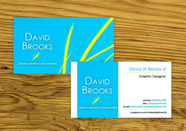 Maybe Ill get some printed someday, but I am sure I will redesign prior to that. What are your thoughts on this business card? |
|
Epic
Main Eventer

Joined on: Jan 1, 2002 20:41:22 GMT -5
Posts: 2,314
|
Post by Epic on May 22, 2009 11:53:30 GMT -5
If I were to receive this from a potential employer, depending on the job, I wouldn't be blown away by it but I would hold onto it. It's simple, but it works. It's a nice design that incorporates everything a business card should, and nothing it shouldn't. I don't know about color prints, and if there would be any type of fee increase for having one side completely baby blue, but I remember hearing a "rule" about keeping it below three colors which I think you did. If Kliquid is still around, I think he might be able to clear that up? Maybe? -- Anyway, you're DEFINITELY going to want to lose the glow / shadow on all of the text. It's unnecessary. With that, you're going to want a more professional font. Nothing extravagant, but certainly not Arial. Looking at the card again, I notice you would be applying for a graphic designer position. For something like this, I'd think you would want something a bit more original.. something that your potential employer is going to remember, hold onto. Right now, your card is nice and you know, it's neat looking.. But there's nothing there that makes me say "Holy crap, I need this Brooks guy doing my artwork!" I appreciate the simplicity you're going for, and you're spot on, I just think you need to establish more of an identityIf you are serious about getting cards printed, I would suggest checking these out for some inspiration and such.. inspiredology.com/cool-business-cards/Nice work! |
|


