|
|
HBK Sig
Mar 29, 2010 14:46:08 GMT -5
Post by The Champ is Here! on Mar 29, 2010 14:46:08 GMT -5
nothing to big of a deal, my first attempt at something 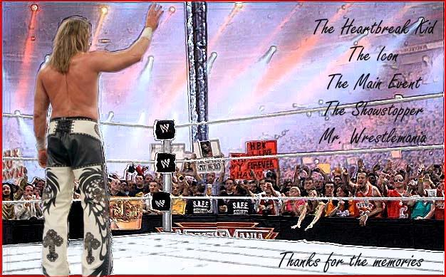 |
|
|
|
HBK Sig
Mar 29, 2010 14:56:34 GMT -5
Post by alexgg on Mar 29, 2010 14:56:34 GMT -5
I dont like how Micheals sticks out like that. I love the effect myself but some parts look ruined such as the Turnbuckle and ropes.
The red border dosnt work well in my opinion, black would of had been a better choice.
and finnaly I disliek the font as it dosnt stick out enough.
Good job for a first.
|
|
|
|
HBK Sig
Mar 30, 2010 3:01:16 GMT -5
Post by King Silva on Mar 30, 2010 3:01:16 GMT -5
I really just think the font is bad.
For a first time though it is good.
|
|