|
|
Post by Valbroski on Jan 14, 2012 14:18:24 GMT -5
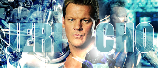 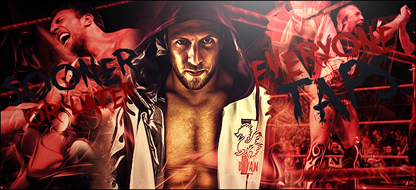 sorry to be boring with all the wrestling graphics but I'm just starting to get back into watching so they are fun to make  I really would love some feedback on the daniel bryan one mainly because I'm having trouble with the text/text placement. I still want it to say Sooner or later everyone taps but I'm not sure the best way to go about it. I put it like this as a placeholder but I'm hoping to get some ideas on how to fix it because it still looks off to me. Anyway sorry to ramble, thanks for reading/looking. I appreciate any feedback. Oh and I forgot to mention, any feedback on lighting would be great as well because I'm still trying to get the hang of that. |
|
Deleted
Joined on: May 7, 2024 17:37:03 GMT -5
Posts: 0
|
Post by Deleted on Jan 14, 2012 15:26:49 GMT -5
i think they both look good but as you said yourself, the text on the daniel bryan one needs work. i don't think its as much of placement as it is making the text more visible. whether it be changing the font color, adding a glow, drop shadow, etc. also, it looks like hes vomiting up the 'n' in everyone so lowering the text may be an option as well.
|
|
|
|
Post by Valbroski on Jan 14, 2012 15:38:24 GMT -5
Thanks for the reply man 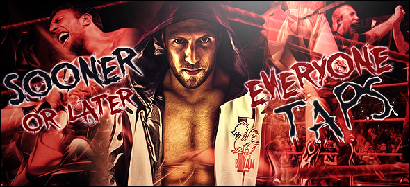 I think you were right about the glow for the text. My original idea was to not make the text stand out but maybe that was the wrong way to go about it. I also lowered the 'everyone' because I couldn't un-see Bryan vomiting up the n after you pointed it out haha. I still feel like the text looks a bit off though so if you or anyone else have anymore suggestions I'd be happy to hear them. |
|
|
|
Post by bennet07 on Jan 14, 2012 16:29:38 GMT -5
do you take request if so could you make one for everyone in my sig so dolph mcintyre barrett ryder and rhodes
|
|


