|
|
Post by [MJH] on Feb 29, 2008 11:31:34 GMT -5
Updated 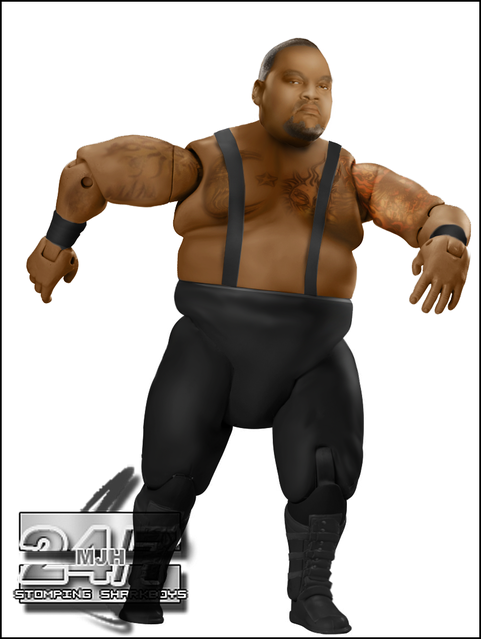 Added boots Changed head Lightened skin |
|
Deleted
Joined on: Apr 30, 2024 8:53:43 GMT -5
Posts: 0
|
Post by Deleted on Feb 29, 2008 11:50:31 GMT -5
You've made alot of BDV's.
But like your other one, i cant really see it good so could you make it lighter plz.
|
|
|
|
Post by ● kaneisdaman ● on Feb 29, 2008 11:51:39 GMT -5
Looks good but your previous attempts were better. The head has far too much shading on the top and the hair does even have a definite lining which it should. For some reason the face looks odd too maybe since you flipped it. The head is also too big for the body, make it smaller.As for the torso its quite good as are that tats although they could be stronger. The positioning of the sun is odd too. The straps are great, nice work. The tights are fine too. Finally the boots. BDV doesnt have the laceups, he has that velcro or whatever it is style where the buckles goes across. Try and incorporate that next time.
Overall its good but previous attempts were more successful.
|
|
|
|
Post by [MJH] on Feb 29, 2008 12:18:08 GMT -5
You've made alot of BDV's. But like your other one, i cant really see it good so could you make it lighter plz. seriously you need to sort out your screen because the only dark parts are the chin and top of the head. |
|
|
|
Post by Kody on Feb 29, 2008 12:54:48 GMT -5
No, it's way too dark.
|
|
|
|
Post by [MJH] on Feb 29, 2008 12:59:26 GMT -5
well tbh it's fine for me and if I lighten it anymore it'll look to light, it's not my fault my screen is different to you guys's.
|
|
|
|
Post by mania on Feb 29, 2008 13:15:50 GMT -5
Skintones ain't matchin'. Not sold on the head much.
|
|
|
|
Post by [MJH] on Feb 29, 2008 13:23:21 GMT -5
Skintones ain't matchin'. Not sold on the head much. Thanks for some criticism that isn't just saying it's too dark.  Tbh I didn't spend much time on the head, I'll try using a real photo later hopefully itll be better. |
|
Stewart
Superstar

Joined on: Oct 21, 2007 17:14:43 GMT -5
Posts: 616
|
Post by Stewart on Feb 29, 2008 17:31:21 GMT -5
Awesome Tattoo Work But Like Mania Said Skin TOnes Dont Match And The Left Arm Looks Alittle Bit Wierd.
9.1/10
|
|
|
|
Post by [MJH] on Feb 29, 2008 17:42:53 GMT -5
Awesome Tattoo Work But Like Mania Said Skin TOnes Dont Match And The Left Arm Looks Alittle Bit Wierd. 9.1/10 are you judging the newer one or the older one? |
|
Stewart
Superstar
Joined on: Oct 21, 2007 17:14:43 GMT -5
Posts: 616
|
Post by Stewart on Feb 29, 2008 18:07:39 GMT -5
The Newer One.
|
|
|
|
Post by [MJH] on Feb 29, 2008 18:09:23 GMT -5
well mania said the skintones don't match on the other one, in the newer one the skin tones match. Obviously not perfect but cloase enough.  |
|
|
|
Post by Kody on Feb 29, 2008 18:22:07 GMT -5
Sooooooooo much better. The head is very nice. Love the boots, too.
|
|
Deleted
Joined on: Apr 30, 2024 8:53:43 GMT -5
Posts: 0
|
Post by Deleted on Feb 29, 2008 21:45:44 GMT -5
Does it look like he is trying to dance to anyone else? Looks great though MJH
|
|
|
|
Post by ● kaneisdaman ● on Mar 1, 2008 3:27:35 GMT -5
To me, the tones are more odd on this one. The abundance of white on the cheeks just looks odd, it almost gives a rikishi resemblance. I suggest making the whole body slightly darker with the head getting a little more than the rest of the body. Nice to see the fixed boots, also head could be smaller.
|
|
|
|
Post by JClemons2010 R.I.P JAX on Mar 1, 2008 12:18:59 GMT -5
Does it look like he is trying to dance to anyone else? Looks great though MJH Yeah... ...this is good though MJH...The only flaw I can see is that his torso is a tad bit skinny....and your forgot his stomach tattoo which I believe is a dragon...very good though a step-up from your last one |
|
|
|
Post by thegr8collector on Mar 2, 2008 10:01:54 GMT -5
the tits could be more defined
|
|


![[MJH] Avatar](http://i56.tinypic.com/5x3ote.jpg)


