|
|
Post by .:xx Double_B xx:. on Mar 9, 2008 18:04:12 GMT -5
Hitman: 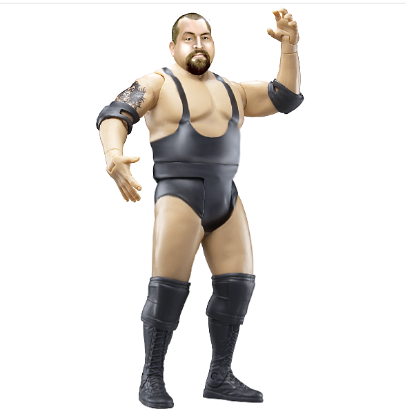 Mine: 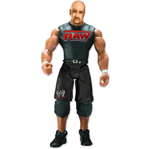 first to 5 No Reason= ah, you know the drill. |
|
|
|
Post by Kody on Mar 9, 2008 18:42:04 GMT -5
Hitman - b-boy's logos look kinda just slapped on. Head is bad. The highlights are very bad. Too bright. Makes him look like he has white skin in some areas, black in the others.
|
|
|
|
Post by ruckfules123 on Mar 9, 2008 19:04:36 GMT -5
Bret-Overall better.BB,you should'nt add that much highlights.
|
|
Deleted
Joined on: May 5, 2024 12:52:50 GMT -5
Posts: 0
|
Post by Deleted on Mar 9, 2008 20:30:44 GMT -5
Hitman - Better Head.
|
|
|
|
Post by .:xx Double_B xx:. on Mar 9, 2008 22:14:47 GMT -5
Bret-Overall better.BB,you should'nt add that much highlights. ok, i will try to use a lower opacity. |
|
JakksFigFan
Main Eventer

Joined on: Sept 7, 2007 19:51:20 GMT -5
Posts: 2,132
|
Post by JakksFigFan on Mar 9, 2008 22:18:45 GMT -5
Hitman, better head, B-Boys just looks to smudged.
|
|
Stewart
Superstar
Joined on: Oct 21, 2007 17:14:43 GMT -5
Posts: 616
|
Post by Stewart on Mar 9, 2008 22:26:27 GMT -5
Hitman - Just Overrall Better
|
|
|
|
Post by .:xx Double_B xx:. on Mar 10, 2008 0:07:44 GMT -5
hitman wins, good job. I feel honored to be even given a chance to V.S Hitman. (no homo)
|
|
|
|
Post by brethitmanhart on Mar 10, 2008 13:02:33 GMT -5
hitman wins, good job. I feel honored to be even given a chance to V.S Hitman. (no homo) That made me laugh. Good match, your improving alot. The figure is much better than some of your first ones. |
|
Irish Ghost
POSSIBLE BAD TRADER
Joined on: Mar 5, 2008 15:23:06 GMT -5
Posts: 1,674
|
Post by Irish Ghost on Mar 10, 2008 14:00:41 GMT -5
hitman
|
|
Stewart
Superstar
Joined on: Oct 21, 2007 17:14:43 GMT -5
Posts: 616
|
Post by Stewart on Mar 10, 2008 14:05:02 GMT -5
You Need To Post A Reason Why You Think Hitmans Is Better.
Like Example:
Hitman - Head Is More Figure Like And Better Attire.
|
|


