|
|
Post by Epic Z on Feb 27, 2013 14:55:00 GMT -5
Epic Z:  T-Swift: Threadhead  Stip- Mixtape Cover Size-500x500 First to 3 votes wins, no reason no vote. Good luck! |
|
The Canadian Zebra
Main Eventer
 WF 15+ Year Member
Formerly: T-Swift, Flyleaf, Ian White's Mustache, and Strike Force
WF 15+ Year Member
Formerly: T-Swift, Flyleaf, Ian White's Mustache, and Strike Force
Joined on: Apr 17, 2004 12:00:07 GMT -5
Posts: 2,862
|
Post by The Canadian Zebra on Feb 27, 2013 19:10:37 GMT -5
Good Luck EZ!
|
|
|
|
Post by /X Metal Sorenges x "Mac Oh J~ on Feb 27, 2013 19:30:46 GMT -5
My vote goes to T-Swift on this one.
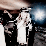
Epic Z: Your graphic wasn't bad at all it just seemed like you could have done much more with the piece and as it currently stood it didn't seem to have much complexity as far as image manipulation, colorization, blending etc. The font/text used could have been a better as well but I like the use of the dark night time scenery as an eye appeal for the mixtape cover but personally this isn't my favorite from you.
T-Swift: Threadhead: I think you did a really fine job on this one here T-Swift. The way you incorporated a bit of background Shad K shading was very nicely done imo. The image placement for both fit quite smugly and the whole piece overall really fit that whole hip-hop tall baller shot calla persona. I like the dirt brown background as well. You've made quite a few really nice pieces, you gotta pull one out now.
Good match you two, it should be a close one!
|
|
|
|
Post by Epic Z on Mar 4, 2013 10:35:28 GMT -5
I hate to be a pest, but do you guys think you could vote on this? I'd hate for this match to go to a waste.
|
|
|
|
Post by ¡Twist Of Lime Green Jello! on Mar 5, 2013 4:04:46 GMT -5
I'm going with T Swift.
Epic Z's just wasn't enough because all I'm seeing is Adjustment Layers and text. Swift's grungy background with the stenciled images compliment each other plus the mirrored effect underneath looks great. The tape is a nice touch too. Only thing I'm not feeling is the render, I'm not sure if its low quality or intentionally blurred.
|
|
|
|
Post by Parchandri on Mar 8, 2013 9:37:20 GMT -5
I'm going to go with Epic Z on this one. I feel it's more of a professional piece, and I could really see this being a page in a magazine. Overall the entry is really clean, simple, and very well put together. I wish the text popped a bit more, but I love the font choice and placement. T-Swift's isn't bad by any means, the background is really nice, and I believe that a continuation of the background instead of the other elements on top of it would have worked much better. I don't care for the tape effect much at all, and the main picture is a bit distracting when paired with the background.
|
|
Deleted
Joined on: May 19, 2024 20:11:53 GMT -5
Posts: 0
|
Post by Deleted on Mar 10, 2013 20:21:04 GMT -5
I'm going with Epic Z, it looks much more like an acutal Album Cover or something I could see 50 doing. While with T-Swift's it doesn't look very much like something out of an acutal cover. Doesn't really spit out Hip-Hop to me while Epic Z's shows 50 in a place that inspires his music and what his mix tape is all about and thats what the embodiment on an emcee and hip-hop truly is so Epic Z
|
|
|
|
Post by Epic Z on Mar 11, 2013 1:37:20 GMT -5
2-2 next vote wins! Good luck!
|
|
Deleted
Joined on: May 19, 2024 20:11:53 GMT -5
Posts: 0
|
Post by Deleted on Mar 20, 2013 1:28:49 GMT -5
Epic Z, soley on the others photo. i dont like how its b&w and blurred. it dosnt seem to go to gether. epic z's seems to be more professional and clean
|
|