|
|
Post by Valbroski on Mar 25, 2013 14:07:57 GMT -5
 couldn't decide if I liked it. |
|
|
|
Post by /X Metal Sorenges x "Mac Oh J~ on Mar 25, 2013 14:45:14 GMT -5
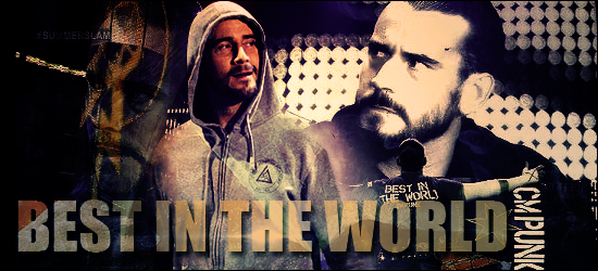
I actually really like this piece you have here Valbroski. Personally I think the dark array of the work actually suits the graphic very well in this case but perhaps a little less on the septia on the top right hand corner Punk would have looked a bit better. The fainted CM Punk face with the Summerslam tag in the background somewhat disturbs the symmetry that the work gathers together so if you work around that primarily that would surely make the piece stand out more. I like the font and the text, nice one Valbroski.
|
|
Deleted
Joined on: May 7, 2024 13:27:11 GMT -5
Posts: 0
|
Post by Deleted on Mar 25, 2013 18:28:58 GMT -5
I like it for the most part, the only thing I don't care for is the image of his face with the fist and lightning bolt logo over it. It looks odd and I think the whole piece would look better without it. Nice work though. I like your text work and effects on the images.
|
|
|
|
Post by Epic Z on Mar 27, 2013 9:39:16 GMT -5
I love how you incorporated the text on his shirt into the graphic. Very creative and cool idea. I wish that it was longer though on the left side so that the text could still be centered. I agree with AC that the lighting bolt isn't needed and it hurts the graphic more than it helps it. I think when it comes to graphic making the phrase "less is more" really comes into play.
|
|
|
|
Post by Valbroski on Mar 27, 2013 21:41:57 GMT -5
I love how you incorporated the text on his shirt into the graphic. Very creative and cool idea. I wish that it was longer though on the left side so that the text could still be centered. I agree with AC that the lighting bolt isn't needed and it hurts the graphic more than it helps it. I think when it comes to graphic making the phrase "less is more" really comes into play. The text honestly happened by accident but I didn't think it looked bad so I rolled with it. I'm starting to agree with you guys now that I look at this again about the logo. It was part of the image to the right, same with the CM Punk text, and I thought it would work for helping with blending but yeah now that I look at it again I'm not really feeling it. Appreciate the feedback guys, thanks for looking. |
|


