|
|
Post by HVMMONS on Aug 4, 2013 21:19:37 GMT -5
After joining this forum last night, i decided to make a signature of one of my favorite wrestlers. I made this signature with Photoshop CS5. I will continue to make more designs! I had more signatures that i made for my MySpace (when it was cool) Jeff Hardy, Chris Sabin, and Matt Sydal fansite, but my hardrive crashed and i lost everything. Maybe i'll remember the passwords so i can share them with you all.  |
|
Deleted
Joined on: May 18, 2024 17:53:05 GMT -5
Posts: 0
|
Post by Deleted on Aug 4, 2013 21:20:41 GMT -5
Wow man looks great. Can you tell me everything you did? Looks really cool man.
|
|
Deleted
Joined on: May 18, 2024 17:53:05 GMT -5
Posts: 0
|
Post by Deleted on Aug 4, 2013 22:20:07 GMT -5
I like the concept and the quality is good, but it's really harsh on the eyes. The double stroke/drop shadow on the main Ziggler pic makes it feel like you're either supposed to be wearing 3D glasses or he's vibrating left and right. That combined with a pretty busy background makes it a little tough to look at. I think this graphic would benefit greatly from toning down the effects on the front Ziggler image. But overall it seems like you have nice design ability and a good layout concept, just could use some tweaking.
|
|
|
|
Post by HVMMONS on Aug 4, 2013 23:04:25 GMT -5
Wow man looks great. Can you tell me everything you did? Looks really cool man. Thanks! I started off with a plain white background, planted the Ziggler PSD in the middle. I wanted this Ziggler signature to just be all black and white and to have the WHC not in black and white. The WHC didn't turn out as i planned but i wanted that to stand out from the very start. Then after messing with multiple different things, i made separate layers for the brushes giving it a bright color feel to match his shirts). After placing the brush layers where i wanted them i began placing the photos underneath the brush layers and simply blended the pictures into the white background using "pin light" option. Of course, i erased (soft eraser tool, very low opacity and flow) some portions of each picture to give in more to the white background. |
|
|
|
Post by HVMMONS on Aug 4, 2013 23:08:26 GMT -5
I like the concept and the quality is good, but it's really harsh on the eyes. The double stroke/drop shadow on the main Ziggler pic makes it feel like you're either supposed to be wearing 3D glasses or he's vibrating left and right. That combined with a pretty busy background makes it a little tough to look at. I think this graphic would benefit greatly from toning down the effects on the front Ziggler image. But overall it seems like you have nice design ability and a good layout concept, just could use some tweaking. Thanks for the constructive criticism. I do agree i overdid myself on the effects of the main Ziggler, though  . My main plan for the main Ziggler was to have a two sides (blue, and pink) to match the color of his "It's Not Showing Off", and "Stealing The Show" shirts. I was not a huge fan of using the gradient option of a blue & pink stroke on the main Ziggler, so i did the "vibration" effect as you said, allowing the pictures of Dolph in the background to stand out more.  |
|
|
|
Post by Mr. PerpetuaLynch Motion on Aug 5, 2013 3:10:14 GMT -5
It's some really solid work which tends to be rare around here now-a-days. I dig the color scheme and everything about that background. Good stuff.
|
|
|
|
Post by HVMMONS on Aug 5, 2013 11:15:18 GMT -5
It's some really solid work which tends to be rare around here now-a-days. I dig the color scheme and everything about that background. Good stuff. Thanks! I'm glad you like it! |
|
|
|
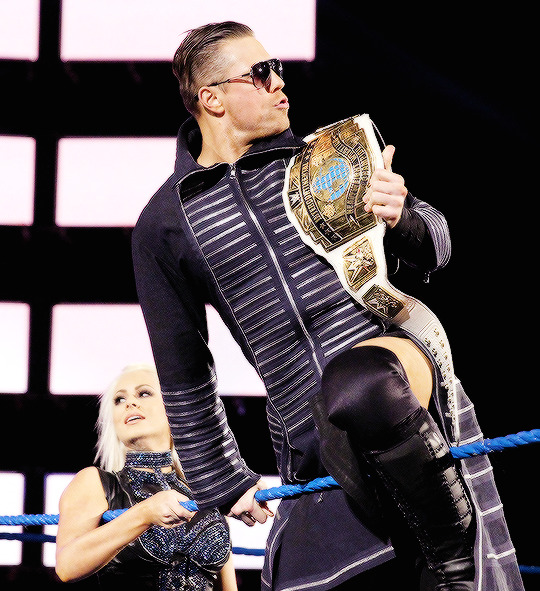
Post by HVMMONS on Aug 9, 2013 15:12:07 GMT -5
Here's a small little graphic of Ziggler, again. Nothing special. I plan to do 2 more with Punk and DBryan.  |
|
|
|
Post by HVMMONS on Aug 21, 2013 23:32:14 GMT -5
I made this for fun, not for sure if they're considered a stable now. I just made it from what happened on Raw. Enjoy. 2013 Corporation:  |
|
Deleted
Joined on: May 18, 2024 17:53:05 GMT -5
Posts: 0
|
Post by Deleted on Aug 23, 2013 21:42:03 GMT -5
Good clean work here Evan. What font is that?
|
|
|
|
Post by HVMMONS on Aug 23, 2013 22:34:49 GMT -5
Good clean work here Evan. What font is that? Thanks! I believe it's called Angryblue? I can't remember off the top of my head, I'm on my cell phone at the moment. |
|
Deleted
Joined on: May 18, 2024 17:53:05 GMT -5
Posts: 0
|
Post by Deleted on Aug 24, 2013 10:28:31 GMT -5
Good clean work here Evan. What font is that? Thanks! I believe it's called Angryblue? I can't remember off the top of my head, I'm on my cell phone at the moment. Alright thanks |
|
|
|
Post by HVMMONS on Aug 30, 2013 0:12:26 GMT -5
Forgot to post my latest graphic. I'm sure most of you guys have seen this in my signature the past two weeks, but if not here's my little graphic of Jeff Hardy  |
|