|
|
Post by ¡Twist Of Cinnamon! on Feb 15, 2014 7:38:09 GMT -5
 No prizes whatsoever for guessing the theme. I was hoping for a better image of Batista to work with but no such luck, that was the only recent high quality studio image of him unfortunately. Rate and comment to your heart's content. |
|
Deleted
Joined on: Apr 26, 2024 10:32:09 GMT -5
Posts: 0
|
Post by Deleted on Feb 15, 2014 11:59:51 GMT -5
Love the Happy Days theme but there's something that just not clicking for me here.
The bright spot right behind Batista's shoulder is extremely bright (may just be my screen but it's a bit harsh). I'm not too sure how I feel about the text being on top, maybe try the text behind him and enlarge it so even though it's a little hidden you could still make out 'Animal' and 'Unleashed'.
For the back, there's just an overkill of chains. Maybe not separate the title match participants with chains and just have the all in one long image. Also try to incorporate the six man tag match information into the same box with with the rest of the card just so it's all organized in one spot and not broken out separately.
Lookin' forward to what you do for Wrestlemania.
|
|
|
|
Post by ¡Twist Of Cinnamon! on Feb 16, 2014 4:17:28 GMT -5
Love the Happy Days theme but there's something that just not clicking for me here. The bright spot right behind Batista's shoulder is extremely bright (may just be my screen but it's a bit harsh). I'm not too sure how I feel about the text being on top, maybe try the text behind him and enlarge it so even though it's a little hidden you could still make out 'Animal' and 'Unleashed'. For the back, there's just an overkill of chains. Maybe not separate the title match participants with chains and just have the all in one long image. Also try to incorporate the six man tag match information into the same box with with the rest of the card just so it's all organized in one spot and not broken out separately. Lookin' forward to what you do for Wrestlemania. Thanks for the comments! 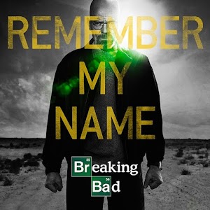 Thats what I was going for so the bright light was intentional, however I didn't want to go too far otherwise it made the text blended in too much with it.  I didn't change anything on the front because the theme would be lost if the text got moved behind him but I reworked the back to what you suggested. The chains between those at the top was to give them a 'locked in' effect seeing as they'll be in the Chamber. I got rid of a lot of the chains but kept the border ones since the horizontal ones don't look right if they're not connected to anything. If I end up doing a Wrestlemania 30 cover, it won't have a TV or movie theme |
|
Deleted
Joined on: Apr 26, 2024 10:32:09 GMT -5
Posts: 0
|
Post by Deleted on Feb 16, 2014 10:03:33 GMT -5
I like the back a lot more.
I've seen that picture of Walt before but couldn't find it when I was trying to compare yours with the original.
You should definitely continue making covers and other graphics. I enjoy seeing your work, it's disappointing how dead this board is.
|
|
|
|
Post by ¡Twist Of Cinnamon! on Feb 17, 2014 2:26:23 GMT -5
I like the back a lot more. I've seen that picture of Walt before but couldn't find it when I was trying to compare yours with the original. You should definitely continue making covers and other graphics. I enjoy seeing your work, it's disappointing how dead this board is. Cheers, I appreciate the comments  |
|
Deleted
Joined on: Apr 26, 2024 10:32:09 GMT -5
Posts: 0
|
Post by Deleted on May 3, 2014 7:23:18 GMT -5
Ok, again I’m going to start out by saying that your work is on a whole different level than the majority of stuff that gets posted on this board anymore. It’s pretty clear you have very solid ideas (particularly in composition imo) and spend a lot of time executing them.
The front:
It’s simple yet effective. I’m not too keen on the green color scheme myself but I understand your source of inspiration had green so it’s all good. Sometimes simplicity can go a long way and that’s apparent with this lone image of Batista that you’ve chosen. I haven’t seen the original image of Batista so I’m going to assume you pasted that image onto the background of the landscape to match the BB graphic. The image looks like it belongs there and if I wouldn’t have known this was based on the BB graphic, I would have assumed that was one big promo image that you ripped straight from WWE. I do think the sun glare spots are a little weak. The piece around the logo looks particularly weird and kinda looks like a random brush stroke opposed to an actual sun glare. The logo itself looks good though. I really dig the chains around the logo. That’s a nice added touch. The one thing I would have done is gone a lot bigger and bolder with the tagline text. I think it’s blended in a little bit too much right now to where it appears a bit dim. I would take advantage of that yellow color and really make it pop.
The spine:
There’s not too much to say here except it looks really good. It looks professional. I don’t have an actual WWE blu ray to compare but the stacked WWE logos at the top does look a little weird to me although I know one is the home video logo opposed to just the WWE logo.
The back:
The composition flows very well. I prefer the chains dividing the wrestlers at the top of the image because it adds a nice graphic element and matches the theme of their specific match. However, I prefer The Shield and Wyatts to be free and not boxed in with chains like you did in your update version. My biggest complaint with the back is the text work. Nothing pops at all. The white text looks amazing on that background on the front and the spine but it only shows up on the very bottom info on the back. If you step back and look from far away, the bottom retail info is the most prominent text when it should be a tagline going across the top grabbing your attention. All of the black text just looks very dull. I’m not a big fan of that font choice either to be honest but it does work. I understand using all capital letters for the headlines and for the match listing but it doesn’t look right having all caps in the synopsis / yellow section. A lot of the text would look better with some white and green thrown in and adding black strokes where needed. (especially in the tag lines / headers.)
Very good work overall and with a few tweaks I think it would look extremely professional.
|
|


