|
|
Post by destructiondan on Dec 13, 2006 15:49:58 GMT -5
 yeh i know its not the best but its my first please rate and tell me how i can improve |
|
|
|
Post by classicfan on Dec 13, 2006 18:24:19 GMT -5
too big, and the blue glow is not needed...you should make it smaller, drop the blue glow and maybe add a green glow, and ad an action shot in the background
|
|
|
|
Post by destructiondan on Dec 13, 2006 19:04:39 GMT -5
thanks alot bro ill bear that in mind
|
|
|
|
Post by animal5 on Dec 16, 2006 1:06:54 GMT -5
too big, and the blue glow is not needed...you should make it smaller, drop the blue glow and maybe add a green glow, and ad an action shot in the background wow dude do u know anything? ok drop the blue glow and add a simpler green matter of fact dont even use a glow effect bc it makes sigs look so noob,make it smaller and dont add that flash effect on the sig and add more detail |
|
|
|
Post by destructiondan on Dec 17, 2006 8:49:38 GMT -5
 i made this one today is this any better? |
|
|
|
Post by subwayboy on Dec 17, 2006 11:40:17 GMT -5
no
|
|
|
|
Post by destructiondan on Dec 19, 2006 16:56:57 GMT -5
 i think this ones alot better i did this today please rate and tell me how to improve guys |
|
|
|
Post by classicfan on Dec 19, 2006 18:14:51 GMT -5
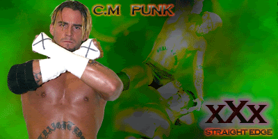
now this is the right idea..ur gettin on the right track..the only thing i don't like is that cm punk looks flat..imma make a cm punk sig and u can use it as a reference
|
|
|
|
Post by Cass on Dec 19, 2006 18:17:22 GMT -5
the text looks really good
the cut needs some effects
there it too much around the bg cut....add less so u can see it better
|
|
|
|
Post by jonesy12345 on Dec 19, 2006 19:44:20 GMT -5
to get a better look on your main pic, duplicate it and then blend to overlay, it will make the image stand out more. the CM Punk Graphic isn't all that bad. i hate the background picture blend tho. 3/10.
|
|
|
|
Post by destructiondan on Dec 23, 2006 16:04:07 GMT -5
 4th sig i hope im improving |
|
|
|
Post by alex123ecw on Dec 23, 2006 16:12:01 GMT -5
4th sig i hope im improving GOD LIKE very nice! 8/10 |
|
|
|
Post by animal5 on Dec 24, 2006 12:11:24 GMT -5
dude you're fourth sig looks great!!!
wow keep making more dude I like your work!
|
|
|
|
Post by batistabomb93 on Dec 24, 2006 12:15:49 GMT -5
Nice 4th One bud. Add a Border to it to make it look a little more professional. The only thing I dislike about it is how large your name text is. I understand you want to mark your work, so maybe you can initial it on the corner so the whole graphic can be shown.
|
|
KRAYZIE BONE
Main Eventer
 WF 10 Year Member
Visual.Avenues
WF 10 Year Member
Visual.Avenues
Joined on: Jul 20, 2003 22:29:25 GMT -5
Posts: 1,608
|
Post by KRAYZIE BONE on Dec 24, 2006 22:53:41 GMT -5
the 4th one is good. the only thing wrong with it is the text is bad. but your definately improving.
|
|
|
|
Post by destructiondan on Dec 28, 2006 11:17:34 GMT -5
 right so here is my first attempt at a vid sig i like it . please rate and tell me what i should change etc thanks. |
|
Deleted
Joined on: May 8, 2024 16:43:46 GMT -5
Posts: 0
|
Post by Deleted on Dec 28, 2006 12:07:51 GMT -5
Very Good.Theres nothing wrong with it to me
|
|
|
|
Post by destructiondan on Dec 28, 2006 13:15:45 GMT -5
thanks bro keep postin people
|
|
|
|
Post by Cass on Dec 28, 2006 13:16:59 GMT -5
i dont like how the gif comes to a dead stop and its kinda out of the white lines, but other than that its pretty could just fix the two things i said
|
|
Psyco Champ!
Main Eventer
0-2
Joined on: Apr 8, 2006 21:35:54 GMT -5
Posts: 1,028
|
Post by Psyco Champ! on Dec 28, 2006 17:26:02 GMT -5
i would have put a green glow on them so it would flow nice with the background...also try messin around w/ the colors of the two dif cut pics so they match
|
|