PenguinDeluxe
Main Eventer
 20 Refs and Counting
Joined on: Dec 19, 2006 21:22:54 GMT -5
Posts: 4,932
|
Post by PenguinDeluxe on Dec 29, 2006 2:08:37 GMT -5
 hope you like it |
|
|
|
Post by rock21 on Dec 29, 2006 3:42:07 GMT -5
I love it.
1,000,000/1,000,000
|
|
|
|
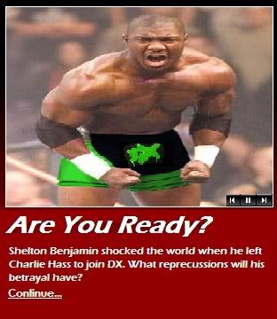
Post by ericbischoff on Dec 29, 2006 6:15:44 GMT -5
That's paint, not graphic.
|
|
|
|
Post by mustardredux on Dec 29, 2006 7:05:49 GMT -5
It still is a graphic you idiot.
It's just crap.
|
|
BTG Motherpunker
Main Eventer
It always goes down smooth.
Joined on: Jul 5, 2006 19:24:17 GMT -5
Posts: 2,690
|
Post by BTG Motherpunker on Dec 29, 2006 10:10:00 GMT -5
That's a pretty good idea but it looks really fake.
10/10 for originality, 4/10 for the actual graphic.
|
|
|
|
Post by mustardredux on Dec 29, 2006 10:52:21 GMT -5
Originality? I remember when every other member here had one of these stupid sigs  |
|
|
|
Post by pero on Dec 29, 2006 11:18:15 GMT -5
I love the way Shelton looks with Green tights, wish you would have done it in PS though. Could have been a really good graphic.
|
|
Psyco Champ!
Main Eventer
0-2
Joined on: Apr 8, 2006 21:35:54 GMT -5
Posts: 1,028
|
Post by Psyco Champ! on Dec 29, 2006 11:30:00 GMT -5
its not bad for paint, but like nitro said if u would have done it in photo shop, i think it would have came out much nicer
|
|
PenguinDeluxe
Main Eventer
20 Refs and Counting
Joined on: Dec 19, 2006 21:22:54 GMT -5
Posts: 4,932
|
Post by PenguinDeluxe on Dec 29, 2006 16:28:10 GMT -5
umm... it is in photoshop. It was my first time using ps.
|
|
tylerblackohyes
Superstar
Kiss2Kill
Joined on: Jul 11, 2005 5:23:40 GMT -5
Posts: 588
|
Post by tylerblackohyes on Dec 30, 2006 3:31:55 GMT -5
Wow, dude. If you're going to post something, at least make sure your Photoshop skills are slightly better than that. And save it at a higher quality, too. And spell repercussions correctly.
|
|
|
|
Post by PID on Dec 31, 2006 0:59:23 GMT -5
If you're going to post something, at least make sure your Photoshop skills are slightly better than that.. It's hard to get better than that if you can't post and get feedback.
The main problem I see is that the picture is stretched way out of proportion. He looks really wide. Since for this graphic you need to fit in his face, trunks, and fill that specific shape of a rectangle, you should find a more horizontal picture so he doesn't look as squished. Also, save your JPEGs at a higher quality level. Just keep practicing with Photoshop and you'll continually learn new things. |
|
|
|
Post by canyoufeeldaheat on Dec 31, 2006 9:42:47 GMT -5
Work on that mother  ing text so it matches the one from wwe.com, everyone has some doped up crud font. Anyway, it sucks. |
|