|
|
Post by destructiondan on Dec 31, 2006 13:57:02 GMT -5
|
|
Deleted
Joined on: May 8, 2024 21:26:29 GMT -5
Posts: 0
|
Post by Deleted on Dec 31, 2006 14:04:01 GMT -5
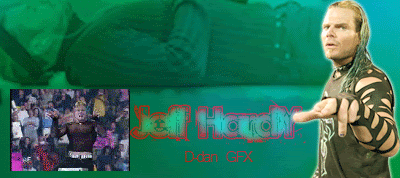
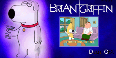
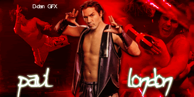
I love the Jeff Hardy except the video on it is a bit too slow.Family Gut is good and i love the glow on bryan.Maybe the Cm Punk could use a different text.The Paul London is probaly perfect
|
|
|
|
Post by classicfan on Dec 31, 2006 14:42:28 GMT -5
i only really like the CM punk one and the paul london one....but how are u puttin gifs in em
|
|
|
|
Post by destructiondan on Dec 31, 2006 15:00:26 GMT -5
|
|
becca
Main Eventer

Joined on: Dec 13, 2005 11:20:18 GMT -5
Posts: 4,042
|
Post by becca on Dec 31, 2006 15:16:41 GMT -5
The Hardy one isn't really very good. The background picture is really strange, the text kind of gets lost and the text color isn't very complementary. The video seems random.
The Family guy one is ok. I think the placement of the video is better. There is a little mistake in your blurring on Brian's leg. I don't think the font fits Brian at all, that font would have been better with Hardy. The background is pretty bland.
The CM Punk one is getting better, its a pretty standard layout with the main pic in the middle and the background being composed of action shots, but it works fine. Again, the text kind of gets lost.
My favorite is the London one. I like the action shots and the text and how the main figure has a bit of a red tint so he blends in a little, but still stands out.
One comment about all of these is in putting your name on them. If you are going to do that, try to make it somehow blend or be creative. The placement of your name in all of them is really random and takes away from the graphic. Try to blend the name in more by using the same font or placing it somewhere more original, like in the London one you could rotate it so that it runs along the line that his body makes (in the jumping pic).
|
|
|
|
Post by destructiondan on Dec 31, 2006 15:38:00 GMT -5
The Hardy one isn't really very good. The background picture is really strange, the text kind of gets lost and the text color isn't very complementary. The video seems random. The Family guy one is ok. I think the placement of the video is better. There is a little mistake in your blurring on Brian's leg. I don't think the font fits Brian at all, that font would have been better with Hardy. The background is pretty bland. The CM Punk one is getting better, its a pretty standard layout with the main pic in the middle and the background being composed of action shots, but it works fine. Again, the text kind of gets lost. My favorite is the London one. I like the action shots and the text and how the main figure has a bit of a red tint so he blends in a little, but still stands out. One comment about all of these is in putting your name on them. If you are going to do that, try to make it somehow blend or be creative. The placement of your name in all of them is really random and takes away from the graphic. Try to blend the name in more by using the same font or placing it somewhere more original, like in the London one you could rotate it so that it runs along the line that his body makes (in the jumping pic). you know what thanks alot for the advice i coudln't agree more with how the text doesnt fit brian im gonna take all this in for when im makin my next sigs |
|
|
|
Post by destructiondan on Jan 3, 2007 11:24:26 GMT -5
cmon keep postin ppl
|
|
|
|
Post by Cass on Jan 3, 2007 14:24:09 GMT -5
id say my favorite is the brian one, the gif is place perfect with a great border
|
|