Revvie®
Main Eventer
 Somewhere between Reality, and the Absurd
Joined on: Jun 29, 2005 1:04:26 GMT -5
Posts: 4,327
|
Post by Revvie® on Jan 8, 2007 3:35:27 GMT -5
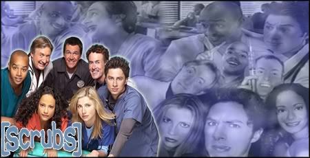 Constructive Critism is definitely wanted..still trying to get the hang of photoshop  Revvie  |
|
|
|
Post by Mole on Jan 8, 2007 12:14:34 GMT -5
- Text is squished, or at least it looks that way. When resizing anything, make sure you hold down the shift key and drag it diagonally.
- Backgrounds that composed entirely of pictures distract from the main image.
- The glow is unecessary and doesn't look too good. Also, since it's supposed to be the main picture, I'd probably have it in the middle of the picture, a little it larger, and have [scrubs] above it.
Overall, it's not too good, but, like you said, you're still trying to get the hang of it. Don't worry, you'll get better.
|
|
Revvie®
Main Eventer
Somewhere between Reality, and the Absurd
Joined on: Jun 29, 2005 1:04:26 GMT -5
Posts: 4,327
|
Post by Revvie® on Jan 8, 2007 13:32:48 GMT -5
thnx man. I will work on the things you pointed out and try to get another one up in a few days.
|
|
Phila.Elite
Main Eventer
Joined on: Jun 6, 2002 21:53:50 GMT -5
Posts: 1,642
|
Post by Phila.Elite on Jan 8, 2007 17:30:40 GMT -5
I dont like your idea of the background being filled with people just doesnt look good at all!
I also don't like the coloring!
4.5/10
I recomend using the picture on the Left! Getting rid of that entire background and make a new one that goes along with the theme without using people.
Find a Better Color Contrast...
And don't Put the scrubs text on the people!
Nice Try!
|
|