Jacob
POSSIBLE BAD TRADER
Joined on: May 15, 2006 14:11:26 GMT -5
Posts: 16,577
|
Post by Jacob on Jan 10, 2007 15:59:57 GMT -5
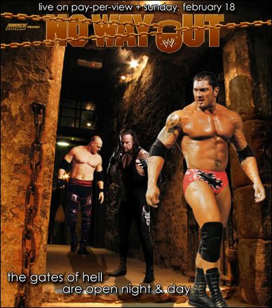
I decided to make some changes, new logo, add shows, play with lighting, ect. Before.After.First graphic in a while, I like the way it turned out. I went for the 'WWF in the 90's' look with the logo, ect. Let me know what you think. |
|
|
|
Post by James Hetfield on Jan 10, 2007 16:15:43 GMT -5
You've got a pretty good idea going. It just looks alittle un-polished to me.
|
|
|
|
Post by classicfan on Jan 10, 2007 18:04:35 GMT -5
lol kane is like oo a bug...lol but anyway...this is pretty good but like Minoru said, its a little unpolished
|
|
|
|
Post by hurricane on Jan 10, 2007 18:39:41 GMT -5
I think use the actual NWO font, add a date and it'll be a little more authentic. But, the pictures. They just seem pretty amateur or something, I don't really know how to explain it. They just dont look right. I understand what you were going for, its just unappealing to me.
|
|
|
|
Post by extreme on Jan 11, 2007 0:46:56 GMT -5
you've something pretty creative here. I don't watch too much WWE so I don't know if thats the real text font for the PPv but it looks a bit childish to me. Just try to improve this a bit, I like the concept and the effort
|
|
Deleted
Joined on: May 2, 2024 21:42:29 GMT -5
Posts: 0
|
Post by Deleted on Jan 11, 2007 3:58:21 GMT -5
Good idea, just not well performed. Need to make shadows, make them darker, different colors, etc.
|
|
|
|
Post by classicfan on Jan 11, 2007 17:43:22 GMT -5
basically its not tough enough...
|
|
Jacob
POSSIBLE BAD TRADER
Joined on: May 15, 2006 14:11:26 GMT -5
Posts: 16,577
|
Post by Jacob on Jan 12, 2007 4:24:25 GMT -5
Updated.
|
|
|
|
Post by Trypod on Jan 12, 2007 14:58:17 GMT -5
nice idea.
even with the lighting changes, you could still play around with the levels more. also take into consideration where the pictures are located and the lighting they're under. kane should probably be the darkest where he's deep in the picture and the hallway where there really is no light, and batista is just emerging.. but he's probably got enough light already. undertaker's picture seems out of place. you've got two 'live' shots of batista and kane, where it looks like they're actually walking through the hall, but then there's undertaker striking a pose for the camera. it's actually quite goofy-looking. the logo change was good as well. the official isn't always better, but if it's not possible to create something as good as or better, then don't bother. wise decision. the first logo looks pretty bad. also think the info text is a poor selection. it could definitely do without the stroke, though.
so yeah, definitely an awesome idea. i still wouldn't stop at version two. keep going with it, for sure.
|
|
|
|
Post by classicfan on Jan 12, 2007 17:21:07 GMT -5
now i like the updated version...much more of the masculine feeling (9-10)
|
|
|
|
Post by Jord on Jan 13, 2007 11:32:09 GMT -5
I love the second one. The colour is nice, but the Undertaker PSD just dosn't fit, IMO.
I love how you cans ee their shadows.
|
|