|
|
Post by sickdb101 on Jan 14, 2007 14:24:25 GMT -5
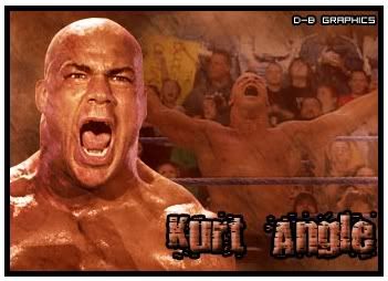 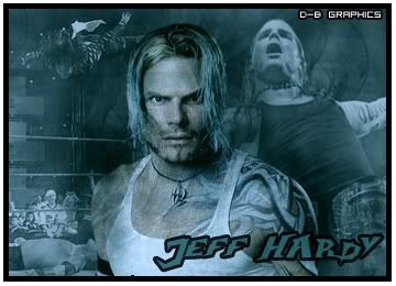 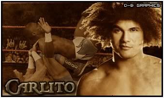 I only redid this one because It's the one I'm using. 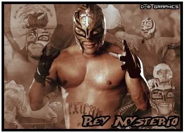 Well I think I have gotten much better at making graphics since I last posted one. Anyway rate and reply please  . Edit: I redid my Sabu sig with a different color, text style and border style. Before: 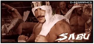 After: 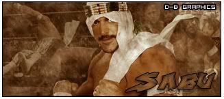 |
|
|
|
Post by classicfan on Jan 14, 2007 14:30:54 GMT -5
Me and you kind of go for the same look...good work All=(9-10)
|
|
|
|
Post by Mole on Jan 14, 2007 14:42:14 GMT -5
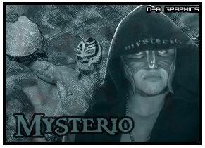   I don't really think you've gotten much better considering they're all the exact same. - Bad font that doesn't fit the graphic or the character
- Huge, ugly border
- Background that is either all action shots or filled with them to the point where the really isn't much of a background
I know this from experience it's really hard (see: impossible) to improve if you do the same thing over and over. |
|
|
|
Post by classicfan on Jan 14, 2007 14:56:52 GMT -5
I don't really think you've gotten much better considering they're all the exact same. - Bad font that doesn't fit the graphic or the character
- Huge, ugly border
- Background that is either all action shots or filled with them to the point where the really isn't much of a background
I know this from experience it's really hard (see: impossible) to improve if you do the same thing over and over. The text does fit the superstars and yes the borders do need work but thats it |
|
|
|
Post by sickdb101 on Jan 14, 2007 15:00:23 GMT -5
Yeah, borders and text styles are my biggest probelms when making graphics. Also adding to many action shots in the backgrounds. I'm going back to good-tutorials.com to read more tutorials to improve these problems. Thanks for the replies guys.
|
|
|
|
Post by hurricane on Jan 15, 2007 15:43:39 GMT -5
They're all pretty much exactly the same...they don't look bad or anything just try something different.
|
|

