|
|
Post by jjames on Feb 2, 2007 6:39:27 GMT -5
 i was going to add Text but the text is'nt working on my photoshop so i will need to get a new one or i will do it when i go to my Nan's. |
|
Jamc9103
Main Eventer

Joined on: Jun 24, 2004 5:49:25 GMT -5
Posts: 1,457
|
Post by Jamc9103 on Feb 2, 2007 10:58:12 GMT -5
Horrible Blending, you should blend them, and get rid of the strokes around the pictures that have, and it might look half decent
And, that is WAY to big to be a sig.
Btw. Text isnt working on your photoshop??? lol
|
|
|
|
Post by Mr. PerpetuaLynch Motion on Feb 2, 2007 14:40:27 GMT -5
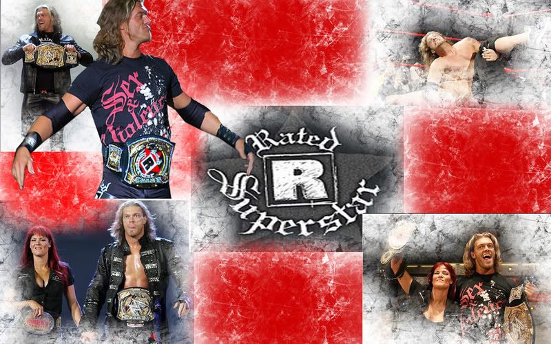
Ok, Why is Edge floating at the top of the banner with no legs? With the cut you have, he should be somewhere where you can't see the absence of legs. Secondly, the top right corner has a picture that is blended alright if you set it to like Overlay or something but the other three pictures and the Rated R Superstar logo are just tossed in there arbitrarily with no blending done to them at all. To me it looks like something that could be done in paint. I'm not saying it was but it easily could be.
|
|
|
|
Post by zombies on Feb 3, 2007 15:58:03 GMT -5
looks good I like the pics you used and the rated r superstar in the center is a good effect.
I like it I would like to see it with text now I give 7/10
|
|
|
|
Post by ovwlegend on Feb 3, 2007 17:02:49 GMT -5
bad use of brushes and pictures. Even if the blending was good it would still be bad also the pics are badly sized
2/10
|
|
|
|
Post by hulkamaniaisrunnin on Feb 4, 2007 12:11:10 GMT -5
Number 1: Thats not a sig.
Number 2: Blend!
(3-10)
|
|