|
|
Post by Lk™ on Aug 3, 2007 17:25:08 GMT -5
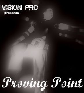
yeah, first in awhile. tell me what you think.
|
|
Danny
Main Eventer

Joined on: Oct 2, 2006 13:46:27 GMT -5
Posts: 3,718
|
Post by Danny on Aug 3, 2007 21:48:36 GMT -5
I really like this. I know its messy, but I like messy sigs. Text works very well. Nice affects. I like how the left side of Randy's face is contrasted. I love how it matches the color of the sig.
|
|
|
|
Post by classicfan on Aug 3, 2007 21:49:26 GMT -5
I'm not liking it personally. I don't like how the text cuts off in the corner. I love the main cut but the background pics are blended badly. I see what you're going for but it seems to me that the contrast is just wayyy to high for my liking.
|
|
|
|
Post by sean™ on Aug 3, 2007 21:50:53 GMT -5
i wanna make love to that sig. just so you know
|
|
|
|
Post by Lk™ on Aug 3, 2007 22:27:39 GMT -5
thanks, sean.. and styles.  classic fan, i know what you're trying to say but you're completely wrong. in order to come out with a good graphic you have to be willing to take risks, which is something i've never seen you do. what's your idea of "good blending", anyway? |
|
|
|
Post by rkolegendkilla on Aug 4, 2007 0:05:43 GMT -5
Looks great. Fits with the Orton character extremely well, and only a great GFX maker can pull this look off. Great work, buddy.
|
|
|
|
Post by classicfan on Aug 4, 2007 10:06:46 GMT -5
thanks, sean.. and styles. classic fan, i know what you're trying to say but you're completely wrong. in order to come out with a good graphic you have to be willing to take risks, which is something i've never seen you do. what's your idea of "good blending", anyway? Eh, you got me there. I really don't take too many risks. I need to branch out, I'll give you that. Anyway, it just seems there is a lot of mess in the pics of Orton. Just seems like spacing may have fixed it.  |
|
|
|
Post by Trypod on Aug 4, 2007 10:48:19 GMT -5
This is lk at his best. I haven't seen many people that have been able to pull off clusterf*ck blending and make it so appealing.
Good stuff.
|
|
|
|
Post by Mole on Aug 4, 2007 11:46:52 GMT -5
Like everyone has been saying, LK, you're great at this kind of graphic. My only complaint is that I really don't think the text should be cut off at Orton. Other than that, I think it's great, it's blended well, is pleasant on the eyes even with the super-high contrast you gave it, and it's otherwise just pretty damn delicious.
|
|
|
|
Post by Kody on Aug 4, 2007 12:51:37 GMT -5
I LOVE the font, and the way it's been placed here. The blending is alright, and like the main pic.
Good work.
|
|
|
|
Post by timebombversion420 on Aug 4, 2007 12:58:07 GMT -5
looks pretty good, Im not a fan of the font how it cuts off in the corner, and how messy it looks
|
|
|
|
Post by teeg526 on Aug 4, 2007 15:15:35 GMT -5
I've never been a big fan of cutting off text unless it's in Adobe InDesign but it fits well into the sig but I wouldn't do it regularly. The colors and font all mesh well with the pictures but the background pics need some work in the blending department. But other than that, well done and I look forward to see what else you do.
|
|
|
|
Post by gin on Aug 5, 2007 19:04:30 GMT -5
Pretty good blending. Seems like you are going for that rusted look. Therefore the font isn't really fitting. Plus the blending options you did on the font needs work. Other than that it's pretty good.
|
|
W¡LDCARD
POSSIBLE BAD TRADER
Sell me your TNA figures!
Joined on: Mar 23, 2005 3:32:51 GMT -5
Posts: 3,444
|
Post by W¡LDCARD on Aug 6, 2007 4:03:18 GMT -5
LOVE the use of color in this. The main cut's a good choice, but you could turn down the contrast a wee bit. - The text looks like a weak attempt at Royal Rumble 2004, by which I mean the effects make it look very cheap. (I like the font, though.) The brown over the yellow has his ugly grainy effect; it almost looks like the low quality you get after compressing a sig. The white glow shadow you have behind the pic is unnecessary. As some others have mentioned, the position of the text is questionable. You should be able to read the whole name. - The pic at the very far left looks like it needs to be stretched vertically a little bit, and the blending of it into the upper left corner pic needs a little work. - The little smiling head looks out of place and tacked-on. - There are these unsightly rectangles near Orton doing a dropkick and Orton holding up the WHC. Never pretty. - The Orton pose on the far right needs to be rotated to the left a little more. It kinda looks stupid with all the other pics being straight and this one having Orton falling over. A little strip of white near the top of the main cut's head could use some blending/erasing. Overall, great job. Just work with the text and take care of the little details. Just trying to help. |
|
TM Punk ™
Mid-Carder
Warning bar :(
Joined on: Jul 15, 2007 17:03:16 GMT -5
Posts: 428
|
Post by TM Punk ™ on Aug 7, 2007 19:46:47 GMT -5
great sig, i really like it but i dont like how the letters get cut off and all.
|
|