|
|
Post by The Sexy Psychotic on Sept 13, 2008 10:14:14 GMT -5
Well, heres most to all my Graphics, and they are in order, so you can see how I started, and what I'm like now, I started and posted my first graphic on Aug 4th, now, 5 weeks later, I feel I have greatly improved                   I know its plain, I just kinda got bored of it, but still happy with it                                                  Thanks for looking, but if you did, please atleast give a short reply |
|
Max
Main Eventer
 "This is your life"
Joined on: Mar 22, 2008 12:06:28 GMT -5
Posts: 1,713
|
Post by Max on Sept 13, 2008 11:21:16 GMT -5
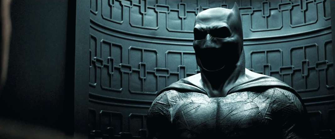
Nice stuff you got there. I like all the Batman stuff. The Norris jokes are nice. All the Edge stuuf is awsome. Same with Orton. BTW WHere do you get you're PSDs and that cage like brush from one of the Edge's?
|
|
|
|
Post by The Sexy Psychotic on Sept 13, 2008 13:00:07 GMT -5
|
|
|
|
Post by The Sexy Psychotic on Sept 14, 2008 5:44:39 GMT -5
I thought, since I do this on RSS, I'd do it here, and update this regualry    Please, if you do look through, please reply, I pretty much do this for praise, lol Nah, but really |
|
KRAYZIE BONE
Main Eventer
WF 10 Year Member
Visual.Avenues
Joined on: Jul 20, 2003 22:29:25 GMT -5
Posts: 1,608
|
Post by KRAYZIE BONE on Sept 14, 2008 16:42:21 GMT -5
some pointers:
stay away from filters and outer glows.
look @ some tutorials on working with text.
|
|
|
|
Post by jomoishollywood on Sept 15, 2008 20:14:06 GMT -5
The backgrounds are too plain, just try making one.
|
|
|
|
Post by The Sexy Psychotic on Sept 17, 2008 11:24:53 GMT -5
 Got the new TNA Game yesterday, and just felt like I had to do a TNA graphic, and I think its good, I worked more on the background, using only brushes, and I used 2 PSD's Comments? EDIT--   I done the lighter one first, and just as I was gonna post it, I thought it could do with a little darkening, so I did, and I did cut out the main RA pic, and as you can see, I'm pretty poor at it, lol |
|
|
|
Post by Almost Like Flacco on Sept 18, 2008 11:28:18 GMT -5
Where did you get the Alter Bridge logo psd from the Edge graphic?
|
|
|
|
Post by The Sexy Psychotic on Sept 18, 2008 13:52:29 GMT -5
|
|
|
|
Post by Almost Like Flacco on Sept 18, 2008 14:16:33 GMT -5
Thanks, man. Good work, btw. I like the Edge and Orton graphics.
|
|
|
|
Post by KeBen Owens on Sept 19, 2008 23:10:12 GMT -5
theres a few things you still need to work on but i can definitly see that youve improved. try working alittle more on matching the font to the graphic - some of them look a little odd. also try working on your cutting out of the images. the edges around the people are sometimes too hard and they dont look natural. -abcs
|
|
|
|
Post by The Sexy Psychotic on Sept 21, 2008 2:09:31 GMT -5
Heres another, I put alot of thought into thsi one, its for a CD cover that I'm doing for a Collection of Raw's  |
|
|
|
Post by The Sexy Psychotic on Sept 23, 2008 14:18:39 GMT -5
|
|