|
|
Post by Parchandri on May 20, 2009 15:54:48 GMT -5
Stips Theme: Hockey Player, Basketball Player, Football Player.. etc etc (any sports player) Size: 600x400 Kemp's Parch's Parch's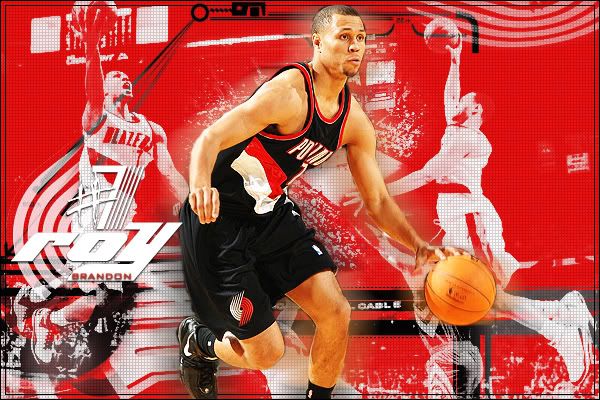 |
|
|
|
Post by theforrestgriffin2 on May 20, 2009 16:06:10 GMT -5
Pretty good battle.
Parchs is very good. I really like what you did with the text. Only thing I don't like is his number.
Kemps I really like this but I think that its to plain. And needs more of a spark.
My vote goes to parch.
|
|
|
|
Post by @PaulGriffin on May 20, 2009 16:28:55 GMT -5
Kemps I really like this but I think that its to plain. And needs more of a spark. Exactly the reason why he should win. It's clean, legible, and overall very pleasing to the eye. Meanwhile, Parch took a very hard color, used a bunch of brushes and images, and then put text in there somewhere that is hardly noticeable due to coloring. Needs to work on contrast big time. KempAY! ftw. |
|
Deleted
Joined on: Oct 31, 2024 18:24:30 GMT -5
Posts: 0
|
Post by Deleted on May 20, 2009 17:59:00 GMT -5
i love kemps. its very stream line and very professional. like nzo said, parch's text is a bit hard to read and the color isnt too flattering.
kemp gets my vote.
|
|
|
|
Post by LAXxxx305 on May 20, 2009 19:56:45 GMT -5
Parch. This too graphics look awesome, but Kemp's is a little too plain. Both did a great job. Parch's has awesome blending and just looks phenomenal.
Vote: Parch
|
|
|
|
Post by xtremefate on May 20, 2009 20:41:57 GMT -5
I guess I'm the decider?
Well I thought both were well. But I didn't like the fact that parches was a little to intense on the red and the text didn't sit well with me and I didn't even notice the #7 until now. But I love the players behind the red, the front picture of roy brandon is nice and that little black tech ish border.
Kemps was simple and sleak and he pulled it off well. He used a dark gray as a background with different shades which adds some excitement over it and the player and text pops out perfectly and the text choice was great. I like how had the Hossa text a white ish color. The number text was nice but that speed thing on the left hand side was a little too choppy for me a bit. A little more blur would have been nicer. I like the slight gradient he used on the text though.
My vote: Kemp.
|
|
|
|
Post by OverTheEdge on May 21, 2009 8:14:23 GMT -5
I'd have to go with Kemp's.
It just seems much more organized. Usually, I'd find something that had the team name, logo, player's name, and number to be way too cluttered but you found a way to really make it work and look great while doing so. It looks really smooth and has a flow to it.
Parch, your's is really good too. I really like the blending of the pictures with the red background--although I'm not too big on the checkered pattern on it--and the text and brushes work really well too. However, the border seems a little much with how much is already going on within the graphic itself. Also the huge color difference of the main picture, as well as the shadow/glow around it, really throws the whole thing off for me.
|
|
Epic
Main Eventer
   
Joined on: Jan 1, 2002 20:41:22 GMT -5
Posts: 2,314
|
Post by Epic on May 21, 2009 9:55:09 GMT -5
Kemp: Right off the bat, the Red Wings logo looks out of place to me, as if it had just been thrown on there. Maybe moving the 81 to the right and the logo to the left would allow the curves of Hossa's body to conform to the wings of the logo and create a less 'random' feel. Text work is professional looking but overdone, and I guess that's my feeling on this entire piece. The colors are really nice, and I like the focus on red and white, but why is the uniform and text so vivid and exciting and the logo so dull? I think there's a gradient on the logo that's not agreeing with me. I enjoy the blur on both sides of Hossa, you did this particularly well. On second thought, moving the 81 over would put all the text on the right side so that would have to be handled delicately. I still think the wings and form of the body would compliment each other rather well.Parch: I think you've got a bit too much going on here and it detracts from what at it's core is a solid lay out. Firstly, the text is just killing me - Too many different fonts. I like the "roy", but the shadow on the "Brandon" is just horrendous. I like the number (7? 1? I'm guessing 7.. if it's 1, then I don't like it anymore, haha), but not the number sign. A little too much random brush work going on in the background for me but here the bright powerful red could work. Maybe with more focus on the player than the brushes. Also, on that note, the main focal picture is too highly contrasted and he loses that hue variation that we need to see in people. Right now, he's an interesting shade of orange. Got some "jaggies" on the cut too, especially on the ball / hand and the back of the head, but this is just a small glitch in the piece that while distracting, can be easily fixed. Overall I'm going to give this one to Kemp and while I commend you both for participating in some sort of revival of this board's graphics battle league, I would like to see you both take on more ambitious themes.  |
|
