|
|
Post by The Future on Nov 26, 2011 8:04:42 GMT -5
  Lion & lotus flower...it's still healing up, as I got it just a week ago. The lion stands for what I wanna name my first son(Leo) and the lotus is my favorite flower. |
|
thestongguy
Main Eventer
 Refs: 11
Joined on: Aug 15, 2004 22:17:02 GMT -5
Posts: 1,063
|
Post by thestongguy on Nov 26, 2011 10:58:43 GMT -5
 got this a few weeks ago... |
|
Deleted
Joined on: Oct 1, 2024 2:15:47 GMT -5
Posts: 0
|
Post by Deleted on Nov 26, 2011 18:14:23 GMT -5
Booker- All caps if you havent got it already New Wave- That is pretty tight man Newish addition, The Poet From Hell by Charles Broson:  Thanks man. I'm a big fan of the movie and the man himself so I decided to get something he actually drew. The banner itself was just an add on. The artist used a thinner needle which made it sting a bit more, but I dig it. Looks sick man! |
|
|
|
Post by PhoeniX™: Valoween on Dec 20, 2011 11:33:42 GMT -5
I'm getting a new tattoo in the new year. A cat that I had most of my life died last year, and he had an hourglass type marking on his nose. I thought as a not-so-obvious tribute to him, I could get an hourglass with angel wings with shading around it. Here are a couple of ideas I put together in Photoshop, and will hopefully be getting a friend to draw up a design for me soon. 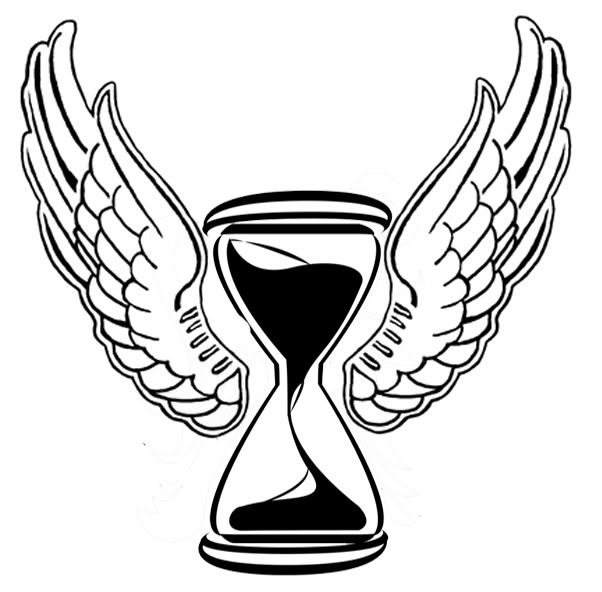 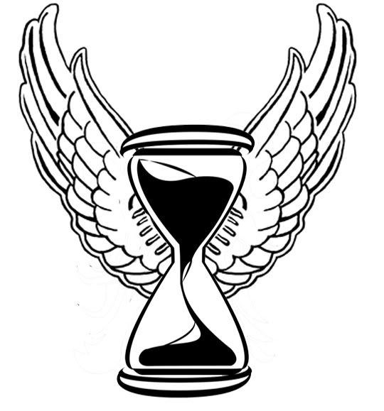 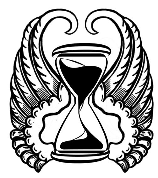 It will be on my forearm and be about 5-6 inches long. |
|
|
|
Post by P@ul on Dec 20, 2011 12:12:23 GMT -5
I'm getting a new tattoo in the new year. A cat that I had most of my life died last year, and he had an hourglass type marking on his nose. I thought as a not-so-obvious tribute to him, I could get an hourglass with angel wings with shading around it. Here are a couple of ideas I put together in Photoshop, and will hopefully be getting a friend to draw up a design for me soon. It will be on my forearm and be about 5-6 inches long. I'm digging the second one of the most out of those. |
|
|
|
Post by K5 on Dec 20, 2011 19:35:38 GMT -5
yep, i'd go with the second myself. particularly because it's two separate pieces together instead of one large conjoined image.
|
|
|
|
Post by PhoeniX™: Valoween on Dec 20, 2011 21:36:37 GMT -5
I'm confused though, as on my screen the 2nd one is the most conjoined of the three designs. Unless you mean the third pic, with the the second design technically.
|
|
Deleted
Joined on: Oct 1, 2024 2:15:47 GMT -5
Posts: 0
|
Post by Deleted on Dec 21, 2011 0:25:44 GMT -5
 Newest tattoo to my collection, its inside my right arm. Hurt like a bitch but well worth it. Looks cool. |
|
|
|
Post by PhoeniX™: Valoween on Dec 22, 2011 16:21:14 GMT -5
Any other opinions?
|
|
|
|
Post by AdamBomb on Dec 22, 2011 16:26:01 GMT -5
Personally, I like the first design the most with the hourglass and wings being separate pieces. Just feels less busy to me, if that makes sense at all.
|
|
Deleted
Joined on: Oct 1, 2024 2:15:47 GMT -5
Posts: 0
|
Post by Deleted on Dec 22, 2011 16:29:48 GMT -5
Personally I like the 2nd design the most. The 3rd design looks feminine to me.
|
|
facemeat
Main Eventer
Joined on: Jul 24, 2011 0:38:10 GMT -5
Posts: 2,891
|
Post by facemeat on Dec 22, 2011 16:47:23 GMT -5
Personally, I like the first design the most with the hourglass and wings being separate pieces. Just feels less busy to me, if that makes sense at all. I agree. The first one is definitely my favorite. |
|
|
|
Post by PhoeniX™: Valoween on Dec 22, 2011 19:23:51 GMT -5
Yeah it all makes sense, and now i look at it, the last one is a bit feminine. I like how the hourglass is the vocal point in the first two.
|
|
|
|
Post by PhoeniX™: Valoween on Dec 22, 2011 19:50:09 GMT -5
  I revised them a bit. Also my partner suggest I could add something to the bottom to balance out the top-heaviness of it. So I was thinking of smoke/flame-like shading that the main design will be rising out of. |
|
Deleted
Joined on: Oct 1, 2024 2:15:47 GMT -5
Posts: 0
|
Post by Deleted on Dec 22, 2011 21:54:01 GMT -5
Hmm. Personally I like the smoke version. Although it really all depends on what you want man. ;D
|
|
|
|
Post by PhoeniX™: Valoween on Dec 23, 2011 7:23:21 GMT -5
Either one will have the smoke, I was just playing with wing placement in the first one. I think after Christmas, I shall visit the shop and book it in. I will talk with the artist about the best shaping, placement and shading. Can't wait, tbh.
|
|
|
|
Post by P@ul on Dec 24, 2011 0:04:49 GMT -5
Really digging the new design. I'd go with the smoke around it.
|
|
|
|
Post by PhoeniX™: Valoween on Dec 24, 2011 5:53:25 GMT -5
Thanks  |
|
|
|
Post by Ricky Nitro on Dec 25, 2011 6:13:43 GMT -5
Don't worry about the top being wider than the bottom if it's going on your forearm. Your forearm is wider at the elbow end than it is at the wrist end anyway, so it will be a natural fit. You want it to stay within muscle lines so that it looks right.
|
|
Deleted
Joined on: Oct 1, 2024 2:15:47 GMT -5
Posts: 0
|
Post by Deleted on Dec 28, 2011 17:00:20 GMT -5
"Oh no, there goes your future"........  |
|