|
|
Post by ¡Twist Of Lime Green Jello! on Feb 4, 2012 2:55:56 GMT -5
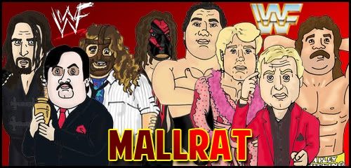
Something I done out of boredom, a quick idea turned into a bit of simple artwork. Rate and critique to your heart's content.  |
|
Tylor
Main Eventer

Joined on: Dec 23, 2008 18:17:08 GMT -5
Posts: 4,437
|
Post by Tylor on Feb 4, 2012 3:06:49 GMT -5
Love it. Simple concept, very effective. Don't like the V S from John Cena vs. Kane. Looks weird spaced out. Awesome cover!
|
|
|
|
Post by ¡Twist Of Lime Green Jello! on Feb 4, 2012 4:00:24 GMT -5
Love it. Simple concept, very effective. Don't like the V S from John Cena vs. Kane. Looks weird spaced out. Awesome cover! Yeah I know what you mean about the VS, it could have been fixed by making their match placement horizontal but that means Brodus and Clay would get a bigger spot and I didn't want that for a minor match. I wanted to take full advantage of the text boxes, hence the justified text, but too bad it didn't work out for the Vs though. Thanks for the reply  |
|
Mallrat
Superstar
Wha'cha gonna do brother!
Joined on: Jan 31, 2012 5:44:43 GMT -5
Posts: 989
|
Post by Mallrat on Feb 4, 2012 8:44:37 GMT -5
Really nice that is. Better than the actual cover which might aswell say Sheamus wins it on the front lol
|
|
Mallrat
Superstar
Wha'cha gonna do brother!
Joined on: Jan 31, 2012 5:44:43 GMT -5
Posts: 989
|
Post by Mallrat on Feb 4, 2012 9:03:52 GMT -5
Also whats really annoying is the only good images with Daniel Bryan in, if you don't want him screaming, all say Mark Henry on the belt.
|
|
|
|
Post by ¡Twist Of Lime Green Jello! on Feb 4, 2012 21:11:01 GMT -5
Also whats really annoying is the only good images with Daniel Bryan in, if you don't want him screaming, all say Mark Henry on the belt. Not sure what you exactly mean there. Only thing I got out of it was that it says Mark Henry on the belt, its something I never even noticed until you mentioned it actually. Cheers for the comment above too! |
|
Mallrat
Superstar
Wha'cha gonna do brother!
Joined on: Jan 31, 2012 5:44:43 GMT -5
Posts: 989
|
Post by Mallrat on Feb 4, 2012 21:20:43 GMT -5
Sorry what I mean is, trying to find a good recent image of Daniel Bryan is difficult. As the only ones that are available are either Daniel Bryan shouting/screaming or with Mark Henry's name on the belt.
For example both the DB images are perfect pose wise, yet they have Mark Henry's name on the belt, sorry if I made no sense.
|
|
|
|
Post by ¡Twist Of Lime Green Jello! on Feb 4, 2012 21:29:40 GMT -5
Sorry what I mean is, trying to find a good recent image of Daniel Bryan is difficult. As the only ones that are available are either Daniel Bryan shouting/screaming or with Mark Henry's name on the belt. For example both the DB images are perfect pose wise, yet they have Mark Henry's name on the belt, sorry if I made no sense. Ah I see what you mean now. When it comes to covers and match cards, I prefer to use studio taken pics instead of in ring ones and the two of him that I used are the only ones available of him holding the belt. I wasn't able to change the nameplate on the belt but I did slightly brush over it and also fix up some nagging parts of the cover. The diagonal bars werent aligned properly plus I made the 'WWE Presents', '25th Anniversary...' and all the back text the same font seeing as they were three different ones. The updated version has been posted. |
|
Mallrat
Superstar
Wha'cha gonna do brother!
Joined on: Jan 31, 2012 5:44:43 GMT -5
Posts: 989
|
Post by Mallrat on Feb 4, 2012 21:33:38 GMT -5
Good Job. Yeh should have said studio pics lol. That's what I meant the only 2 studio pics of Daniel Bryan have Mark Henry's name on the plate ... Good Job of removing it though |
|
|
|
Post by ¡Twist Of Lime Green Jello! on Feb 4, 2012 21:40:00 GMT -5
Good Job. Yeh should have said studio pics lol. That's what I meant the only 2 studio pics of Daniel Bryan have Mark Henry's name on the plate ... Good Job of removing it though It seems to be a common thing though. When someone wins the belt and they have their pics taken backstage, the previous champion's nameplate is still on the belt. Its caught me off guard a few times too. |
|
Mallrat
Superstar
Wha'cha gonna do brother!
Joined on: Jan 31, 2012 5:44:43 GMT -5
Posts: 989
|
Post by Mallrat on Feb 4, 2012 21:47:27 GMT -5
Yeh I know what you mean but he won it in November. Cena or Orton would have had about 30 studio pics done in those 3 months |
|
|
|
Post by ¡Twist Of Lime Green Jello! on Feb 4, 2012 21:51:02 GMT -5
Yeh I know what you mean but he won it in November. Cena or Orton would have had about 30 studio pics done in those 3 months Lol, wouldn't surprise me  And as a small preview for my next one that I started and almost finished... Its clearly obvious which PPV it is but I won't reveal until we get the final card.  |
|
|
|
Post by bennet07 on Feb 5, 2012 16:12:08 GMT -5
did you make one for ever ppv if so could you send them to me so its just the cover none of the case would rather use this then what wwe actually uses
|
|
Mallrat
Superstar
Wha'cha gonna do brother!
Joined on: Jan 31, 2012 5:44:43 GMT -5
Posts: 989
|
Post by Mallrat on Feb 5, 2012 17:42:14 GMT -5
Chamber with Punk?
Look forward to seeing it
|
|
|
|
Post by ¡Twist Of Lime Green Jello! on Feb 5, 2012 17:53:59 GMT -5
did you make one for ever ppv if so could you send them to me so its just the cover none of the case would rather use this then what wwe actually uses Just PPVs I can be bothered doing. I was going to do one for every PPV last year but only ended up doing Wrestlemania, Money In The Bank, Summerslam, Night Of Champions, Hell In A Cell and TLC. Chamber with Punk? Look forward to seeing it Yup, its the Chamber with Punk. I made some changes to the back so the one in the blurred pic is different now. |
|
|
|
Post by pxkgotosleep on Feb 5, 2012 18:21:29 GMT -5
It's fine. I don't think that Big Show should look the same height as D Bry' on the front cover though.
|
|
|
|
Post by ¡Twist Of Lime Green Jello! on Feb 5, 2012 21:21:48 GMT -5
It's fine. I don't think that Big Show should look the same height as D Bry' on the front cover though. Its just a habit when doing the main event matches. |
|
|
|
Post by Mole on Feb 13, 2012 7:12:29 GMT -5
My only suggestion would be to give the text on the back some space to breathe from its borders, especially the preview/hype/etc. text. Also, whatever you did to the spacing to that text makes it much harder to perceive it as a contiguous thought.
|
|
Deleted
Joined on: Sept 28, 2024 6:38:41 GMT -5
Posts: 0
|
Post by Deleted on Feb 13, 2012 9:00:42 GMT -5
its rather boring, the gray and pale blue color scheme just makes it seem so flat. as mole said, give the text on the back some space. it looks like everything just blends together and is not inviting to read. same goes for the spacing for the match boxes.
|
|
|
|
Post by Cammi Oh on Feb 13, 2012 10:11:15 GMT -5
Something I done out of boredom, a quick idea turned into a bit of simple artwork. Rate and critique to your heart's content. I LOVE the front cover of that! Very nice! |
|